
Disney announced earlier this month that it’s going all-in on streaming media.
As part of this new strategy, the company is undergoing a major reorganization of its media and entertainment business that will focus on developing productions that will debut on its streaming and broadcast services.
This will include merging the company’s media businesses, ads and distribution, and Disney+ divisions so that they’ll now operate under the same business unit.
As TechCrunch’s Jonathan Shieber reports, Disney’s announcement follows a significant change to its release schedule to address new realities, including a collapsing theatrical release business; production issues; and the runaway success of its Disney+ streaming service — all caused or accelerated by the national failure to effectively address the COVID-19 pandemic.
So what better time than now to give Disney+ the Extra Crunch user experience teardown treatment. With the help of Built for Mars founder and UX expert Peter Ramsey, we highlight some of the things Disney+ gets right and things that should be fixed. They include zero distractions while signing up, “the power of percentages,” and the importance of designing for trackpad, mouse and touch outside of native applications.
Zero distractions while signing up
If the user is trying to complete a very specific task — such as making a payment — don’t distract them. They’re experiencing event-driven behavior.
The win: Disney have almost entirely removed any kind of distractions when signing up. This includes the header and footer. They want you to stay on-task.
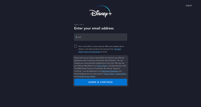
Steve O’Hear: This seems like a very easy win but one we don’t see as often as perhaps we should. Am I right that most sign-up flows aren’t this distraction-free and why do you think that is?
Peter Ramsey: Yeah, it’s such an easy win. Sometimes you see sign-up screens that have Google Adwords on it, and I think, “You’re risking the user getting distracted and leaving for what, half a penny?” If I had to guess why more companies don’t utilise this technique, it’s probably just because they don’t want to deal with the technical hassle of hiding a bunch of elements.
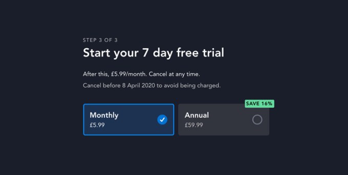
The power of percentages
Only use percentages when it makes sense. 80% off sounds like a lot, but 3% doesn’t. Percentages can be a great way of making a discount seem larger than it actually is, but sometimes it can have the reverse effect. This is because people are generally bad at accurately estimating discounts. “What’s 13% off £78?”
The fail: If you sign up to a year of Disney+, then you’re offered 16% free. But 16% isn’t easy to calculate in your head — so people guess. And sometimes, their guesses may be less than the actual value of the discount.
The fix: In this instance, it would be far more compelling (and require less mental arithmetic), if it was marketed as “60 days free.” Sixty days is both easy to understand and easy to assign value to.
Percentages may be harder to process or evaluate in isolation as an end user but they are easy to compare with each other i.e., we all know 25% off is better than 10% off. Aren’t you advocating obscuring the actual saving in favour of what sounds better on a case-by-case basis and therefore actually working against the end user? Of course I’m playing devils advocate a little here.
So, it’s actually a really complex dilemma, and there’s no “easy” answer — this would probably make a great dinner time conversation. Yes, if you’re offering two discounts, then a percentage may be the easiest way for people to compare them.
But, in the example of Disney+, a “16% discount” is purely financial and awkward to translate into cash. Whereas if they advertised it as “Two months free Disney+” then that “value” requires no calculation.
I’m presuming there is also a reason why putting a discount in actual monetary terms isn’t always optimal either, if one is optimizing for conversions?
Again, it’s tough. As an example, if you were buying a new car and there was a 2% discount, that might equate to £1,000. You couldn’t really rephrase this as a benefit (like I did with the “Two months free” Disney example), and 2% feels very little. So in that instance, you’d be better off using a financial discount i.e., £1000 feels like more than 2% of £50,000.
There are (usually) no points for originality
It’s better to execute something really well than force yourself to design something original but execute it poorly.
The win: Has Disney copied Netflix? Yes. Has Amazon Prime copied Netflix? Yes. Have they all kind of copied each other? Yeah, probably. But that’s fine, because what Disney have created is a really well-executed version of this design.
This is something we’ve talked about before in our UX teardowns for Extra Crunch. However, in this example you’re saying that not only is it okay or optimal to piggyback a well-established user experience/user flow, but it’s also an opportunity to really execute well. In other words, not striving for originality doesn’t mean not striving to do your best work.
Correct, and as an example, it wouldn’t be easy to make something easier to use than Twitter. Recreating — and executing well — a clone of Twitter would be really hard.
The ‘I have no idea what this does’ button
Buttons may technically do something — say, adding an item to a shopping basket — but unless the user knows what has happened, then it may as well have not done anything.
The fail: When adding an item to your watchlist, you need to click on the (+) button. When you know what it does, this is fine, it’s just a button. But, it never tells you what it does, you need to guess. Once you click it, the “+” just turns into a tick.
The fix: Copy Netflix: Their button says “Add to watchlist.” Sure, it’s three words so takes up more space, but new users can actually understand it.
Ah, the return of “mystery meat” navigation once again. Why do you think designers do this? Is it because they think it looks aesthetically pleasing not having any text next to or part of a button?
Haha, “mystery meat” navigation is an amazing term. Obviously this is just my opinion, but anecdotally from talking with designers, it’s mostly because it’s aesthetically pleasing, as you suggest.
When a button like this isn’t clearly communicated, the result presumably is that users will use the feature less? And in this example, it’s a pretty core feature.
I’d say so yeah. People massively underestimate how sticky routines are, and how quickly those routines form. So yeah, if people use Disney+ for weeks without every trying this random “+” button, they might never bother.
Trackpad, mouse and touch — remember that they exist
Remember that — unless you’ve built native apps — people will interact with your software in a variety of ways. Some will have scroll wheels on a mouse, some a touchpad, some will click and scroll the page. So, make sure your elements work with all of these methods.
The fail: When scrolling through episodes in a series on Disney+, you can very easily accidentally select one of the options. This is because you can’t use very common touch gestures, like the “double finger swipe.”
The fix: Build software for the entire spectrum of device inputs — including accessibility devices. Test, test, test.
This is one that really annoys me; when a UX essentially breaks a perfectly good and established UI element or function of the underlying device or operating system. Yet it happens way more often than it should. Laziness or is there something else going on here?
Me too! There may be an element of laziness here, but I think what’s more likely is that the product team just never thought of it. Or, they did think of it, but didn’t think it was an important enough issue to fix.
Test, test, test seems to be the mantra, but accessibility obviously goes way beyond testing and is outside the scope of this teardown. Are there any resources you’d recommend for accessible web and app design that can help product people begin to get up to speed with best practice?
There are a bunch of resources on Google, I couldn’t list just one. The real problem with “standards,’ per se, is that technology moves faster than standards can adapt, so there’s always a lag. This is why great product managers are gold dust to startups.


Comment