Visualizing 15 Years Of Acquisitions By Apple, Google, Yahoo, Amazon, And Facebook
You grow old, you slow down, and you die. That is, unless you can inject some fresh blood. After watching the last generation of tech giants wither or stagnate, today’s juggernauts are relying on acquisitions to keep them young and relevant. Check out the interactive infographic below to compare the size, frequency, and focus of the last 15 years of acquisitions by Apple, Amazon, Google, Yahoo, and Facebook.
Business insurance provider Simply Business created this infographic, which is only available here on TechCrunch. Each dot’s size represents the price paid for that startup if it was disclosed. Scroll over them for a link to learn more about the deal. The plus and minus buttons in the top right let you zoom in on specific time periods. Select categories at the top to filter for certain types of acquisitions. The Frequency toggle reveals phases when companies did heavy buying. And you can click any of the tech giants’ logos to view a complete list of their full-scale acquisitions (small acqui-hires excluded). Sorry to our mobile readers, but it’s much easier (possible) to navigate this on the web.
Trends crystallized by the Simply Business infographic include:
- The drought of acquisitions by Yahoo in 2011 and 2012 before Marissa Mayer began her buying spree after being named CEO.
- Apple has kept the price of its acquisitions low despite its huge cash reserves, as it prefers to buy for technology rather than market share.
- Facebook accelerated its talent-focused acquisitions following its IPO to combat brain-drain.
- While Steve Jobs saw acquisitions as a “failure to innovate,” Tim Cook has been proactive about buying companies to bring new intellectual property to Apple.
-
- There was a recession in acquisitions in the “Rest In Peace: Good Times” era from 2008 to 2009.
- Social, mobile, and hardware acquisitions have come into favor as search, media, and advertising buys have waned in the past few years
And the biggest acquisitions (with disclosed prices) by the giants were:
- Apple – Anobit ($390 million), AuthenTec ($356 million)
- Amazon – Zappos ($900 million), Kiva Systems ($775 million)
- Google – Motorola Mobility ($12.5 billion), Nest ($3.2 billion), DoubleClick ($3.1 billion), YouTube ($1.65 billion)
- Yahoo – Broadcast.com ($5 billion), Overture ($1.83 billion), Tumblr ($1.1 billion)
- Facebook – WhatsApp ($19 billion), Instagram ($1 billion, closed at $715 million)
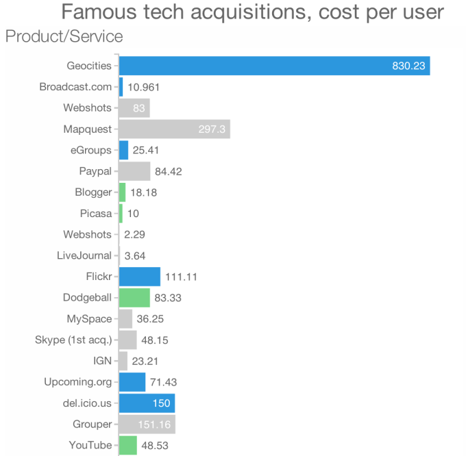
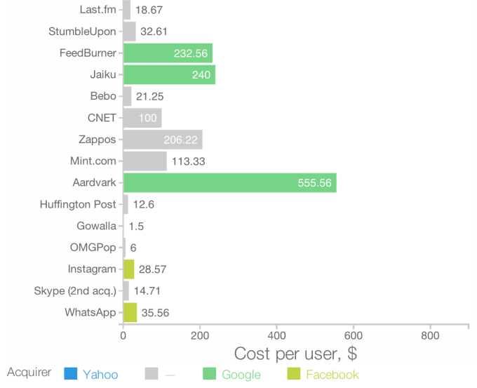
[Update 5:25pm PST: To put the price of the WhatsApp acquisition and others in context, here’s a chart comparing the acquisition cost per user for most of the major consumer space acquisitions from the past fifteen years. Click through to see the original interactive chart that includes details on each deal.]


For more on the acquisition game, read:
As Tech Giants Scramble For Talent, It’s Buy Or Die
Welcome To The Unicorn Club: Learning From Billion-Dollar Startups
When Founders And Investors Split Over An Acquisition Offer
How To Keep Your Team And Make Your Startup Acquisition Succeed