
CommandBar, a B2B tool designed to make software easier to use, closed a $4.8 million raise in 2021 with one of the most starkly minimalist decks I’ve ever seen. The deck only has seven slides and is missing a ton of really important information, but that didn’t stop Thrive Capital and Y Combinator from opening their checkbooks.
We’re looking for more unique pitch decks to tear down, so if you want to submit your own, here’s how you can do that.
Slides in this deck
- Cover slide
- Product slide
- Demo slide (with a link to a Loom demo)
- Thesis slide
- Problem/competitive landscape slide
- Value proposition slide
- Team slide
Three things to love
In the midst of a pretty slim pitch deck, there are some innovations that are worth shining a light on.
Info design, not graphic design
I’ve long held that design is far less important than people seem to think when it comes to early-stage pitch decks. This makes sense: The primary purpose of a pitch is to communicate the startup’s potential to would-be investors. These elements are fundamentally rooted in the content and clarity of the message rather than the aesthetics of the presentation.
That doesn’t mean that design isn’t important, but startups would do well to pay attention to information design (i.e., whether the content is easy to ingest and read), rather than graphic design; early-stage investors are predominantly focused on substance over style. They are looking for compelling business ideas with strong market potential and teams capable of executing those ideas.
Focusing too much on design can often misallocate precious early-stage resources. Startups typically operate under tight budget constraints, and spending significant time and money on pitch deck design may not be the best use of limited resources. The time and effort could be better spent on validating the business idea, conducting market research and refining the product or service. If you have a talented designer on staff, by all means, let them loose on the deck, but be aware that great pitch deck design is a highly specialized niche in its own right, and other design disciplines may not be as transferable as you think.
CommandBar sidesteps this by essentially not designing the deck at all. In doing so, the company created a stark, easy-to-ingest stack of slides.

[Slide 1] How’s that for minimalism. Image Credits: CommandBar
Elegant combo of problem and competitive landscape
In my many years of poring over pitch decks, I can’t say I’ve seen the problem slide combined with the competition slide before, but in this case, it just works:

[Slide 5] These go well together. Image Credits: CommandBar
Yes, the design is utilitarian, but the combination of the two slides sharpens the presentation and helps do something unusual: It cohesively shows the company’s deep market understanding and the solution’s unique value.
The most effective part of this slide is that it shows that CommandBar can take on some truly enormous markets. The company doesn’t have a market size slide (boo!), but the examples on this slide give us an idea: WalkMe has an $830 million market cap. According to PitchBook data, Zendesk last raised at a $10 billion valuation. As of its last investment round, Intercom and FullStory were valued by investors at $900 million and $1.8 billion, respectively. Back-of-a-napkin math says CommandBar is going after a market of at least $13 billion. Not too shabby.
I do want to underscore that while integrating these slides offers some benefits, clarity is key. Ensure the slide is not overcrowded with information. The aim is to enhance understanding and engagement, not to confuse. Careful design and content selection are crucial to making this strategy work — and remember that more and more VCs are using AI to read pitch decks to do first-sifts. My own AI-based pitch deck tool was confused by this slide, incorrectly identifying it as a customer slide. Your mileage may vary, but your pitch deck does need to be machine-readable.
Simplicity
A lot of founders get stumped trying to express what the company is doing and who it is doing it for. That makes sense: Of course a startup is complicated and full of nuance. But investors don’t need that level of in-the-weeds precision, especially not the first time they look at a startup. CommandBar’s second slide cuts through the temptation of complexity, offering up the following:
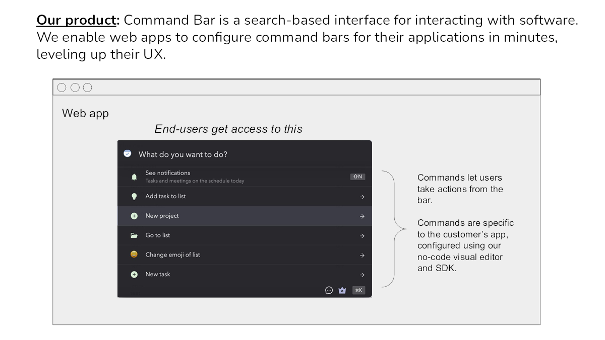
[Slide 2] Distill your purpose in as few words as you can. Image Credits: CommandBar
Three things that could be improved
Clever innovations aside, there’s a lot to be desired with this deck.
The team slide doesn’t have a team on it
[Slide 7] Where is the team? Image Credits: CommandBar
There’s missing information
The deck doesn’t include enough information to know whether it’s venture scale. There’s no real sense of how big the market is. There’s no ask or use of funds. The team is missing. There’s no financial plan, no business model, and no go-to-market plan. There’s no clear pricing or unit economics. There’s no clarity around who the target customers are, how this company might be defendable, or why now’s the right time to start the company.

Image Credits: Haje Kamps
For reference, my AI-powered pitch deck tool gave this deck a 16.9% chance at raising funding.
You need traction
CommandBar’s deck has no real traction metrics, which isn’t great. Even if there’s no revenue, at least some work has been done to de-risk the company. That’s the traction; report it and show it as graphs.
So, what happened?
It’s likely that CommandBar raised its round without a deck at all and that investors came into the pitch knowing more about the company than we see here. Perhaps the team is extraordinary, and the investors knew that because they invested in a previous company, or have had exposure to the founders in the past. Perhaps the company did a compelling demo when it was in Y Combinator.
I asked the founding team about what actually happened.
“Vinay, Richard and I are overthinkers, so before writing our seed deck we created some principles,” said CommandBar’s CEO and co-founder, James Evans. The company took an unusual tack: “We looked at our seed deck as a memo to ourselves of why we — self-proclaimed smart people who could do a bunch of other things with their time — should invest the next decade+ of our blood, sweat and tears into this company. If that were clear and we could reasonably convince ourselves, conveying that message to attract capital should be easy. And if it weren’t . . . then why were we wasting time trying to raise money for this company to begin with?”
Evans actually tore down the company’s deck himself in a recent blog post, which makes for a good behind-the-scenes read (I hadn’t read it before I wrote my teardown above). He told me that while the company may or may not be raising another round of funding (shhhh), it did raise its next round without a deck, saying “it wasn’t a traditional process.”
“We led the A because of a continuation of factors that were present at the seed — a team with great ambition + clear thinking, and a product that customers loved and you could see becoming ubiquitous,” said Itai Tsiddon, when TechCrunch asked him how the Series A round came together. “The stellar early customer traction, with some marquee logos, certainly helped!”
The full pitch deck
If you want your own pitch deck teardown featured on TechCrunch, here’s more information. Also, check out all our Pitch Deck Teardowns all collected in one handy place for you!