Apple Publishes iOS 7 Transition Guide To Help Developers Adopt Flat Design


Image Credits:
As expected, Apple is introducing a completely new design language for iOS 7. For developers, this means they will have to adapt their apps to match the rest of the operating system if they don’t want them to look antiquated. Thankfully, Apple today also published a pretty extensive guide to designing for iOS 7 and transitioning apps to the new version that helps developers understand how they should use new UI elements like borderless buttons, translucent bars and full-screen layouts for their apps.
As Apple notes, iOS 7 provides “a rare opportunity to revisit the way apps communicate their core purpose and functionality to users.”
Here are Apple’s three main themes for developing for iOS 7:
Deference. The UI helps users understand and interact with the content, but never competes with it.
Clarity. Text is legible at every size, icons are precise and lucid, adornments are subtle and appropriate, and a sharpened focus on functionality motivates the design.
Depth. Visual layers and realistic motion heighten users’ delight and understanding.
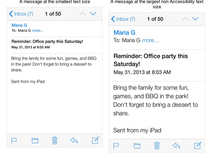
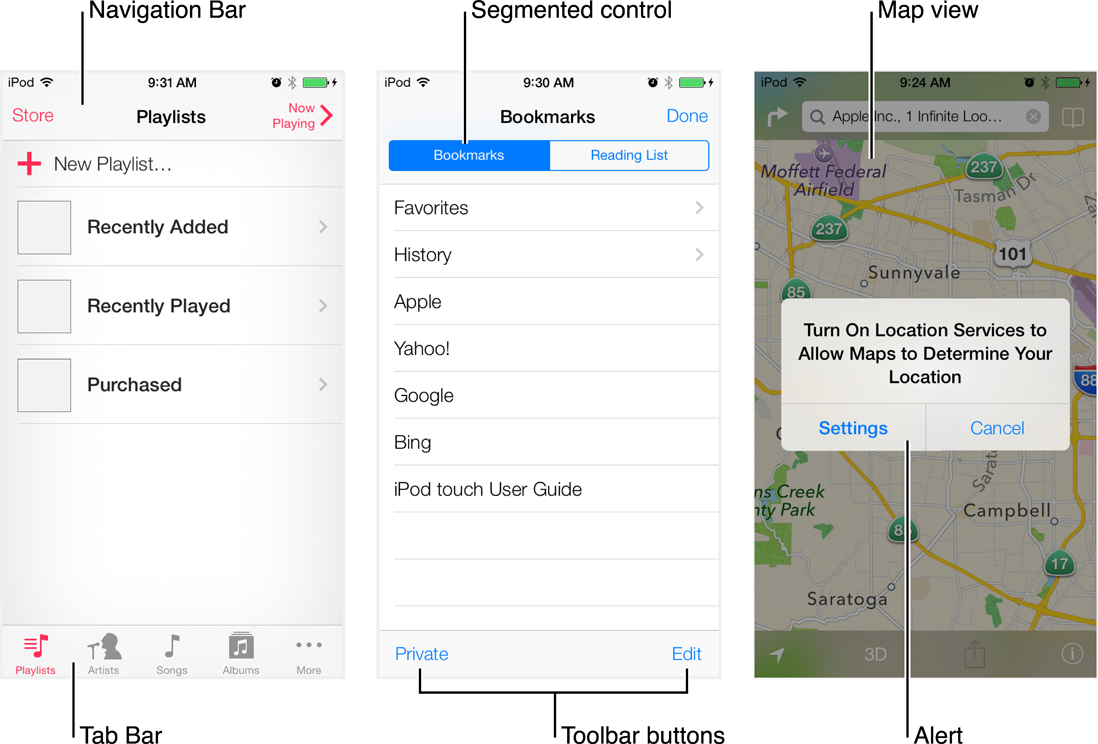
One new feature Apple especially stresses in its documentation is Dynamic Type, which now automates many of the text layout functions in iOS. Apple also notes that iOS 7 apps should get their apps ready to support the new transparent status bar, navigation bars, tab bars, toolbars, search bars, and scope bars, as well as other new UI features like the date picker.
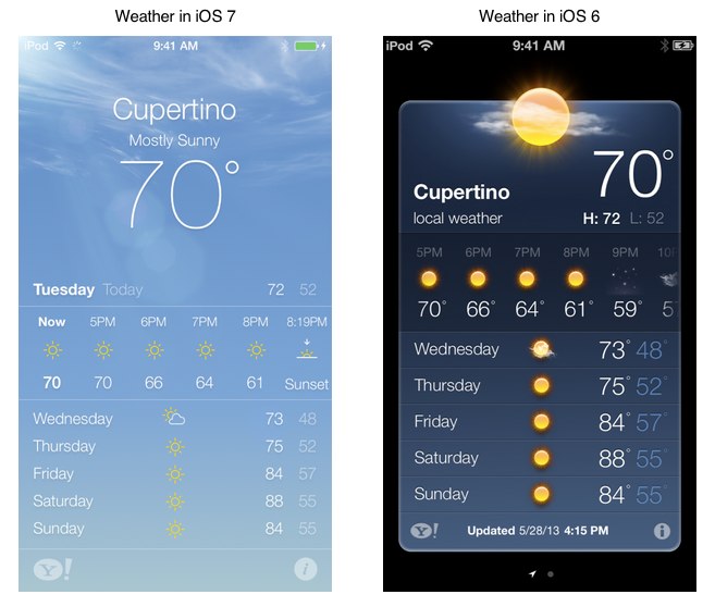
Most importantly, though, Apple is giving developers a couple of tips for building “crisp, beautiful UI and fluid motion” for iOS 7 so that third-party apps match Apple’s own style. This means apps should, whenever possible, take advantage of the whole screen, and developers should reconsider the use of insets and visual frames and instead let the content “extend to the edges of the screen.” They should also “reconsider visual indicators of physicality and realism” and avoid bezels, gradients and drop shadows, because that “sometimes lead to heavier UI elements that can overpower the content.” The UI, Apple says, should just “play a supporting role.” This also means apps should “provide clarity” (that is plenty of white space) and use color to simplify their UI.
Another design feature Apple wants developers to embrace is the use of depth to communicate hierarchy and position through translucent backgrounds and enhanced transitions.
Despite the focus on iOS 7 and the new design, Apple also acknowledges that some developers will have to (or want to) support iOS 6 for the time being. For them, Xcode 5 allows developers to manage multiple versions of an app to compare what they will look like using Apple’s Auto Layout.

- Make sure that app content is discernible through translucent UI elements—such as bars and keyboards—and the transparent status bar. In iOS 7, view controllers use full-screen layout (to learn more, see Using View Controllers).
- Redesign custom bar button icons. In iOS 7, bar button icons are lighter in weight and have a different style.
- Prepare for borderless buttons by moving away from supplying button background images and by reassessing your layout.
- Examine your app for hard-coded UI values — such as sizes and positions — and replace them with those you derive dynamically from system-provided values. Use Auto Layout to help your app respond when layout changes are required. (If you’re new to Auto Layout, learn about it by reading the Cocoa Auto Layout Guide.)
- Examine your app for places where the metrics and style changes of UIKit controls and views affect the layout and appearance. For example, switches are wider, grouped tables are no longer inset, and progress views are thinner. For more information on specific UI elements, see Bars and Bar Buttons,Controls, Content Views, and Temporary Views.
- Adopt Dynamic Type. In iOS 7, users can adjust the text size they see in apps. When you adopt Dynamic Type, you get text that responds appropriately to user-specified size changes. For more information, see Using Fonts.
- Make sure your app doesn’t respond inappropriately to the new Control Center gesture or to a navigation contoller’s swipe to go back gesture, especially if you perform custom touch handling.
- Revisit the use of drop shadows, gradients, and bezels. Because the iOS 7 aesthetic is smooth and layered—with much less emphasis on using visual effects to make UI elements look physical — you may want to rethink these effects.
- If necessary, update your app to best practices for iOS 6 — such as Auto Layout and storyboards — and ensure that the app uses no deprecated API.
You can find the full transition guide and iOS 7 design guide here.