How we got 75% more e-commerce orders in a single A/B test for this major brand


Image Credits: Abdullatif Omar/EyeEm / Getty Images
The Conversion Wizards, a conversion rate optimization (CRO) consultancy, was entrusted with boosting the conversion rates of a multibillion dollar company.
We used research to optimize the page and ran an A/B test. The winning version, labeled “radical,” resulted in a 75% increase in sales.
The original and double-control pages are actually identical. And to ensure that our judgment is sound, we always include a double-control.

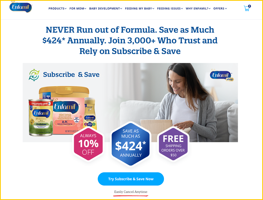
Screenshot from the winning, optimized treatment (above the fold, desktop). Image Credits: Conversion Wizards

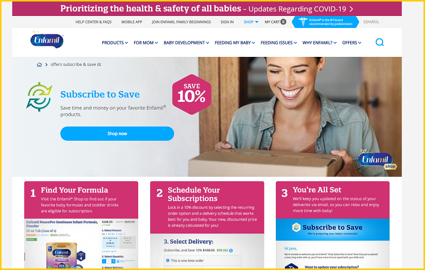
Here’s a screenshot of the original page (above the fold, desktop). Image Credits: Conversion Wizards
We took the average of those two identical pages as the baseline to determine the lift, and it revealed a 75% increase at 99% statistical significance.
Here are the Google optimize screenshots:

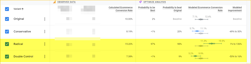
Image Credits: Conversion Wizards

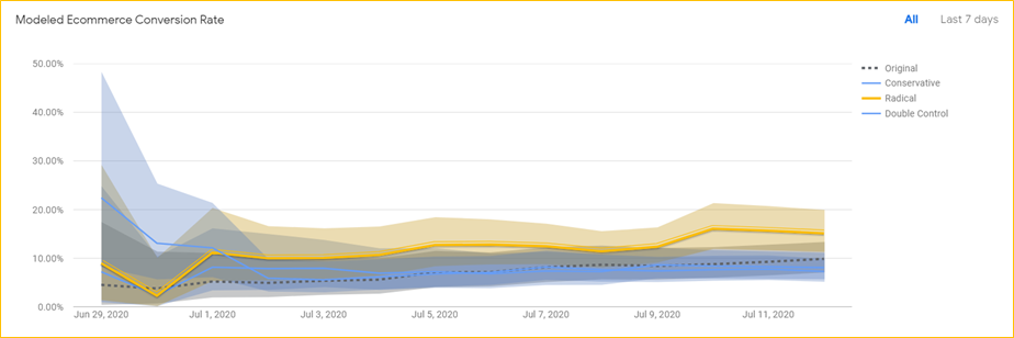
Image Credits: Conversion Wizards
Here’s a link to the full image of the original page.
Here’s a link to the full image of the winning page.
A look under the hood
Before I discuss the changes that produced the lift, it is important that I quickly go over the research that informed those changes. Why? Because it is a critical aspect of the process and too many CRO practitioners do not devote enough attention to figuring out why more site visitors aren’t converting.
Help TechCrunch find the best growth marketers for startups.
Provide a recommendation in this quick survey and we’ll share the results with everybody.
We surveyed both bouncing visitors and subscribers to the Subscribe & Save program. One of the important questions we asked the bouncing visitors was: “If you did not purchase today, what was your reason?”
The results are shown below:

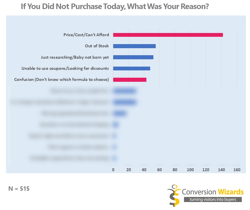
The results of the survey revealed the top reasons customers didn’t buy. Image Credits: Conversion Wizards
From our survey, we learned about some of the most common reasons clients had for not purchasing. After carefully analyzing the data — as shown by the red/violet bars — we decided we could easily influence two of these reasons:
- Too expensive/pricey/unaffordable.
- The confusion clients had concerning which formula to use.
Here’s a word cloud from the survey that shows how massive the price issue was:

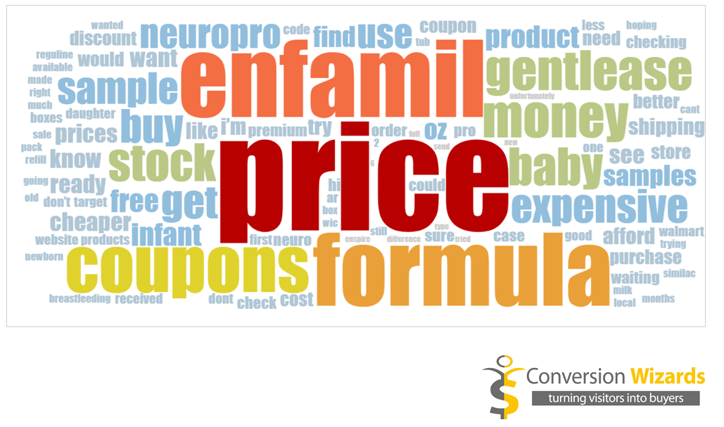
The survey word cloud with the top reasons customers didn’t buy. Image Credits: Conversion Wizards
How to design a higher-converting page
The key to creating a great page that has a strong chance of generating a sales lift lies with answering two essential questions:
Why did the buyers buy?
It’s necessary to know, in their own words, your customers’ reasons for using your product. Quite often, customers buy your product for an entirely different reason than you think. After all, Thomas Edison expected his phonograph to be used to record wills!
Why did most visitors not buy?
Successful e-commerce stores have an average conversion rate of 3% across all traffic sources. According to the Capital & Growth e-commerce answers site, 95% of new Shopify stores never make a sale. Truly understanding why visitors didn’t buy can make a big difference.
Once you’ve figured out the answers to these two questions, build a page that amplifies the customers’ reasons for buying and addresses the expressed objections.
And yes, although this sounds too simple, you’d be amazed how many CRO practitioners begin with sophisticated AI and machine learning!
Addressing price objections and reducing confusion
Our research made it clear that a winning approach had to meet two major goals: Addressing the price issue (by enhancing the value proposition) and minimizing confusion.
To fulfill these aims, we employed these strategies:
A headline to communicate a specific advantage and quell concerns
We noticed that the phrase “never run out of formula” came up repeatedly when we surveyed customers in the Subscribe & Save program, so we included it in the headline — the most critical element of a landing page.
Here are some examples of how customers used the phrase, “I never want to run out of formula again.” “I ran out of formula and had to drive to Walmart at midnight.”

A headline change on the landing page can have a massive effect. Image Credits: Conversion Wizards
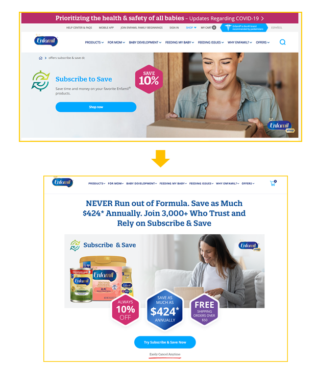
Quantify the potential savings
Although it’s okay to use “10% discount,” we could better express this as “save up to $424 per year.”
Communicate the benefits in a more compelling way
The screenshot below shows a more compelling method of presenting the benefits of the company’s Subscribe & Save program.
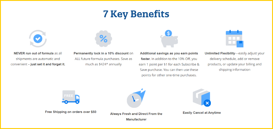

Image Credits: Conversion WizardsOn the other hand, the original page below presents nothing unique, just standard elements like adjusting your schedule, add or remove products, and update billing and shipping information. These are expected features.


Image Credits: Conversion Wizards
Using a call to action that suggests less commitment, like “Try Subscribe & Save Now”
There are countless subscription boxes and “forever billing” that are almost impossible to cancel. Customers are rightfully skeptical about signing up for another subscription. So it is always best to use “Try Subscribe & Save Now,” because by reassuring your customers that they can “Easily Cancel Anytime,” you’ll get more babies to bite.


The new Subscribe & Save banner. Image Credits: Conversion Wizards
Simplifying the product selection process
The screenshot below shows how by simplifying the product selection with higher-level categorizations, we reduced customer confusion and choice overload.

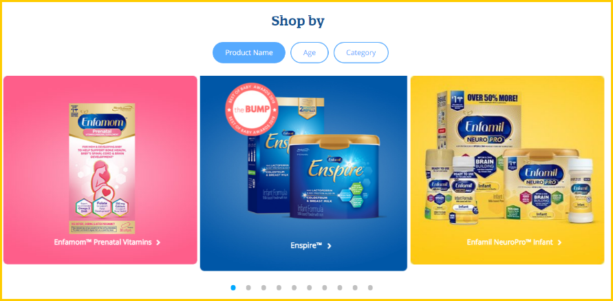
Image Credits: Conversion Wizards
When customers clicked “Shop Now” on the original version (screenshot below), they saw 39 products in a 3×13 grid, and lots of these products appear quite similar. This taxes the prospective customer.

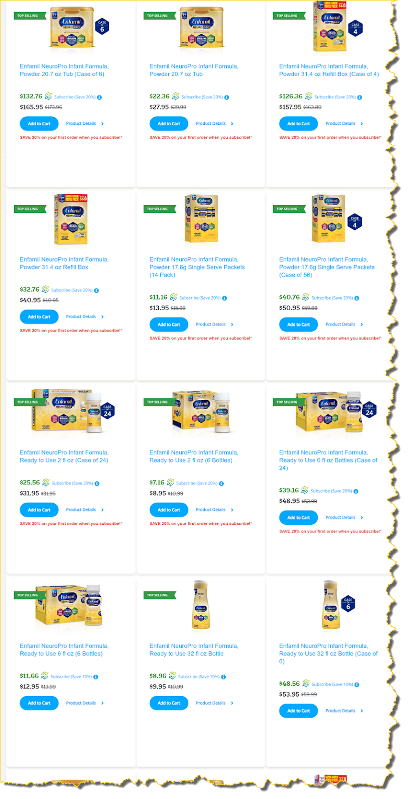
Image Credits: Conversion Wizards
Collapsing the FAQ section
One efficient way to avoid information overload, and the unnecessary friction created by needless page length, is to collapse Frequently Asked Questions.

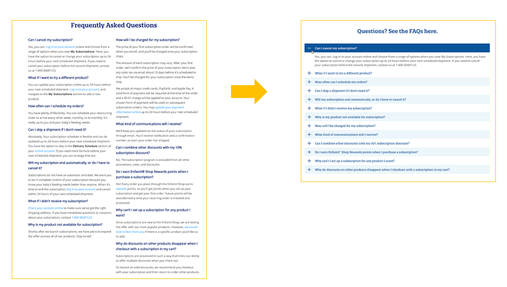
Collapsing the FAQ section helps reduce information overload. Image Credits: Conversion Wizards
Adding social proof
We added various forms of social proof, like the brand’s 500,000+ Facebook likes, 3,000+ subscribers and customer testimonials.

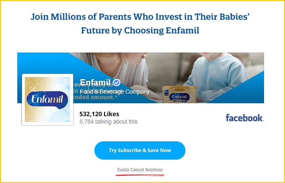
Facebook likes. Image Credits: Conversion Wizards

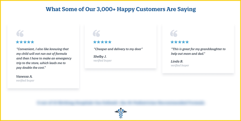
Subscriber testimonials. Image Credits: Conversion Wizards
Including a low price and happiness guarantee
We also included a low price and happiness guarantee because the survey showed that many customers thought the products would be cheaper at Walmart or Amazon.

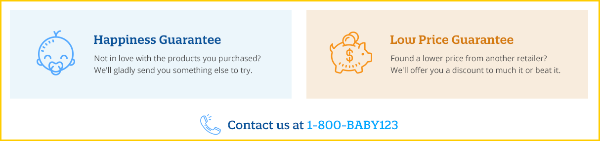
Image Credits: Conversion Wizards
Eliminating the confusion and “click rage” generated by the original screenshots
By using heat maps and video recordings, we could tell that lots of visitors were clicking on the original screenshot expecting to transact. So we displayed the screenshot within a device (on the right, below), and no one clicks the screenshots anymore.

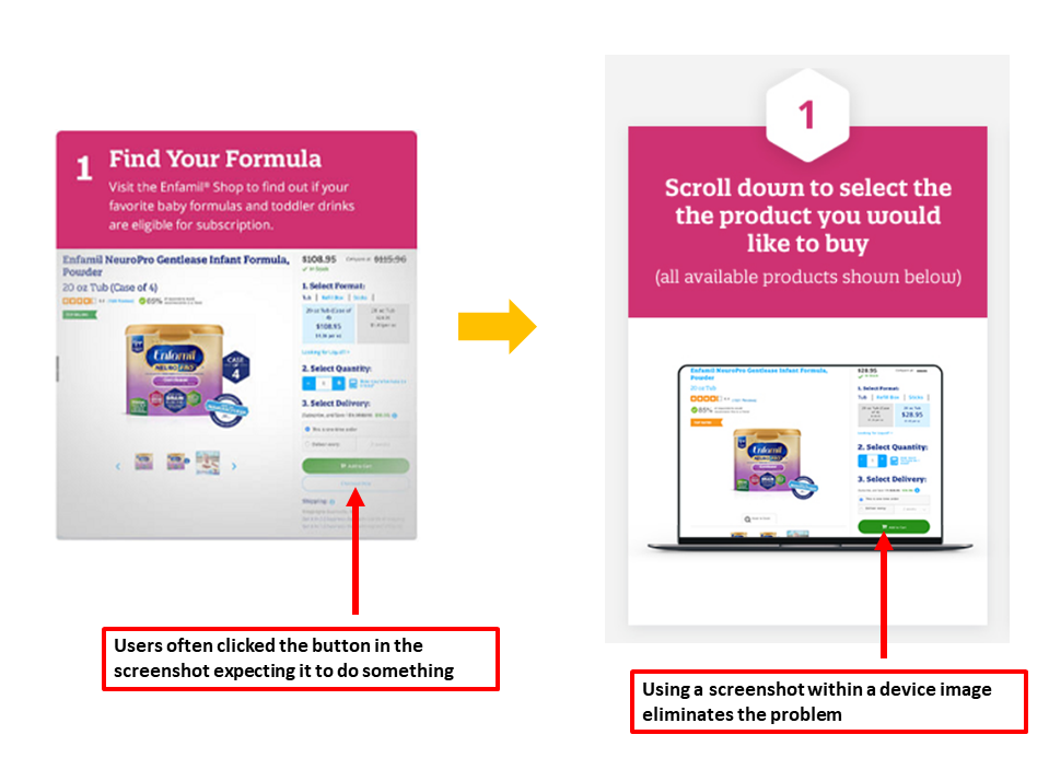
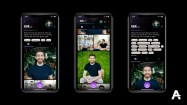
Fixing the UI to eliminate user confusion. Image Credits: Conversion Wizards
Radical redesign over single-element tests
Although we don’t know how much each individual element contributed to increased sales or if certain changes even harmed conversion, overall, the winning treatment raised orders by 75%.
Radical redesigns that incorporate a large number of variables (instead of single-element tests) are more likely to provide substantial gains. Another advantage to doing this is it requires much less time and traffic for your tests to reach statistical significance.
As all CRO practitioners know, an inconclusive test that yields no lessons is a major waste of time and resources, and often makes teams question the value of CRO.