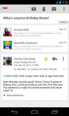
Google’s Gmail application for Android is being updated today with a new design which will bring Google’s now preferred “card style” user interface to the Conversation View within the app. This layout, which Google popularized through its Google Now search application, has become the new go-to design paradigm at Google, arriving across other Google products and services, including Google Drive, the new Google Wallet apps, Maps, Google+ and elsewhere.
It mimics the idea of using index cards, and fits somewhere between minimalism and skeuomorphism, as Fast Company’s recent deep dive into Google’s design process explained.
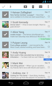 In Gmail, cards will be used to better highlight multi-person, threaded messages in the app’s “Conversation view,” allowing for a “new, cleaner design,” states the company in a post on Google+ this afternoon.
In addition, the app will include other design tweaks, like checkmarks for multiple message selection which makes it easier to see which emails you’re about to move, delete or archive en masse. And the app will alert you in your inbox if account sync is turned off for some reason, to help keep you from missing messages.
Though some users are already seeing an app update in Google Play, not everyone is seeing the updated design just yet. The rollout is a staged one, so your mileage may vary, as they say.
News of the updated Gmail app comes on the heels of some serious issues which affected Gmail’s delivery times for an entire day on Monday. Even now, it seems the damage to the Gmail brand continues – many people have called me today, for example, saying, “oh, I thought I’d dial you since I just don’t trust Gmail right now.” That may be why now is a time for a little good news from Gmail… well, good news if you actually like the card-style layout, that is.