Google uses its card-style layout across the majority of its mobile apps, but until now, the Google Drive app for iOS had lagged behind. Today, however, Google is launching a new version of Drive for iPhone and iPad that brings this new design to the app, as well as a number of smaller upgrades that make using the service on mobile a bit easier.
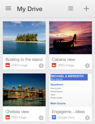
The updated app allows you to switch back and forth between the new card-style thumbnail view (which was already available in the Android app) and the usual list view. If you have a lot of files in your Drive account, you’ll appreciate that the list view now groups files a bit more intuitively and doesn’t just mix them all together.
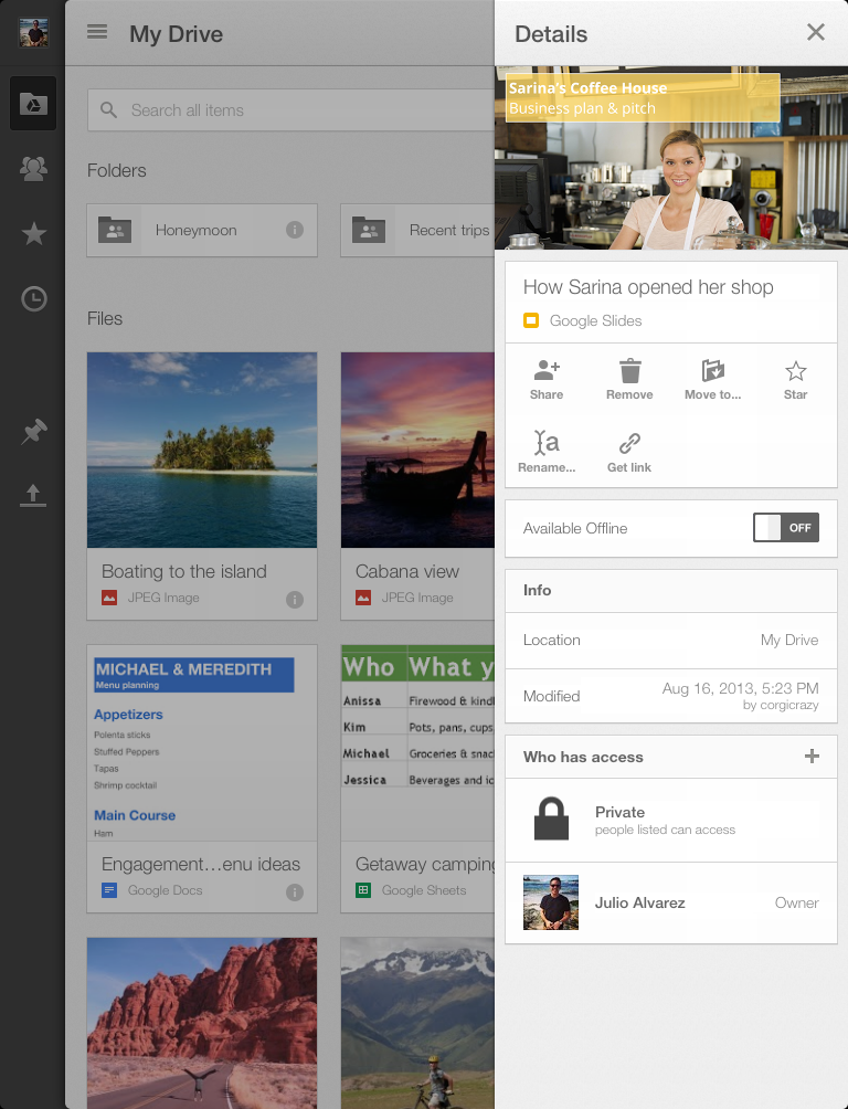
Among the smaller updates in this release are the ability to get links for any Drive file you want to share over email or in a text message (or store in a note). To get these, just open up the details pane for any given file, select “Get link” and the app automatically copies it into your clipboard.
The app, Google notes, now also puts a stronger emphasis on search, which makes sense, given that most people now store enough files in their cloud storage accounts that just browsing them becomes a hassle. Google, of course, also uses OCR and image recognition techniques to make searching through non-text files in Drive easier (something Microsoft also recently introduced for SkyDrive).