YouTube Places New Emphasis On Search With Homepage Tweaks


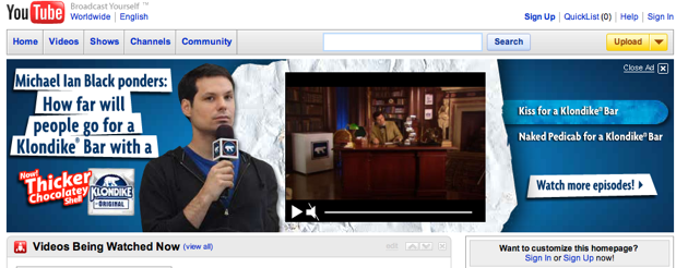
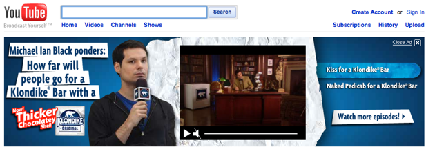
The new version has eliminated most of the clutter and color of the old design, in favor of something that’s unquestionably more Googleish. Before now, navigation buttons like “Home” and “Videos” were likely the first thing people looked at — now, there’s no question that the default action on the site is going to be search. The layout also does a better job categorizing the main features of the site: the left side is now dedicated to finding videos, the right is dedicated to uploading and managing the clips you’ve seen.
It may not sound like a huge deal, but just as very small tweaks on Google can have a major effect, a minor change to YouTube’s design may well change the way people use the site. I won’t be surprised if YouTube sees a marked boost in search queries as a result of the new masthead.
New Masthead

Old Masthead