
Twitter’s Mac app, once thought dead and gone, got an update today to bring it in line with the web and mobile apps in a few ways. The new expanded photo timeline makes an appearance, as does a new tweet detail view, refreshed profiles and an overall design bump.
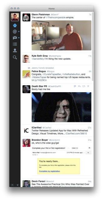
The photo timeline will be the most immediately evident change in the new Twitter for Mac, though there have been design updates throughout the app. Any photos using Twitter’s own photo sharing service will show up in large preview form, just like they do on mobile. This actually works quite a bit better on desktop than it does on mobile, as there is more screen real-estate to play with. The photos jump out at you, and do still reduce information density — but that’s probably just fine for the majority of Twitter users that likely don’t use it as a personal news ticker.
You can toggle the expanded images off in the Mac app, just as you can with the iOS app. This option does not exist on the web client.
The new Twitter for Mac also gets a refreshed icon, which was much needed as the old one was a point-of-least-resistance update of the old one.
The updated iconography continues throughout the app, with the new DM icon making an appearance as well. There’s a new profile view which displays photo headers now, too. Twitter for Mac also gains support for viewing, though not creating custom timelines. Alas, there is no support for photos in DMs, a feature Twitter just rolled out this week.
The tweet detail view now has a numerical representation of retweets and favorites, as well as a visual representation of the avatars that interacted with it. You’ll also get the conversation happening around a tweet in this new view.

The detail view is fairly information rich, which is good, but when you enter a conversation, the view presents the last tweet you clicked on as the top one, with no indicator that there might be some above it. I get that this is an attempt to place you at the point in the conversation where you’re ‘reading’, but it makes it hard to see that there is more to it, especially if you’re reading a reply sent hours after the conversation.

The web view, for instance, places it in the center of a reply stream, with size indicating that it’s the current tweet. As it stands, the convo view loads fairly slowly, and makes you scroll immediately to reveal the full discussion. As we’re on a desktop, I’d love to see all of the white space used to present you with the whole conversation at once.
There also seems to be something weird going on with the scrolling physics in Twitter for Mac. It doesn’t accelerate or coast as long as it should and it feels a bit too resistant.
Other than that, the update looks to be a nice one that continues to give users of the Mac something to be thankful for. There was plenty of reason to think that Twitter would not continue to update its native app for the Mac, and instead rely on the web version completely. That wasn’t true, thankfully, and we’re seeing Twitter continue to iterate on it — which is great. I’d hate to see them forgo the desktop completely, and today’s update looks like a pretty nice indication that they’re not doing that yet.
Image Credit: Garrett Heath