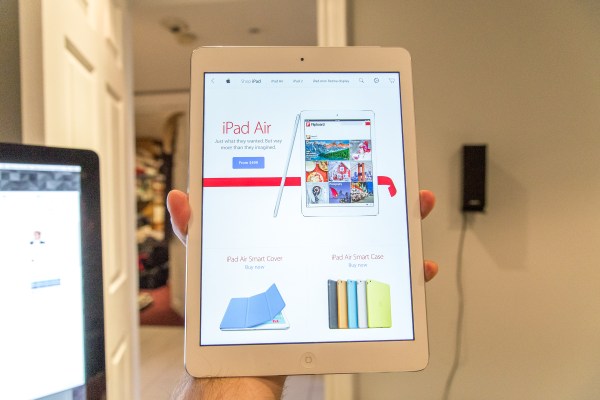
Today, Apple is launching its very first Apple Store app for iPad, bringing a gorgeous shopping experience to its tablet in a long-overdue move. The new app arrives just in time for the holidays and utilizes the display and capabilities of the iPad to present a best-in-class shopping experience.
Though Apple has had an Apple Store app for the iPhone for some time, it has long neglected the bigger devices in its iOS arsenal. The iPad version of the store has been heavily customized for the iPad and features several flourishes that I think will be replicated heavily by other shopping apps in the future. More importantly, it’s incredibly well designed, and exhibits a balanced tension between the clean lines of iOS 7 and just being ‘sparse’.
In a lot of ways, the Apple Store app for iPad is a standard-bearer for the way that native apps should look and feel under Apple’s new aesthetic.
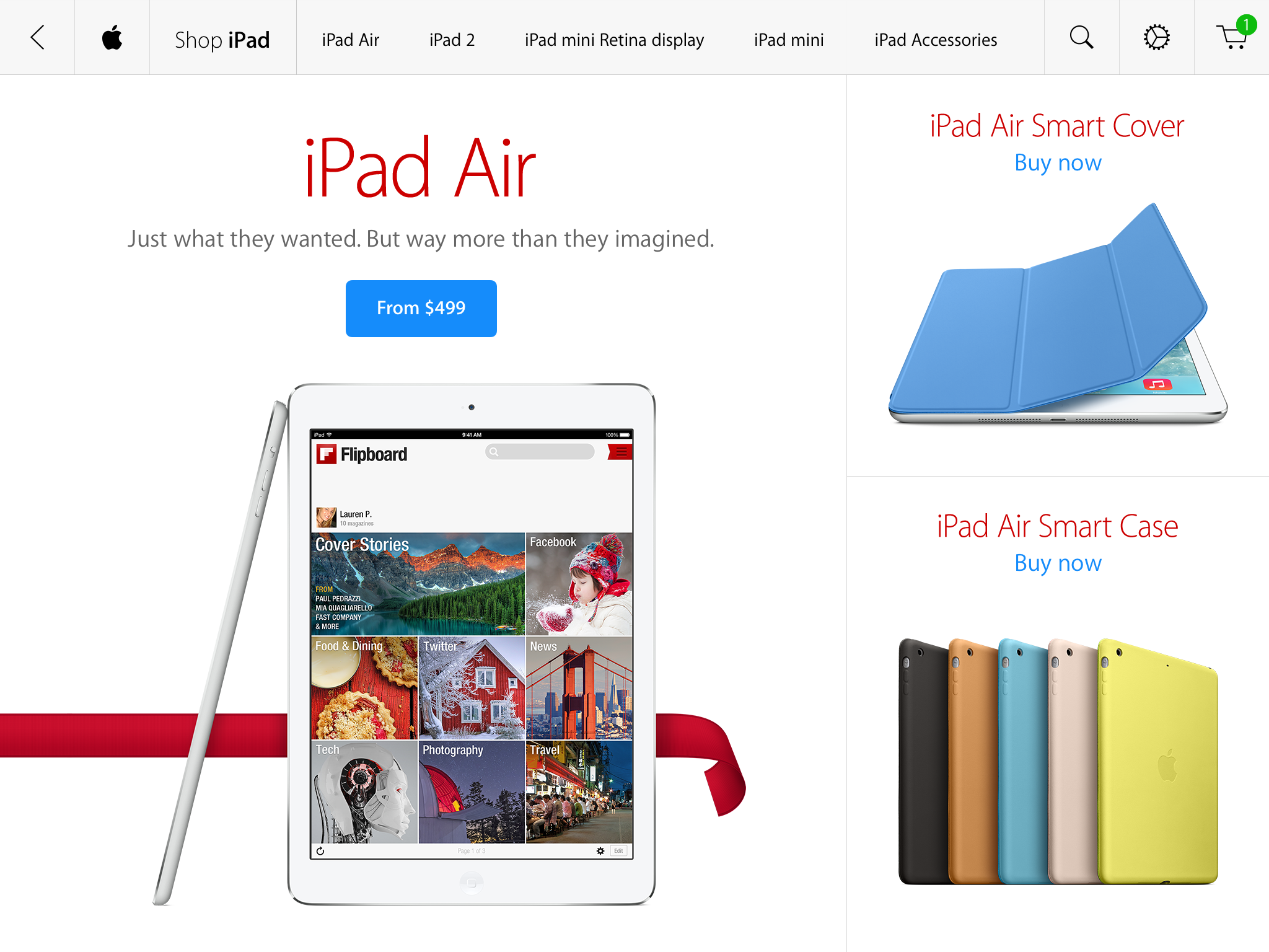
In keeping with Apple’s new iOS direction, the main stars of the App Store app are the images. They’re crisp, incredibly high resolution and all load and present beautifully. The pinch-to-zoom works well throughout, and doesn’t leave you with a blurry mess when you do. Instead, all of the products, both Apple’s and third-party accessories, are crisp and wonderfully shot. There’s good reason for that, as most of the images used throughout the app and on Apple’s website are re-shot by Apple and not ‘manufacturer supplied’.
A top menu provides a standard navigational tool wherever you are in the app. Though it moves itself out of the way as you browse, a swipe down from the top will reveal it at any point. It contains links to Mac, iPad, iPhone, iPod and Retail Store sections.
The sections for the major Apple product categories all play out fairly similarly. You tap on a category and you’re presented with a page that’s laid out in a way that’s strongly reminiscent of the Apple Store website. If you tap on an individual product like an iPad, you’re dropped right into a side-scrolling view that shows off all aspects of the product. You can then pinch to zoom to your heart’s content. Scrolling up and down gives you another replica of the Apple Store website.
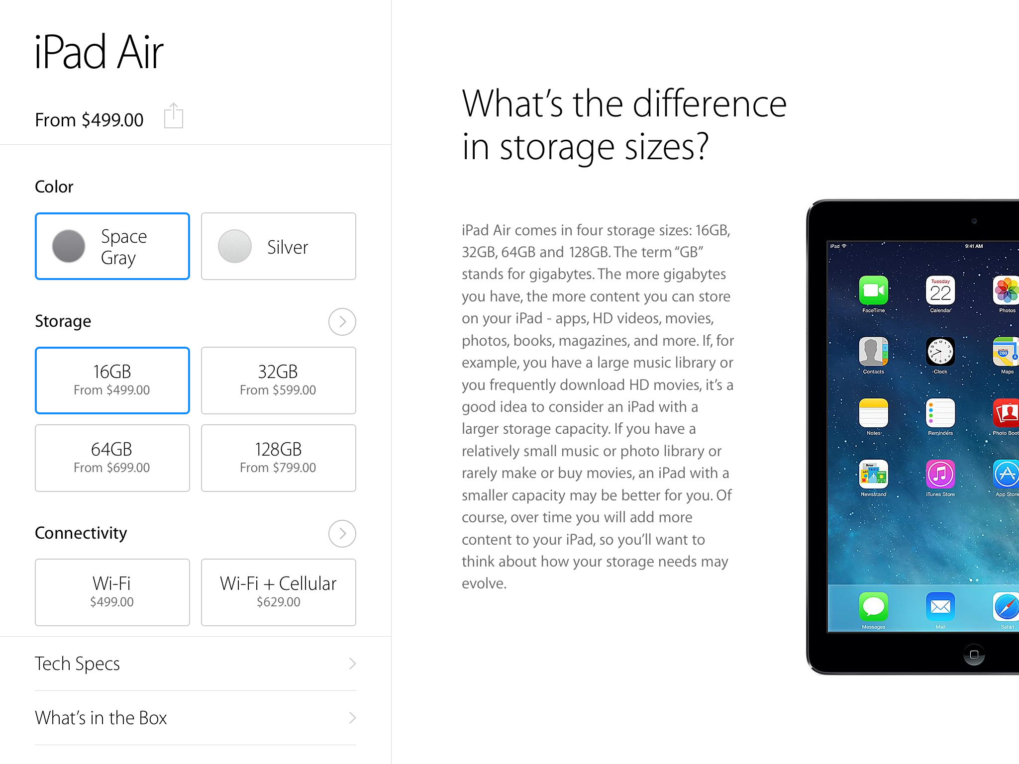
Where things start to get interesting is the way that the app handles context on the individual item purchase page. When you’re presented with an item selection screen on the iPad, for instance, you’ve got color, storage and connectivity sections, as well as specs, box contents and warranty info. If you tap on a color, you see the color options in the right-hand pane (or top pane in vertical mode). Tapping on storage gives you a contextually aware pane on the right that explains the size choice and why you might pick one over another. The same goes for WiFi or cellular options.
It’s a much better experience than the web, where you have to click and scroll around the site to figure out what all of those numbers mean. It’s not a huge thing, but when you’re in the focused environs of the app, you’re presented with the right info when you need it, with minimal fuss. Compare that to apps like Amazon or eBay, where multiple panes and taps are needed to bounce around to find the info you need and it’s a huge improvement.
One interesting choice that’s been made here is that on some screens you will see no prices at all. This makes for a far cleaner and more beautiful presentation, but does require that you tap on an item to get more information. In some screens where you’re comparing a lot of very similar items, this actually makes the presentation a lot better. Once you start drilling down into actually purchasing an item, everything starts displaying prices, ostensibly because you’re in ‘purchasing’ mode, not visual comparison mode. After you’ve chosen an iPad model, for instance, any accessories that you browse will display prices in the thumbnail view.
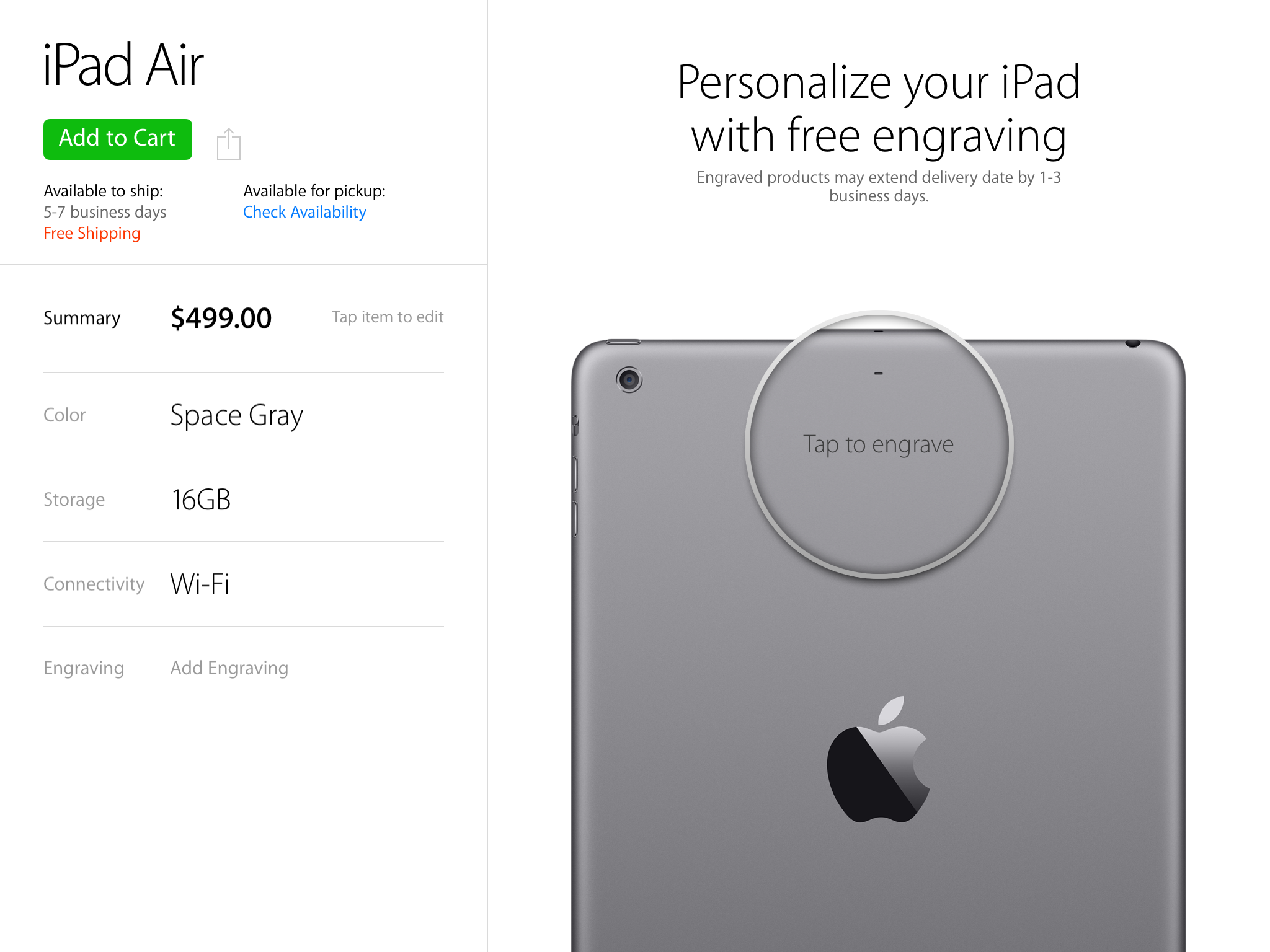
The checkout process for iPads and other engraveable items is also slick, with a simple ‘tap to engrave’ option that lets you type out your message on the keyboard.
The categories of items you can choose from in the accessories section shows off another extremely slick feature. If, for instance, you’re looking at a page full of ‘on-ear’ headphones, you can swipe one pair to flick it to the next image, and all of the images rotate in conjunction to present you with the same view. It sounds basic, but the effect is extremely impressive in practice.
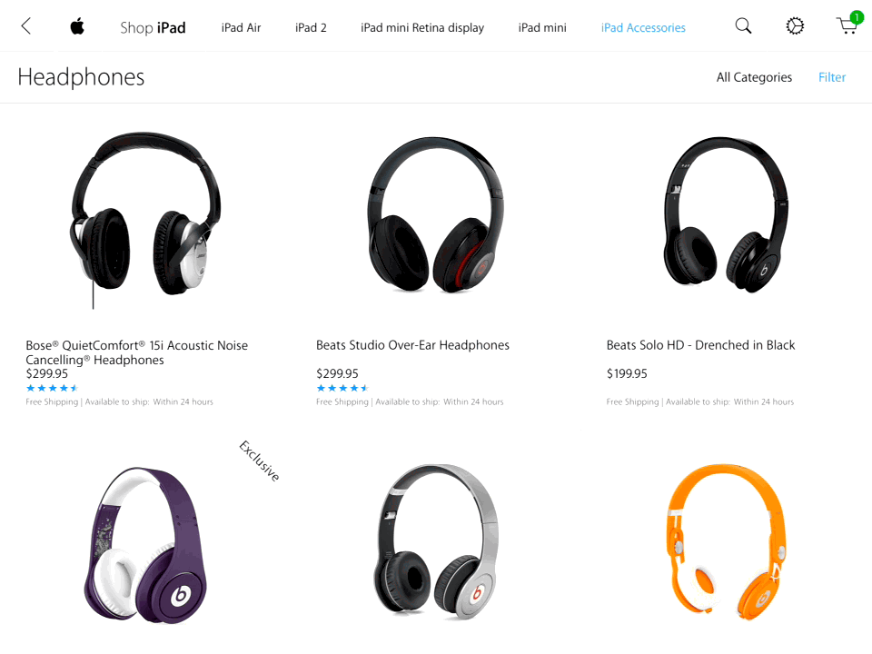
It gets even more clever when you realize you can pinch out to double the amount of items on the screen. The prices fade away and you’re left with a grid of interactive, rotate-able comparison images to pick from.
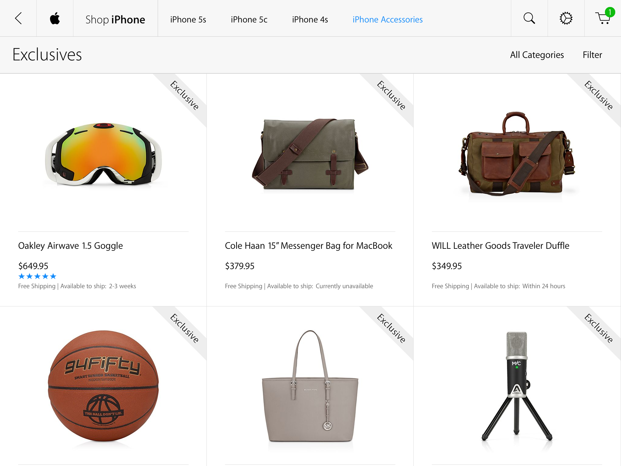
The app also features a section dedicated to exclusive items that are available only in the Apple Store.
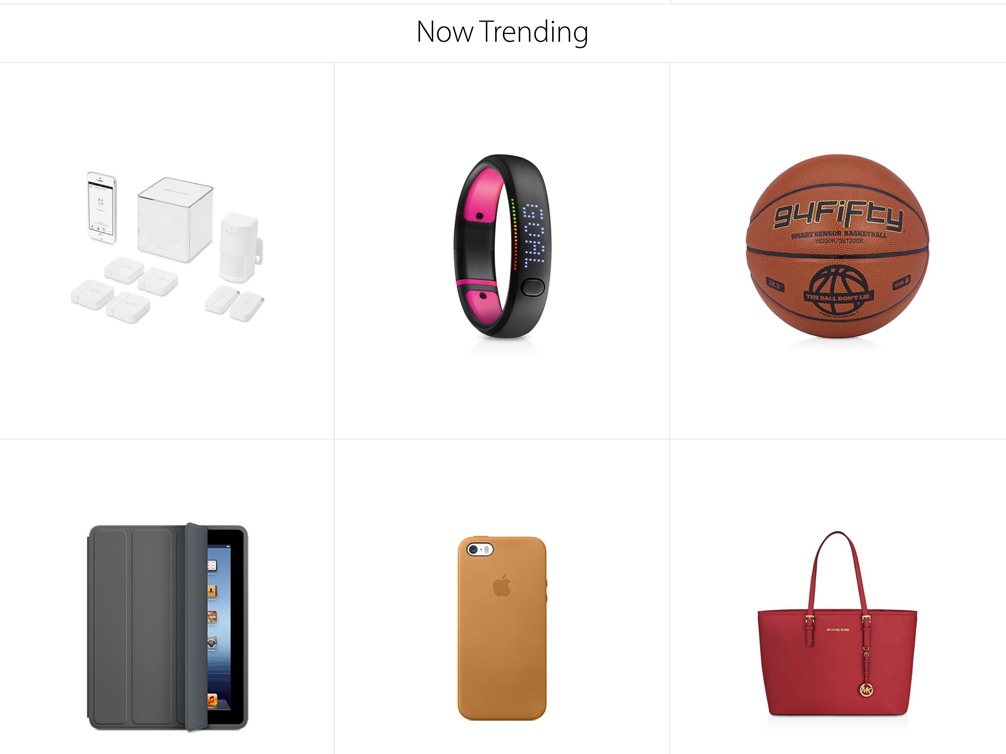
One of the most interesting features of the app, and something that is completely exclusive to the iPad Apple Store app, is a section called Now Trending on the main page. It’s a list of items that are ‘hot’ right now in the Apple Store, and it’s not human-curated. It’s not clear exactly what it’s based on but most likely a combination of what’s selling and what’s being searched for. This is a more organic look at what the most attractive items are on the store than the manually picked lists on the Apple Store site.
The Retail Store section does not feature the same ‘on site’ features as the iPhone app. It seems this is because the use case of the iPad app is significantly different. It’s for ‘home shopping’, not for bringing into the store and wandering around with. You’re much more likely to have your phone with you when you do that, so having in-store purchasing capabilities via EasyPay and other location-based features makes more sense.
You are able to locate stores by ‘closeness’ very easily, and enable pickup at any location close by right in the checkout process. In the iPhone app or on the web, you must first pick from a list of favorite locations to make sure they’re at hand before you go to the inventory check procedure. A small, but nice improvement.
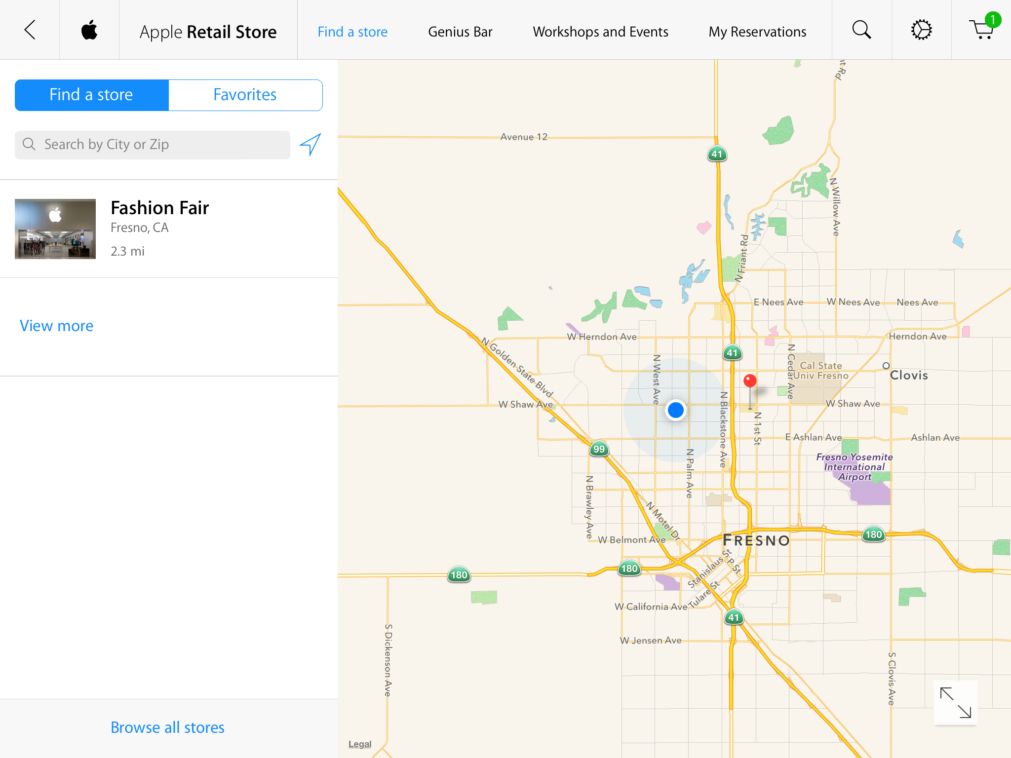
Once you’ve picked a location you can also browse the classes and other workshops that are available and pick a time to come in for them. You can make Genius Bar reservations here too, and review the reservations that are made. A login isn’t required to look at times, but, in keeping with recent changes Apple has made to prevent scalping appointments, the app does require that you use your login to book one.
Perhaps it’s the larger surface area available on the iPad, or chalk it up to lessons learned, but the text-heavy labeling and crowded headers present in many Apple apps for iOS 7 are not seen here. It feels very well done overall, and one of the most pleasant to use of Apple’s current crop of apps.
That’s a lot of words dedicated to what is essentially a storefront dedicated to the device it sells. But it’s also one of the most continuously successful storefronts in the world. Though Apple has many detractors, almost none will say that their retail operation isn’t one of the best in the world. Though the iPhone app is decent, and Apple’s website is one of the most highly trafficked of any out there, the new iPad version of the store will become the new benchmark for buying experiences.
The execution here is top notch, and retailers who are looking to craft a ‘tablet-centric’ experience for buyers (and why wouldn’t they, with 63% of tablet owners planning on using those devices for holiday shopping) would do well to examine what Apple’s pulled off here.
You can download the new Apple Store app for iPad here.