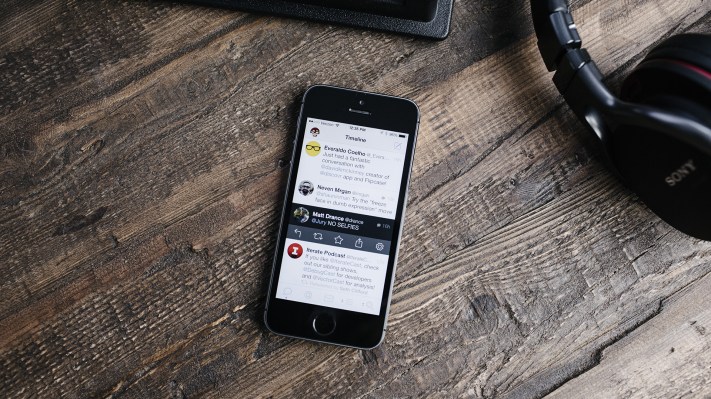
Today marks the launch of the full rewrite of Tweetbot for iOS 7. The app is a paid upgrade, which is available for $2.99 at launch and will go up to $4.99 after the initial sale.
As one of the most popular third-party clients available for Twitter, the app has become the poster child for what outside developers brought to the Twitter equation. And with the iOS 7 update, it’s going to set another sort of precedent by showing what you can do with a truly bones-deep re-thinking of an app with Apple’s new aesthetic in mind.
When iOS 7 was released, we saw a lot of updates come down the pipe that were little more than a re-skinning of iOS 7 apps. A nip and tuck here and there for sure, but only a few were stripped down and redone with Apple’s new indicators in mind. iOS 7 is all about physicality and far less about the illustrative pixel-perfect character of iOS 6. 
“We wanted to have a very clean and iOS 7 look to Tweetbot, with a strong focus on content. We used Physics and custom transitions to add that sense of joy that we add to our apps,” Tapbots’ Paul Haddad says of the Tweetbot 3 redesign.
That sense of joy permeates the app, with subtle animations and wonderfully redone audio cues. Everything is lighter, brighter and more readable overall. Within a couple of days of using the new app it was nearly impossible for me to look at the old version of Tweetbot for any extended period. It felt dark, static and very, very old. Part of this is the natural effect that iOS 7’s ‘shock to the system’ has had on all apps, but a lot more of it is a careful re-evaluation of what makes Tweetbot work.
Going from a very illustrative style to one that has to convey personality via subtle animations and clever uses of Apple’s new physics system is no small feat. Especially for an app as distinct as Tweetbot.
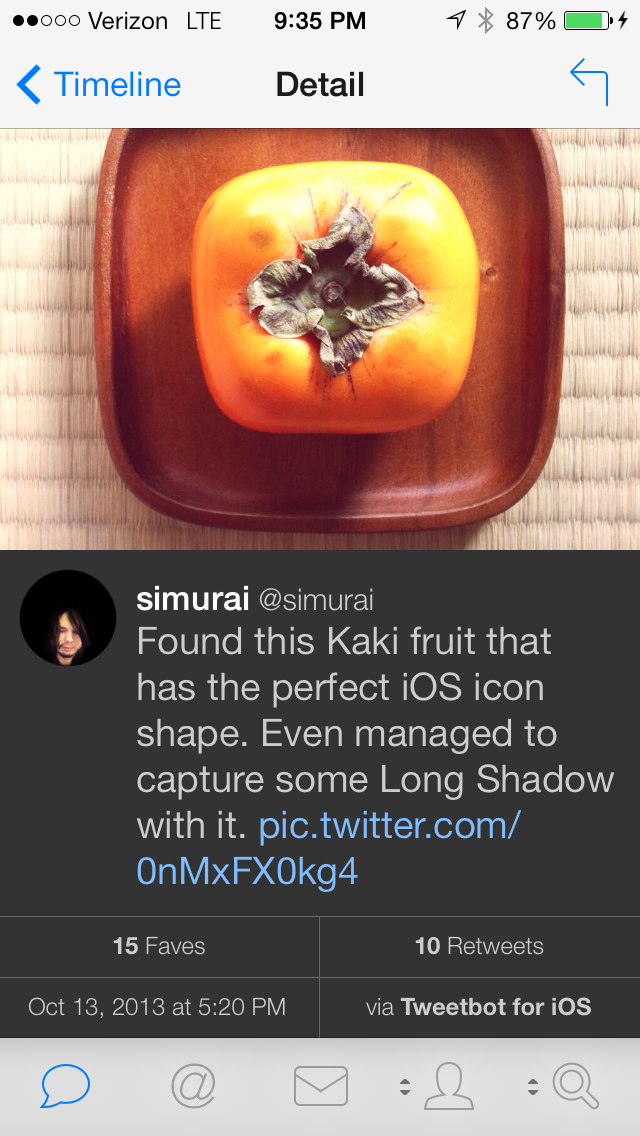
The main timeline of Tweetbot 3 has a brand-new lighter look with a white background and crisp typography. The tweets obey Apple’s system-wide font-sizing controls under Dynamic Type Size if you want to fit more on the page.
One major change that many will notice is that there is only a single directional swipe (right to left) to expand Twitter conversations now. Haddad says that this was to eliminate the confusion between the reply and conversation views. It takes some getting used to if you commonly used the replies view, but it’s less confusing over all.
Tweetbot 3 also features background tweet fetching using Apple’s new APIs. This means that you’ll see your newest tweets as soon as you open the app, a major improvement on the old “open and refresh” behavior.
Tapping on a tweet still swings down the quick-action pane and tapping-to-hold offers additional features like copying links.
The one complaint that I have with Tweetbot 3’s new interface is that once you’ve drilled down into a conversation, you must drill down one more level on another tweet in that conversation to favorite or retweet it. I’d love it if you could tap to drop the action pane as you can in the main timeline. I also wouldn’t mind a discrete font-size control within the app, separately from the system controls.
The personality of Tweetbot 3 really peeks through when you encounter animated elements though. Try tapping on a media link and you’ll get a full-screen image that can be moved around with a finger and tossed off the screen in any direction — enabled by Apple’s new dynamics engine. This isn’t a pre-programmed animation.
The app’s reliance on motion to tell its story once again makes a good argument for “video” or “animated” screenshots on the App Store. The personality of Tweetbot 3 doesn’t translate to screenshots, but it shines on actual usage. This is something that’s likely to come up with all of the best iOS 7 apps in the future.
Frosty panes of translucency are used when appropriate, like the accounts screen and profile views. It all feels crisp and futuristic — and very much like a poster child for the design aesthetics that Apple wanted developers to take away from its new direction.
The incredibly useful and feature-rich nature of Tweetbot, thankfully, has remained in full force. This is truly the preferred client of Twitter power users in every way. There’s no comparison between the utility of Tweetbot and the Twitter apps that are currently offered for iOS. We’ve heard that there is a redesign still in the works at Twitter, and that’s good because as it is, there’s simply no reason for heavy tweeters to use those apps over Tweetbot.

One major, very subversive feature of Tweetbot 3 is the way that it prominently displays Twitter’s Verified check mark. There’s something about seeing the blue badge right in the timeline that makes verification a bigger deal than Twitter ever has. Those avatars jump out at you and the badge is even more of a status symbol now. I have this theory that Twitter is slowly working its way toward verifying all users, but until it does, the blue check is going to become insanely sought after among users of Tweetbot.
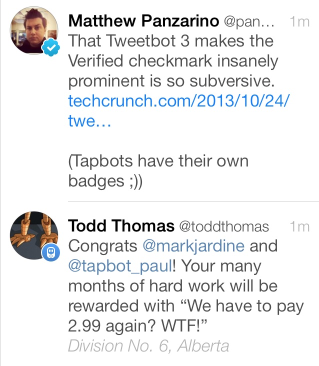
Hilariously, Tapbots Haddad and Jardine have their own custom badges.
The new Tweetbot uses the same token pool as the previous version, so users updating to the new app will not take up an additional slot. But that pool remains just as limited as it was when Twitter instituted its new caps on user tokens, so there is a limited amount of Tweetbot revenue still available to Tapbots. That’s why I find the plan to pay not only justifiable but relieving. I want to pay Tapbots for their hard work getting this thing in the shape that it’s in, which is fantastic. And paying for all of those months of work is the least that most of us can do for as much utility as Twitter power players get out of the app.
The app is available on the App Store today for $2.99.