You know what they say about trends: wait five years and they’ll swing back around again. With confirmation that a a gold iPhone 5s will indeed break onto the scene in September to throw a crimp into Apple’s monochromatic streak (madness! Gold rush jokes!), let’s take a look back at all those times that the company did color and did it well.
While Apple is known for a clean, pared-down aesthetic that hits the human brain’s zen center in a way that just feels intrinsically right, the company’s design history is actually quite colorful. These designs weren’t always pretty, but they were whackadoo and fun in a way that befit the exploration of that brave new world called The Internet.
Between 1976 and 1998, the Apple logo itself was a rainbow striped affair before it was discarded a year after Steve Jobs’ return in favor of today’s modern look. In 2008, Gizmodo reported that Apple was perceived as the top gay-friendly tech company in a survey of 757 gay and lesbian participants, so make of that what you will.
The multi-color logo was an update from the original logo, a decidedly antique-looking ink illustration of Isaac Newton with an apple dangling above his head. The Newton logo was a throwback — a nod to history and to hand craft — which was an interesting choice for a tech company. Although less handmade, the bitten apple logo’s rainbow gave it humanity. Because rainbows just make you feel something.
Speaking of human, let’s talk about the first generation iMac released in 1998. Utterly huggable and Jolly Rancher-hued, the computer was a solution to computers that were slow, had no networking capability, and were, as Jobs put it, “uuuuug-ly.” iMacs were about getting people on the Internet. That was exciting, and the translucent teal body was cool and futuristic to match.
“It looks like it’s from another planet, and a good planet,” Jobs said in his introduction. “A planet with better designers.”
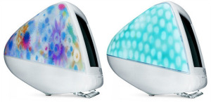
With flavors like “lime,” “tangerine,” “grape,” and “strawberry,” the iMac was meant to make you salivate just like a pack of Gushers would. Evoking every delicious snack ever was pretty genius, to be honest. That’s not to say that things didn’t get weird with the blurry color trips that were the “Blue Dalmatian” and “Flower Power” iMacs. But weird can still be awesome.
Or it can just be awkward. See 1992’s JLPGA PowerBook 170, 500 of which were released in honor of Japan’s JLPGA golf tournament. Maybe the thought of the curvy Bondi Blue iMac is clouding my vision, but the PowerBook’s primary colors and boxy shape just look… basic. Good thing they were limited edition.
Back on the pretty side of the spectrum are the colorful chrome iPod nanos and shuffles and touches and minis. The gold iPhone 5s seems to be an evolution of this design, which gave the colors a particular luminosity.
It’s probably worth noting that the gold iPod mini was unpopular enough to get itself discontinued, but the forthcoming iPhone is “champagne, not ingot,” so there’s hope yet.
Monochrome is professional. It’s cool. But as the iPod proved, balls-to-the-wall color combined with clean product design is a match made in heaven. It’s like the rainbow Apple logo: simple in outline, punchy in spirit. You can’t ignore it.