Google today launched a new responsive AdSense unit in beta that is specifically designed to run on sites that automatically adapt to different screen sizes. Now that responsive design has moved from being just a buzzword to something many web designers are actually putting into practice, being able to control how ads appear on these sites has become a more pressing issue for developers and web designers.
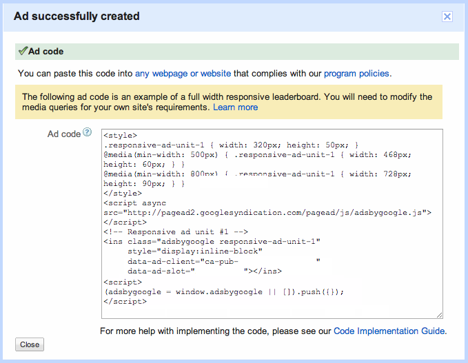
The new units use AdSense’s asynchronous ad code, and developers can use the same kind of CSS media queries they are used to from building their responsive sites to build these responsive ad units. This, Google says, means you can “now dynamically specify the size of the ad that will be served, adapting it to fit the way your site renders a page on a particular device.”
The only thing developers need to ensure is that the size of the ad unit they specify for each screen size matches one of Google’s standard ad sizes. So unlike Google’s standard ad units, you can’t just take the code, copy and paste it into your site and know that it’ll work.
As Google notes, one thing that doesn’t work yet is support for screen orientation changes after a page has been loaded. Google plans to address this in the near future, however. For now, Google also can’t provide a breakdown by size for all the ads served by a responsive unit in its analytics tools. That, too, is something the company plans to introduce later.
Given that CSS media queries only work on modern browsers, developers still have to ensure that they set a default ad size, too. Otherwise, users who are still using Internet Explorer 7 or lower may never see an ad on these responsive sites.