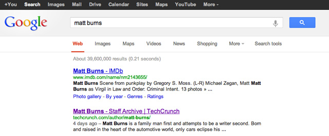
Google is going vertical. In the latest revision of its search page, Google moved the search tools from the sidebar to several drop down menus under the search field. This is just the latest of several notable changes to Google’s core function that also included adding a fully functional scientific calculator to the search page and enabling a handwriting mode in mobile search.
This new version is slowly rolling out to users. TechCrunch was first tipped about the layout this morning and I just spied it on my computer a few minutes ago. I’m honestly torn over the new design.
On one hand I love the vertical layout. My mind never fully embraced the search tools being located on a sidebar. Now, with the tools positioned directly under the search field, I find it’s a bit more natural to change the parameters of the search. But at the same time, it feels very repetitive to have the category bar located a few lines under the black Google product bar. Plus, there is an awful amount of whitespace flanking either side of the search results; I hate whitespace (yes, I hate our site design).
Either way the new layout feels fresh, new and a bit more efficient. Change is always hard, but I feel this new layout will help me search faster — even if that means I can Google myself just a quarter second faster.
Update: Google reached out to TechCrunch to clarify that this new layout is only in testing and all users might not see it.