Your Powerpoint pitchdeck is so boring. So. Freaking. Boring. Although tech bloggers aren’t sent startup’s actual pitchdecks as often as investors are (thankfully), we’re still walked through them on dreadful, “let me read to you from my Powerpoint” phone calls more often than should be socially acceptable. That’s why when image aggregator Piccsy, which is simultaneously a competitor to Pinterest as well as a top 20 content source for the site, pinged us to take a look at its pitch deck, we were pleasantly surprised. A pitchdeck that’s actually fun to read? Can such a thing exist?
Piccsy.com/investors hosts the company’s public pitchdeck, and it’s a striking, visual representation of the data that would be typically found in bullet-pointed slideshows. The format leads you to wander through content and explore, much like Piccsy itself does. CEO Daniel Eckler admits that he doesn’t even know how to use Powerpoint. “I’ve only ever opened the program once or twice in my life,” he says. But it wasn’t just lack of know-how that led the company to ditch the idea of the traditional deck. As outsiders from Toronto, they wanted to stand out, Eckler says.
“We began with a problem (how to get investors to see our deck) and came up with a solution (create something unique, beautiful, informative, and easy to share), as opposed to going with the status quo,” Eckler explains. “This is conceivably the first thing investors are going to relate to when they see a company. Lots of companies that are innovative in other areas are sticking to an old model with their deck, even though they have the resources (dev/design) to do something special.”
Plus, he adds, a generic, Powerpoint-style deck wouldn’t be right for a site that’s all about discovering beautiful imagery.
For what it’s worth, the novel deck has been working. 50,000 pageviews and 15 inbound investor requests came in over the weekend, and the site got linked on Hacker News (where discussion delved into criticisms over content, however, but not the style.) Said one commenter, “it’s a beautiful presentation. I’m jealous….I’d absolutely pay to get a site like that.”
Say, Piccsy – if that whole image aggregation thing doesn’t work out…
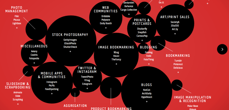
The screenshot above is just a snippet. The full site is here.
(And yes, this is probably just a nifty trick to get an investor link posted to TechCrunch, but a tip of my hat to you then. Well played, Piccsy, well played.)