There’s no question about it: Google+ genuinely looks good. But, as thousands of people have already noted and joked about, it also really does look a lot like Facebook.
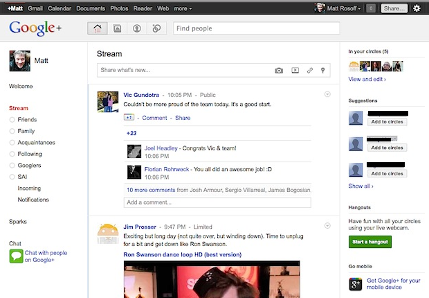
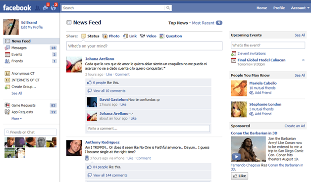
UX designer and consultant UXboy agrees, and put the two interfaces side by side to showcase just how much the entry pages of both services look alike.
Judge for yourself:
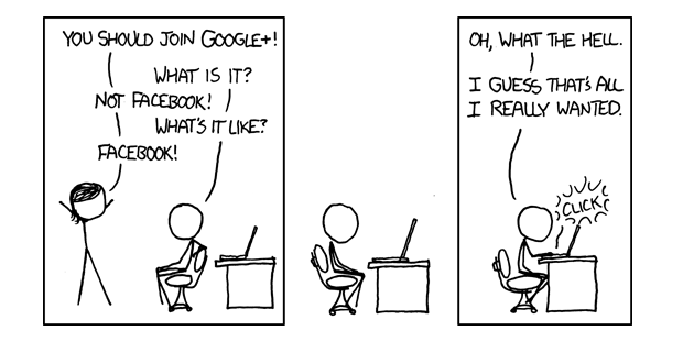
Update – from xkcd: