 When I sat down last week with Google’s Vic Gundotra and Bradley Horowitz to get a tour of Google+, the new social project they rolled out today, my immediate reaction made them extremely happy. I told them that it looks great — Circles in particular — it was almost as if it wasn’t a Google product! That made them laugh. Then Horowitz let something slip.
“It’s Andy Hertzfeld, the original Mac guy,” he said.
Aha!
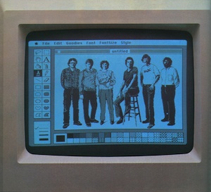
Hertzfeld, who has been working at Google since 2005, is indeed the one we can thank for the better-looking interface on Google+, as he’s the design lead on the project. You’ll likely recognize his name from his time spent at Apple (1979 – 1984) where he was a key designer for the original Macintosh software team.
Steven Levy details more about this in Hertzfeld’s new role in a great, in-depth report on the making of Google+ (which was, as we reported many months ago, codenamed “Emerald Sea”) done while researching for his new book, In The Plex:
With colorful animations, drag-and-drop magic, and whimsical interface touches, Circles looks more like a classic Apple program than the typically bland Google app. That’s no surprise since the key interface designer was legendary software artist Andy Hertzfeld.
Levy reports that with Emerald Sea (again, now Google+), Hertzfeld was given free reign to “flex his creative muscles” for the first time within Google. While traditionally, Google CEO and co-founder Larry Page has been opposed to lavish designs because he’s obsessed with product speed, he signed off on Hertzfeld’s work. “Maybe Apple’s resurgence had a little bit to do with is,” Hertzfeld tells Levy.
[image via attached]
