 Are you addicted to Twitter? Do you have an iPad? Even if the answer to both is “no” right now, after you see Twitter for iPad, those answers are going to change — quickly.
Yes, the wait is over. Launching tonight in the App Store is Twitter for iPad — the first official native iPad app from the company. We all knew it was coming (Twitter even said so a few months ago), but it has been a long wait. It was definitely worth it.
Like most people, I wander into hyperbole from time to time. But it has now been a few days since I first played with Twitter for iPad, and I still think it is hands-down the best iPad app out there. It’s that good. With all due respect to Reeder, Instapaper, Flipboard, and Pulse, this is now going to be my go-to app for just about everything related to reading news. It’s simply such a great experience for reading tweets — and more importantly, reading the links your friends share.
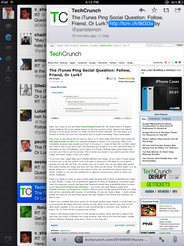
What Twitter has done is create an amazing user experience for reading information. This is thanks to an intuitive user interface that layers on top of itself. So, for example, if I click on a link in my tweet stream, I’ll have a new layer that rolls over to show that webpage in a customized browser window. If you’ve used Flipboard, it’s somewhat similar, but better because it’s much easier to go back to where ever you previously were before you clicked the link. You simply swipe something to the side to move it temporarily or swipe it again to get it off the screen (in portrait mode anyway, where there’s less space).
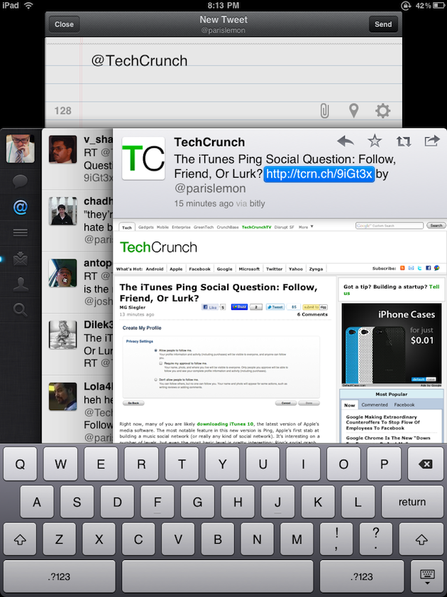
Something else that’s awesome: when you highlight a tweet by clicking on it, it’s now pinned to the top or bottom of the screen as you scroll through your stream. This is great if it’s something you want to reference. A lot of thought has been put into these type of saving state actions within this app. It’s simple to save a draft and go back to it, for example (much easier than with Twitter for iPhone). Or to reference one of these pinned tweets in your own tweet.
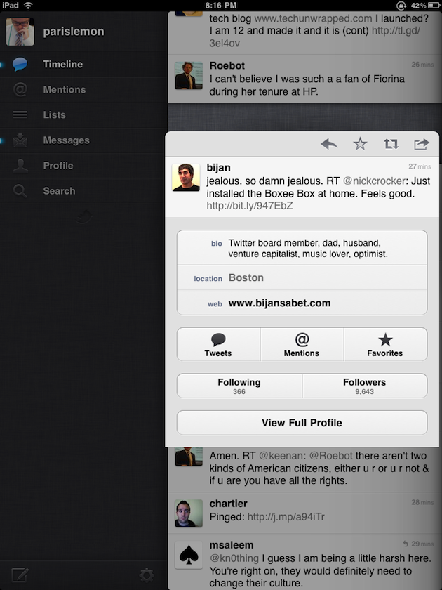
There are also some great new gestures that Twitter came up with for this app. For example, if you pinch-outward on a tweet, it will unfold to show you more information about the Twitter user. Better may be the way you can swipe down with two fingers on any tweet to see a full conversation in context. It’s the little things like this that make the app great — Apple-like, even.
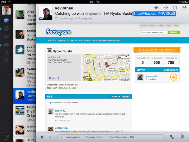
Overall, the app looks and feels quite a bit different from Twitter for iPhone (which Twitter built from Tweetie — developer Loren Brichter’s client that they acquired earlier this year). But Twitter’s Leland Rechis assures me it’s using all the same stuff on the backend. In fact, Twitter is now a universal app — meaning it’s one app that will work on both the iPhone and iPad, it will just look different depending on which device you’re using it on.
Rechis also says Twitter started experimenting with some newer things on the iPad version that haven’t yet been brought to the iPhone version, but undoubtedly will. A great example here is that when you click through to a user’s profile page, you’ll see at the bottom a list of users similar to that user that you may like to follow.
Rechis also notes the importance of the logged-out view — something Twitter worked on before the iPhone version launch. Twitter wants to make the service as useful as possible to people even if they don’t have an account. The idea, of course, is that they’ll hopefully sign up for one — and this app may give them the most reason to yet. When logged out, you’ll be able to see tweet streams based on hot topics.
“Tweets in general are not just what I’m doing, they have an incredible amount of metadata,” Rechis says speaking to why they created this layering idea for the app. Almost 25 percent of all tweets now have a link in them, he says. This app is perfect for those tweets, and content consumption and exploration in general.
Rechis notes that one of his favorite things about tablets is how they eliminate window management. At the same time, you need some way to manage all this information. He notes that Brichter’s original concept was stacks of sheets of paper that you quickly shuffle through. Other members of Twitter including Rechis refined that idea and the end result is Twitter for iPad.
That’s roughly 750 words about the app — but you really just need to see it, and use it. It will definitely be my go-to way to browse Twitter from now on. It’s that good.
Look for it in the App Store shortly. It will be a free download.
Update: I should note that for some of these more advanced gestures, there is a slight learning curve. That said, you can do everything without using those gestures, so it’s not a big deal — it’s just icing on the cake. And yes, Twitter is trying to come up with the best way to teach users about these new gestures.
