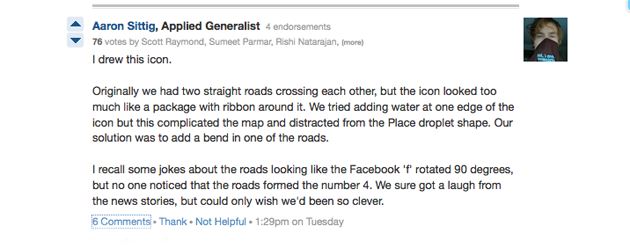
In response on to a question on Quora yesterday afternoon about why the Facebook Places logo looks like it contains a “four” in a “square,” Facebook Design Strategy lead Aaron Sittig confirms our belief that any similarities between the two logos were accidental.

“We sure got a laugh from the news stories, but could only wish we’d been so clever.”
You know what’s cool? That I seriously do post these things to get people to laugh (and think). Rumor has it that a link to TechCrunch’s “Facesquare” post has made the rounds of at least one Facebook Product Designer’s wall, along with the note “Wish we could actually say this was intentional.”
Hmmm … Wonder what that means for the folks over at Foursquare.
Update: SearchEngineLand’s Danny Sullivan and others have pointed out the logo also seems like it borrows from the Google Places pin as well. No word yet from Sittig on whether that particular appropriation was on purpose.