
What do public market investors want to see when investing in IPOs?
We put together a group of 50 of the highest-profile software IPOs (excluding outliers like Zoom during COVID) dating back to 2012. We also studied — but did not include — direct-to-consumer, internet, and fast-casual. We are happy to provide that data upon request.
The group presented here is a very strong representation of the last decade of tech IPOs. We looked for themes, trends and averages that would tell us what worked and sketch a profile of the software companies that have made it in the past.
To do so, we examined execution, performance, size, scale, margins, Rule of 40 and deal size (notional and %), which uncovered a lot of interesting conclusive data.
If a company is willing to accept the valuation the public markets ascribe, the timing is ripe. Jeremy Abelson
Key takeaway: Execution vs. estimates
The most significant finding was the impact of a company’s execution versus their estimate, also known as their “beat and raise cadence.”
Our data show a staggering correlation between stock outperformance and the magnitude of a “performance beat” versus a company’s guidance at time of its IPO. To display this, we broke the group of companies down into three distinct performance groups:
- Group 1: Wunderkind
- Never missed estimates (GAAP revenue, GM%, OM%) and beat peer averages of each metric each quarter.
- Group 2: Rock solid
- Simply never missed a quarter vs. estimates (GAAP rev, GM%, OM%)
- Group 3: Less than perfect
- Missed on a minimum of one metric, one quarter
As you see in the chart below, the impact is significant. Group 1 outperformed Group 3 by a factor of ~7x (a median of 382% vs. 53%) over the space of two and a half years. (Please see red box for median and average.)
Note: This chart contains only 36 names, as we removed any without three years of data (e.g., 2021 IPOs), as well as any direct listings.
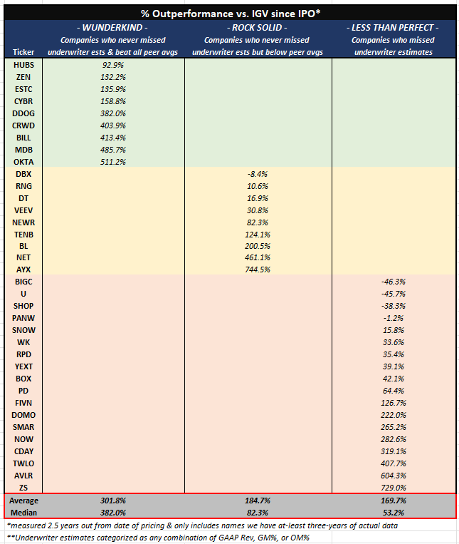
% of outperformance vs. IGV since IPO. Image Credits: Irving Investors
The data should be relevant to management teams that are currently thinking about setting underwriter estimates, which trickles down to IPO pricing and projected fair value of a company/stock.
The raw data
This chart includes the 50 relevant software IPOs we studied and how each company performed for three years versus projections given at time of their IPO across four very important metrics (our favorite being Rule of 40).
The important place to focus is on the quantum. The average beat on the top line is 35% in year three!
To be blunt, it is not uncommon for us to see private companies habitually “miss” versus projections. Companies learn quickly that the private markets forgive misses while public investors heavily punish misses, especially in first quarters post-issuance (and rewards beats).
For reference: FY+0 correlates to the year before a company’s IPO, which is the last year of all actual quarterly results; FY+1 is the IPO year and also the first year with any underwriter estimates; and FY+2 is the year following the IPO and the first full year of quarterly estimates.
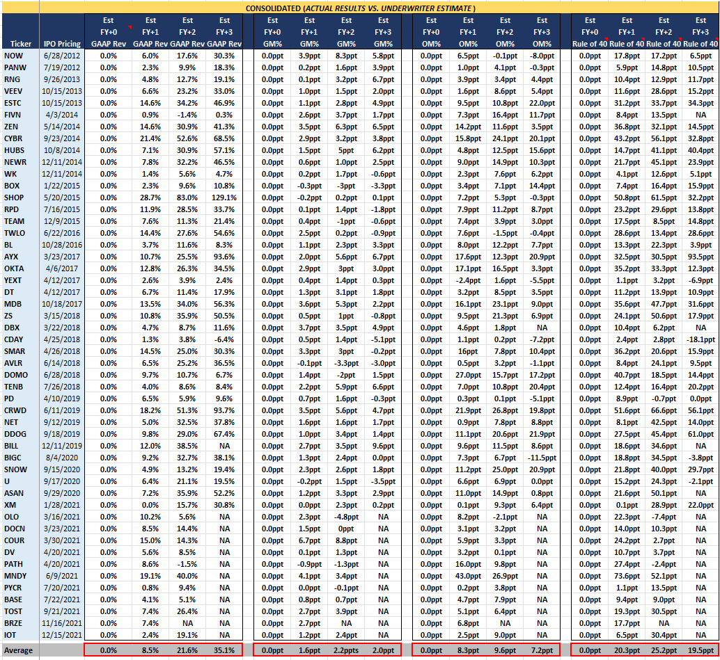
Actual results vs. underwriter estimates. Image Credits: Irving Investors
The above data shows the average software company beats FY+2 underwriter estimates for GAAP revenue by 21.6%, GM% by 2.2 ppt, OM% by 9.6 ppt, and Rule of 40 by 25.2 ppt.
Say a theoretical software company IPO’d in July 2023 and laid out underwriter estimates of:
- FY+2 (CY24E) of $500M GAAP Revenue, 70% GM%, –10% PF OM%, and a 20% Rule of 40
Using this data, we’d expect the actual CY24A results to be:
- At least $608M ($500M * 1.216) GAAP Revenue, 72.2% GM% (70% + 2.2 ppt), –0.4% PF OM% (10% — 9.6 ppt), and 45.2% Rule of 40 (20% + 25.2 ppt)
Incremental data: Size, scale and margins
Chart 1: The notional values of the aggregate dataset across (1) GAAP revs, (2) GM, (3) OM and (4) Rule of 40. This chart allows any company to answer the question: “Based on history, where do I need to be on these four metrics?”
Chart 2: A chart depicting notional size of company, size of deal and size of cash position at time of IPO.
Chart 1: Company profiles (average vs. median)
This chart lays out the following KPIs across the group of 50 software IPOs: Notional Revs, Gross Margin, Operating Margin and Rule of 40.
For a comparable to where you stand today as a potential IPO, you can use the FY+0 which equates to 2022A for a 2023 IPO (highlighted in red).
Again, we think the median is a more telling metric than the average, as it tells us that historically, companies didn’t need to have a massive transaction: They needed to have strong gross margins and be close to profitability, but most conclusively, they needed to have a strong Rule of 40. (However, in today’s market, we do think the next wave of IPOs will be rewarded for scale.)
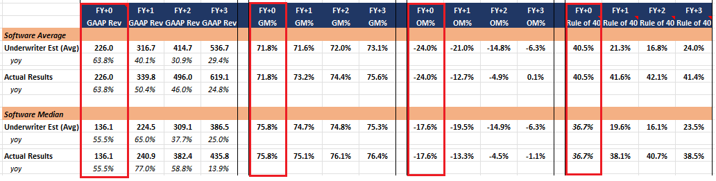
Company profiles: average vs. median. Image Credits: Irving Investors
Chart 2: Size and scale of company and deal
This chart shows the average/median size of companies, the size of their IPOs (notional and as a %), and finally, cash balance.
Looking at the median again, it reinforces the discussion around the ability of smaller companies to go public.
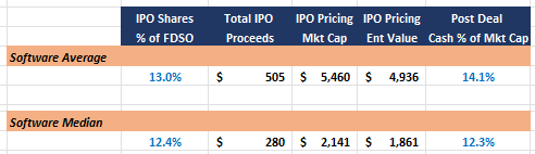
Size and scale of company and deal. Image Credits: Irving Investors
Additional takeaways
- Predictability is key.
- Establishing a highly predictable financial model is key before launching an IPO.
- Top line beats seem to be the most important metric:
- Only three out of 50 companies missed underwriter revenue estimates in the three years following an IPO, while 14 of the 50 missed GM% and nine missed PF OM% over the same period.
- Profitability is NOT a necessity.
- Only 12 of the 50 companies were PF OM% profitable the year before they IPO’ed (FY+0).
- A balanced growth profile appears to be much more of a necessity with 19 of the 50 companies having at least a >Rule of 40 and the average being very close (on a revenue growth + PF OM% basis) with DOMO being a notable outlier to the downside at a negative Rule of 100+.
- Historically, you didn’t have to be large to IPO.
- The average company in the year before IPO (FY+0) reported $226M (+64% YoY) in GAAP revenue, aided by large outliers like DBX (>$1.0B) and TOST (>$0.8B).
- The median was just $136M (+56% YoY) with some smaller names of note, including CYBR $66M (+40% YoY), HUBS $78M (50% YoY), and RPD $77M (28% YoY).
- IPOs are great branding experiences.
- Sixteen of the 50 companies actually accelerated revenue growth in the year following their IPO (FY+2), which was aided by a positive branding experience from the transaction.
Conclusion
A year ago, it was a challenge to find any of the 157 software companies in our comp table at greater than 10x FY+2 EV/Rev, but today there are 23.
Rebounding public market valuations combined with an IPO market that has shown a very strong and current appetite for new growth assets is motivating public market hopeful management teams to start considering a nearer term IPO, and for good reason.
Scarcity value is powerful: IPOs today are getting massively outsized attention and interest from the public markets, and we haven’t even broken the seal with venture-backed tech companies yet.
If a company is willing to accept the valuation the public markets ascribe, the timing is ripe.