
Fibery is a really interesting startup that’s aiming to be the single source of truth and work for product companies. The Cyprus-based company raised a $5.2 million series A recently, and I wanted to take a closer look at what makes the startup tick.
We’re always looking for more unique pitch decks to tear down, so if you want to submit your own, here’s how you can do that.
Slides in this deck
Fibery raised its round with a 15-slide deck and shared the whole thing with TechCrunch+ unedited. That’ll give us a good idea of how the company landed its $5.2 million investment.
These are the slides:
- Cover slide
- Problem slide
- Solution slide
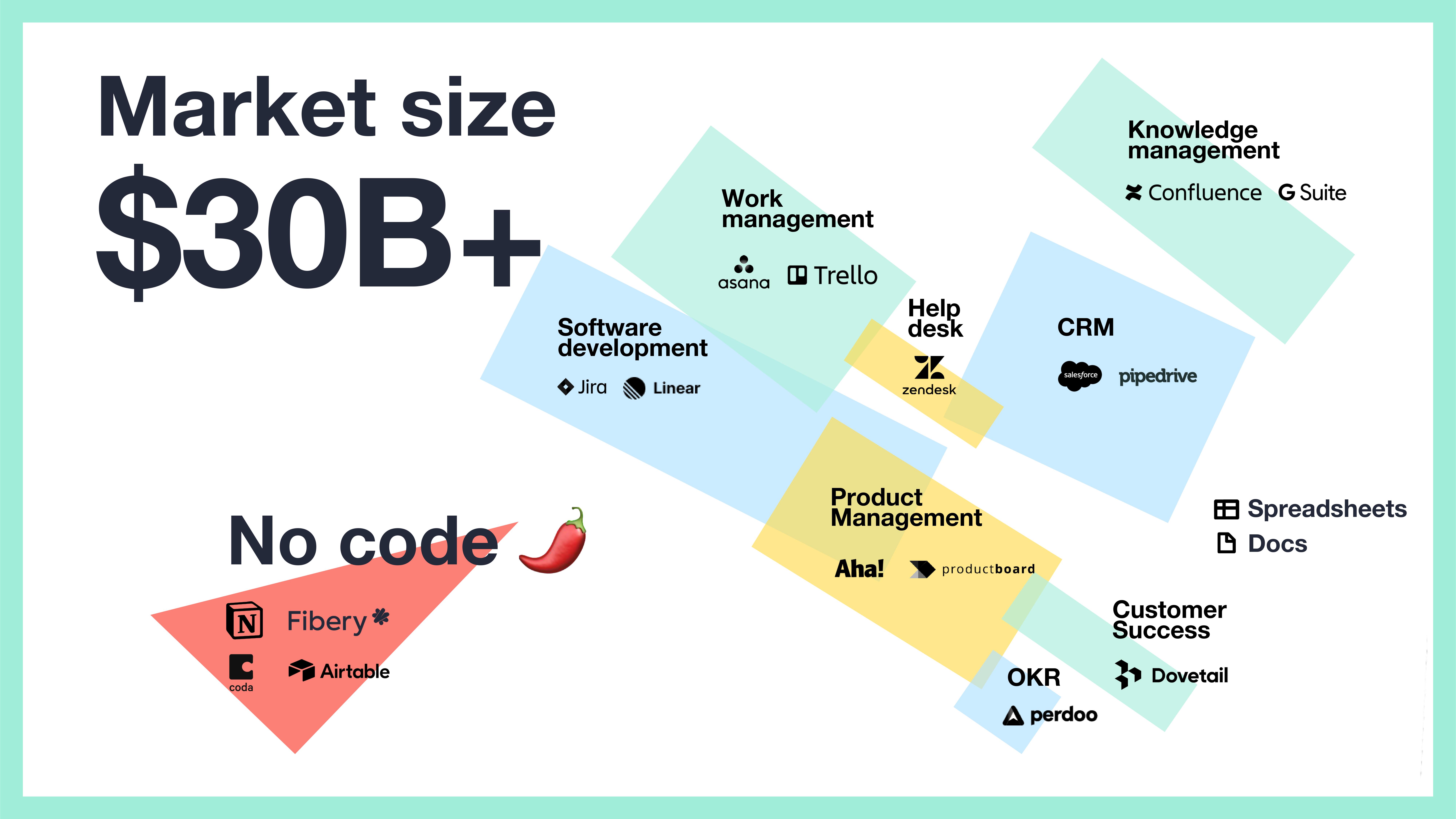
- Market-size slide
- Competitor slide
- Competitive analysis slide
- Product slide
- “Building blocks” slide
- Feedback/customer validation slide
- Go-to market strategy slide
- Business model slide
- Traction slide
- Milestones to date slide
- Team slide
- The ask slide
Four things to love
Click through the full deck and you’re treated to a lot of white space, simplicity and clarity. The company made a few unusual design choices, which really work for me, and the story hangs together well. But there are a few things that I particularly enjoyed.
A solid competitive analysis
The company has two competition slides:
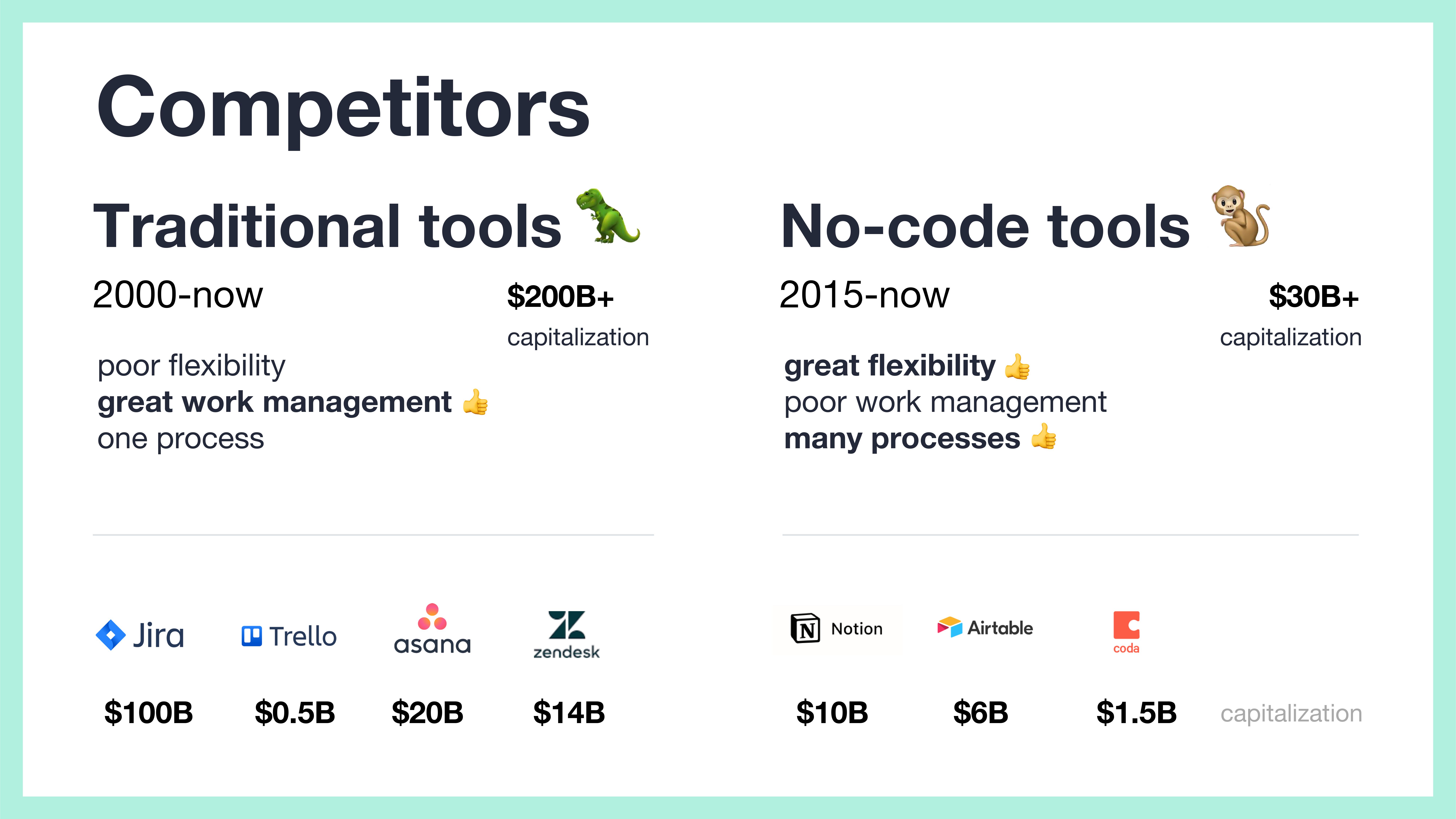
[Slide 5] Competition, part 1. Image Credits: Fibery
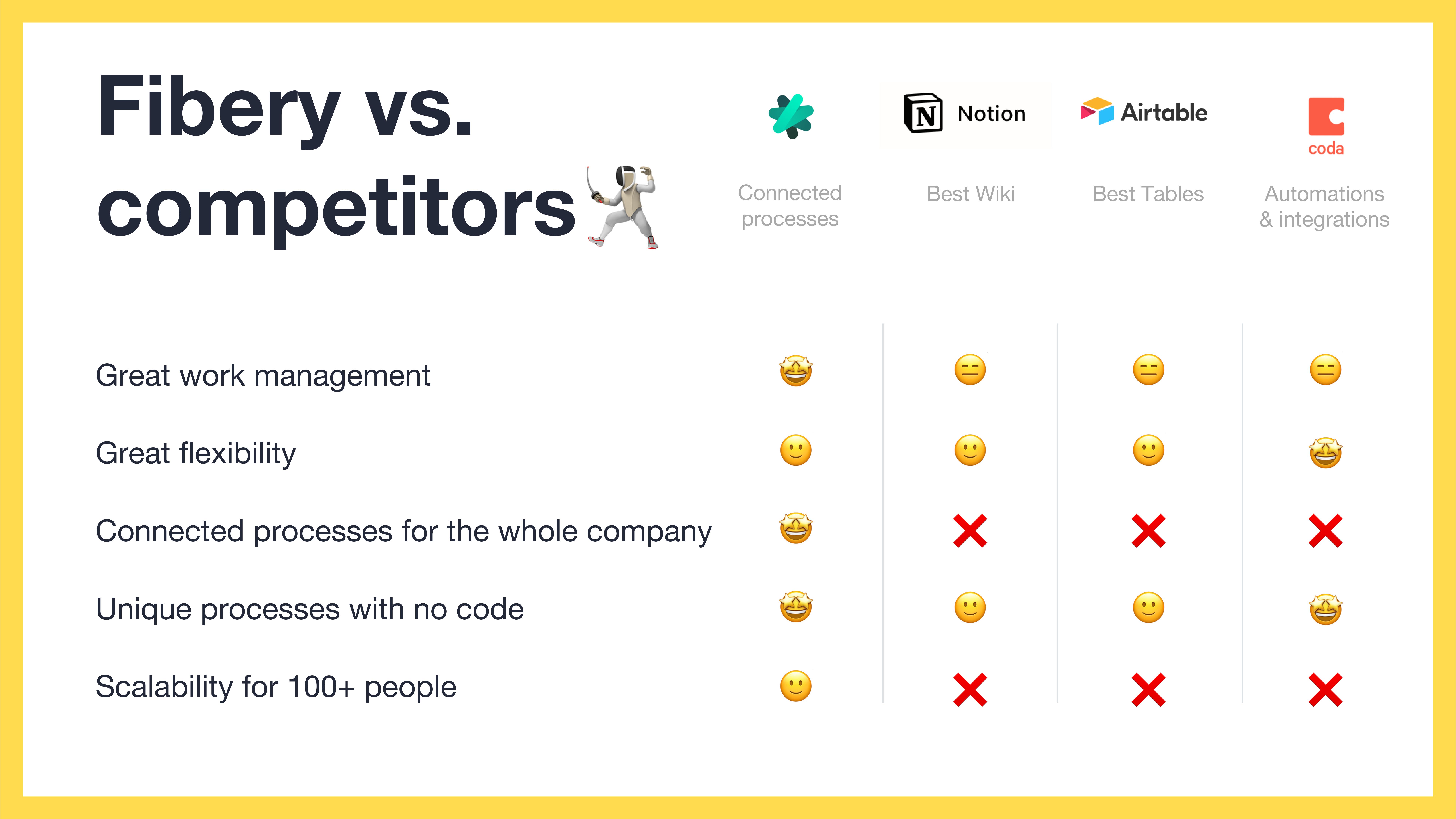
[Slide 6] Competition, part 2. Image Credits: Fibery
On slide 5, the company breaks down both the existing players in this space in a really elegant way, and shows that there’s a big market worth going after. It even manages to identify some of the strengths in its competitors, which is always a nice touch — especially if the solution does something slightly different or is able to offer an additional set of features or an approach to the problem that unlocks a broader or different customer base. Investors who might be interested in this space will know Jira, Trello, Asana and Zendesk; Fibery is shrewdly positioning itself opposite a few multibillion dollar companies. Smooth.
On slide 6, there’s a slightly deeper dive into the other no-code tools Fibery considers to be competitors. Again, the company is choosing to praise its competitors for their strengths (“Best Tables” for Airtable and “Best Wiki” for Notion).
This helps give a deeper understanding of what the company perceives is its positioning in the market.
Great business model clarity
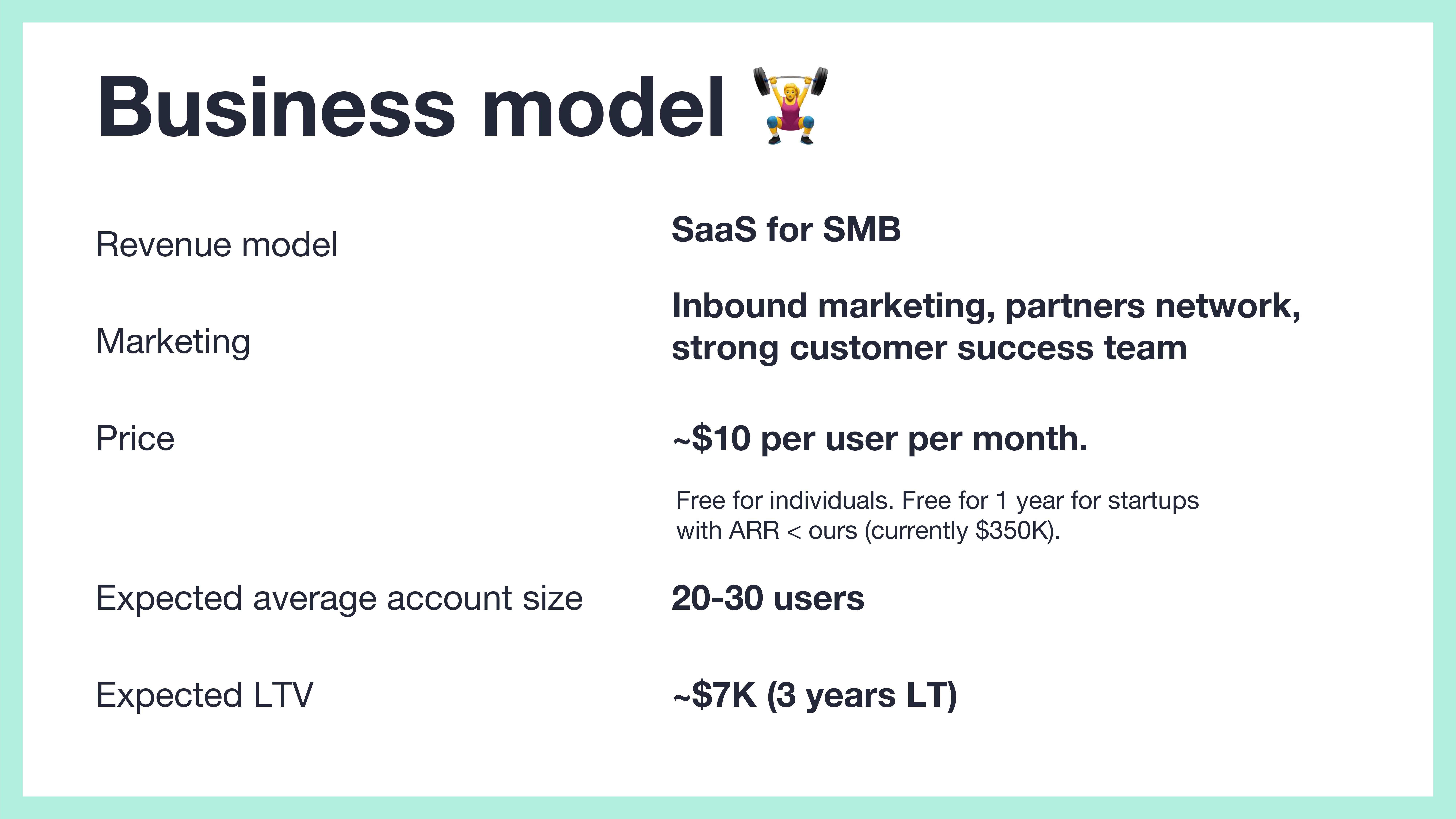
[Slide 11] Business model. Image Credits: Fibery
Inbound marketing and customer success are both great when the customers are coming to you, and “partners network” is a little fuzzy. But it’s missing the customer acquisition cost. I’ll say a bit more about this below when I talk about things that could be improved but overall it’s a solid slide.
Metrics!
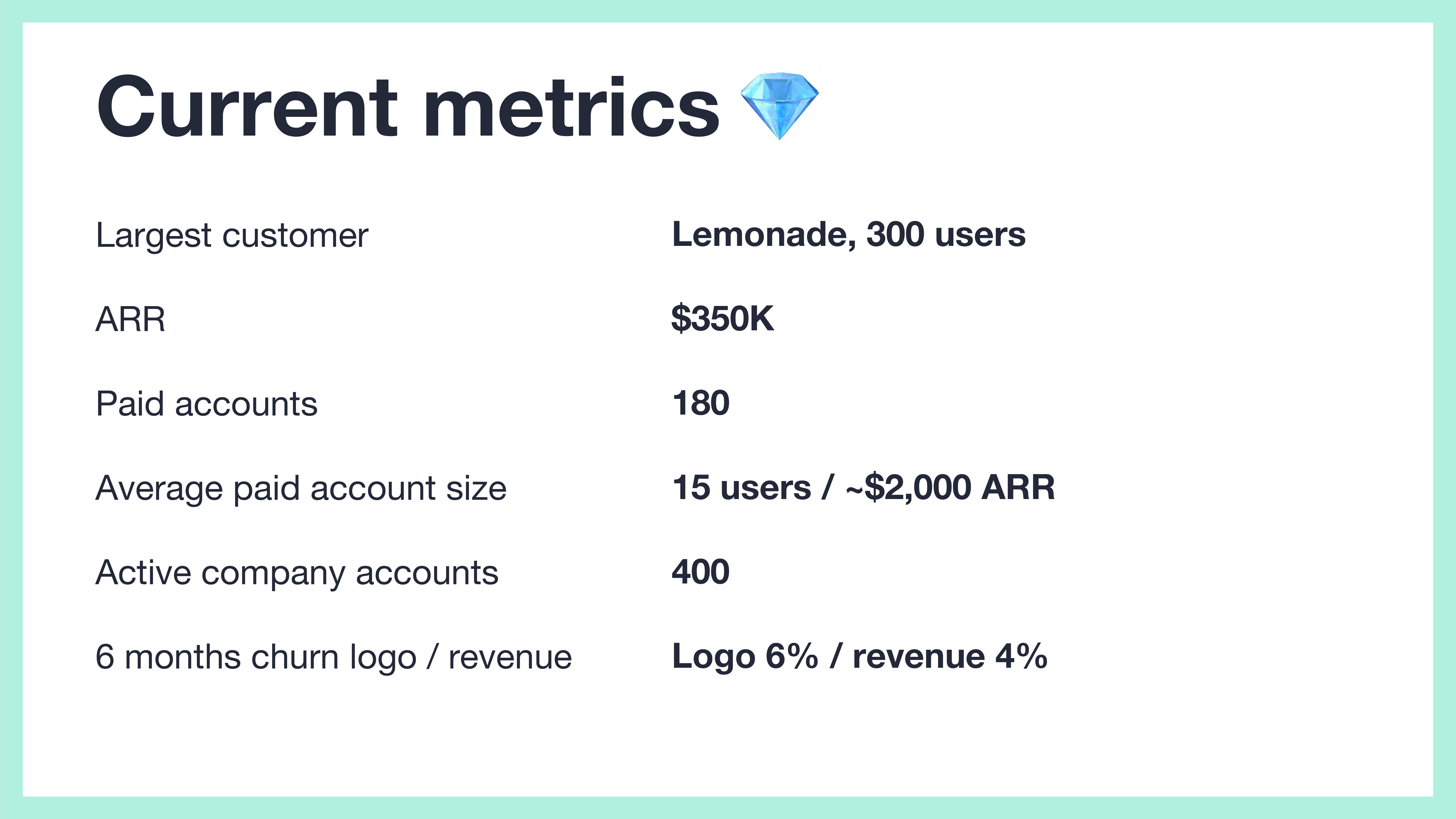
[Slide 12] Show me that traction. Image Credits: Fibery
Still, I wish Fibery had shown some of these metrics as graphs. Having $350,000 annual recurring revenue is impressive, but if it had been stagnant for the past six months, that’d ring some warning bells. Investors don’t invest in snapshots, but in trends, so you may as well show them.
The other quirk is that the numbers are inconsistent. On slide 11, it says that the expected average account size is 20-30, but on this snapshot slide, it shows that Fibery currently has 15 paid users per account. Not saying anything about how it expects to grow that number makes me suspicious.
Bonus win: Great ask slide
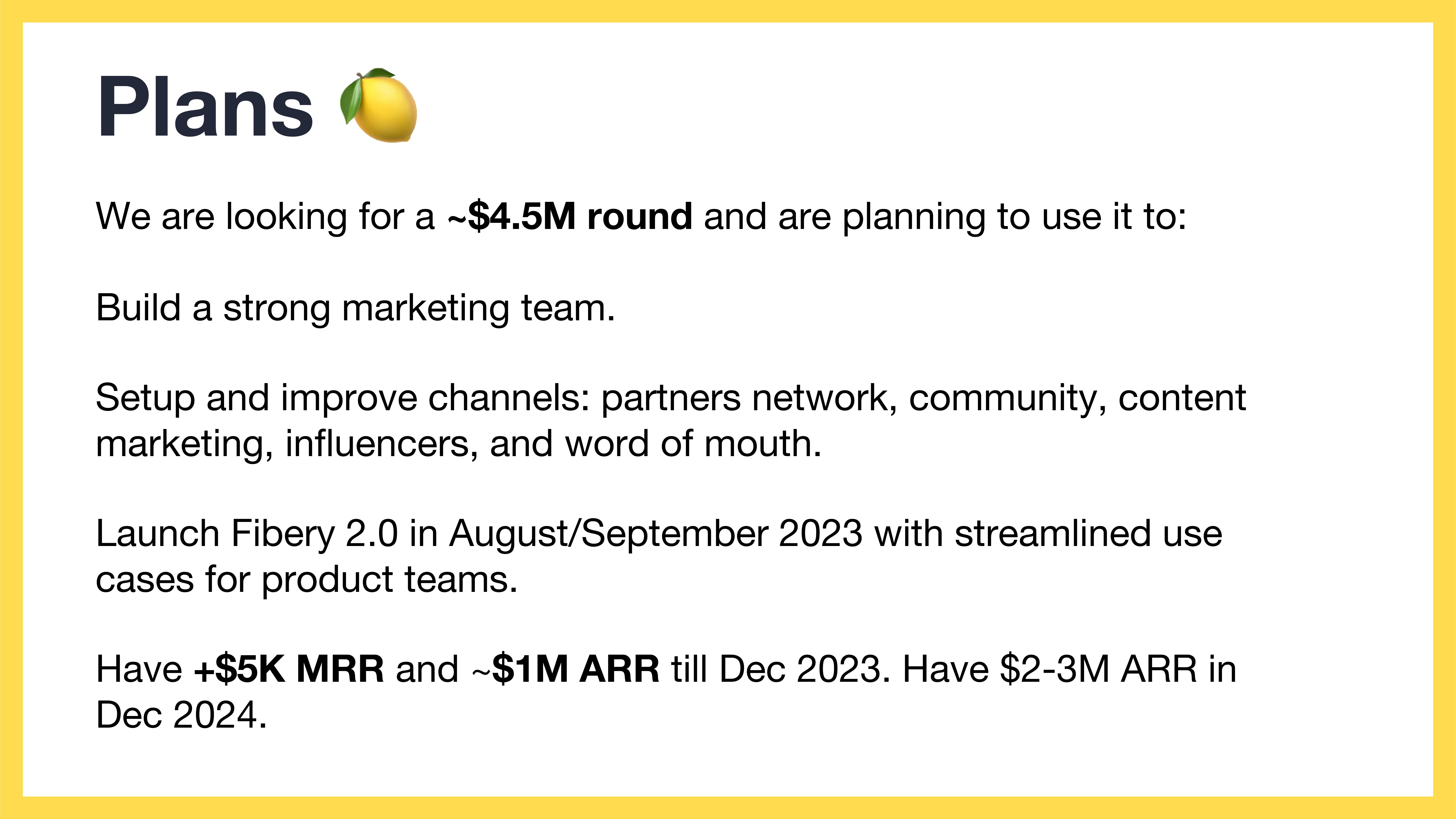
[Slide 15] Yessssss. Image Credits: Fibery
In the rest of this teardown, I’ll take a look at three things Fibery could have improved or done differently, along with its full pitch deck!
Three things that could be improved
Fibery seems a little timid: It has big and bold plans for how it will shift the space it operates in, but then fails to quite get there in the story. Be bold! Be brave! Map out your plans!
Wait, what is this‽
[Slide 4] What am I looking at here? Image Credits: Fibery
Though it can be fun and interesting to approach parts of the story in different and interesting ways, you still have to optimize for clarity. This ain’t it.
What the what‽

[Slide 7] Well that clears things up. Image Credits: Fibery
Ensure that the problem you describe on your problem slide is solved strategically on the solution slide. Then on the product slide, show the specific implementation of the problem in more detail. This slide does neither, and I’m left pretty confused.
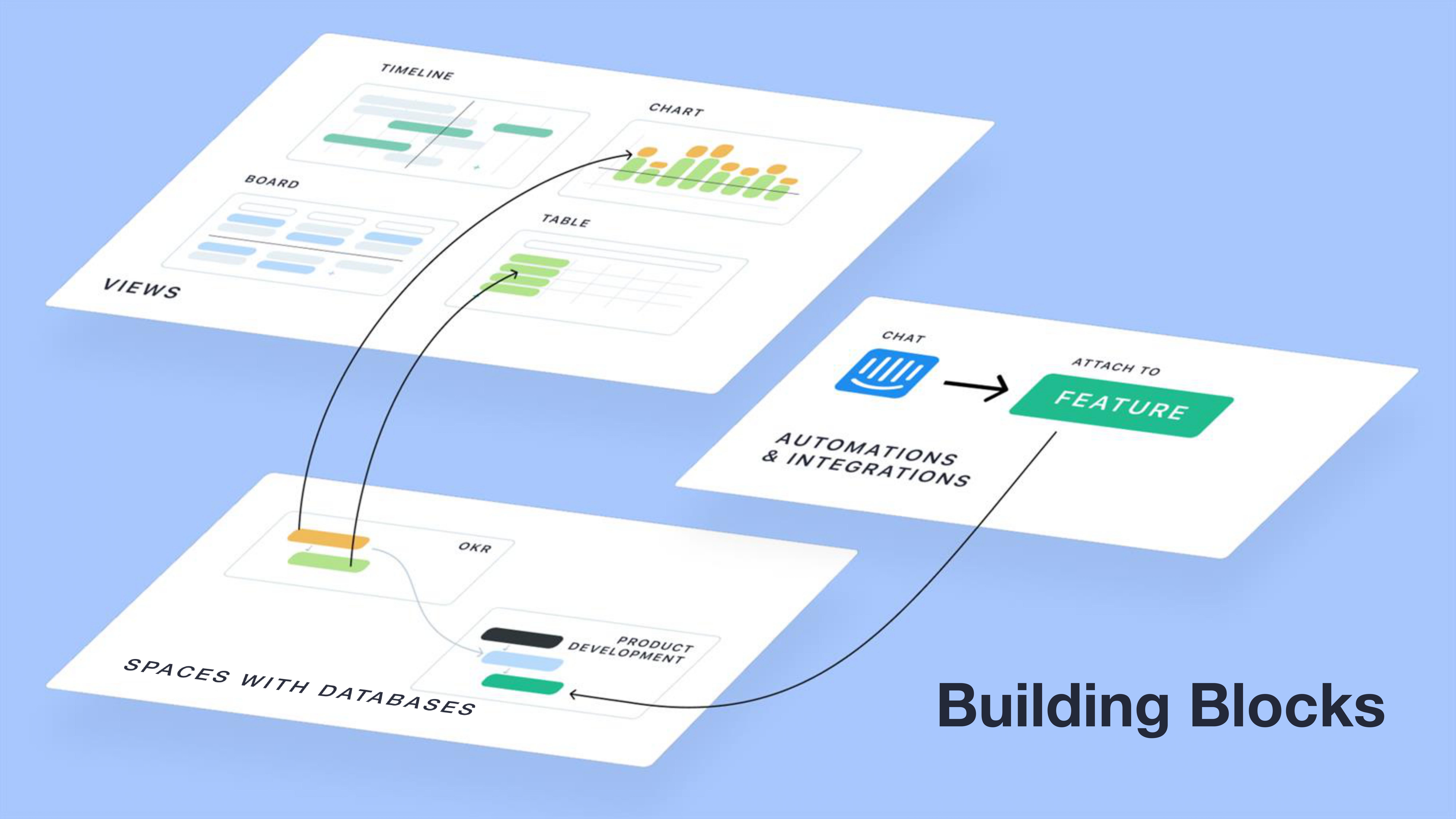
[Slide 8] Building blocks for what, though? Image Credits: Fibery
That’s not a team slide
The company stands and falls by its founding team, so it’s very important to do a good job of telling that story. This slide does not.

[Slide 14] Team-ish? Image Credits: Fibery
Claiming that there’s a strong R&D team with experience is all good and well, but you need to be able to back that claim up; usually, you do that by showing excellence in product. But as we covered above, the product slides were very confusing and unintuitive, which, in turn, makes me wonder how good this team could possibly be.
Linking to your founder’s Twitter account is a bold move, and, looking at Michael’s account, it is targeted and on-brand enough to work. A more common approach would be to link to your LinkedIn or a bio of some sort.
In any case, this slide fails to answer the most important thing about the team: Why is this team the best team to build this company?
The full pitch deck
If you want your own pitch deck teardown featured on TC+, here’s more information. Also, check out all our Pitch Deck Teardowns and other pitching advice, all collected in one handy place for you!