Demand Curve: How Zapier acquires customers via its homepage


Image Credits: zoff photo / Getty Images
Your startup’s homepage should accomplish two things well: (1) Clearly explain exactly what you offer and (2) Convert visitors into active prospects.
If visitors leave confused or your website isn’t able to convert, allocate the resources to fix it before worrying about marketing.
When building your startup’s website, start by getting inspiration from the websites of established companies in your industry. Why? Because larger companies will have the resources to test and optimize their website to convert, saving you the need to do figure it all out yourself.
This post is going to tear down the homepage of Zapier, a SaaS platform that now has millions of customers and integrates with over 3,000 apps.
This teardown covers all the key sections of Zapier’s homepage so that you can apply the conversion tactics and copywriting strategies to your startup’s homepage.
Grab attention early with these three tactics
The above-the-fold (ATF) section of a homepage is the first section users see before they begin to scroll. It’s important that you nail this section, because if it’s not compelling, the rest of your landing page won’t be read.
Zapier’s ATF section has three pieces that we’ll dive into individually: header, subheader and a call to action.

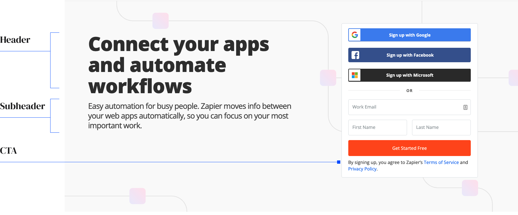
Image Credits: Demand Curve
A descriptive header with no jargon
The purpose of the header is to explain what your startup does and why it matters. It needs to be easy to understand at a glance. One of the biggest mistakes we see startups make is trying to make their header clever. Opt for clarity, not cleverness if you care about getting customers. The best headers can accomplish this in about 10 simple words.
Zapier explains what their product does in three words: “Connect your apps.” Then, they explain why it matters in two words: “Automate workflows.” The implication is that you’ll save a lot of time if you use Zapier.
Help TechCrunch find the best growth marketers for startups.
Provide a recommendation in this quick survey and we’ll share the results with everybody.
When crafting your header, start by writing at least 10 variations and share them with friends and colleagues who don’t work in your industry. Your header should be simple enough that anyone can understand what you sell. Avoid industry jargon unless it’s a primary competitive advantage.

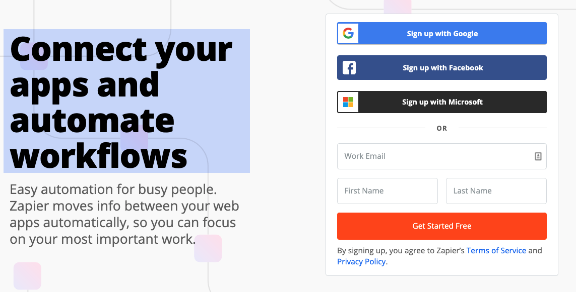
Image Credits: Demand Curve
A subheader that describes the transformation your customers go through
The header and subheader should complement each other. The header explains what you do, while the subheader explains how you do it.
The less information you ask your visitor to provide, the higher the conversion rate will be.
The subheader should add credibility to the claim made in the header by explaining how your company will accomplish the promise of the header. Explaining how it works is critical for conversion so that visitors know you have a real solution to their problems that has been thought through.
Again, avoid technical jargon in the subheader. You’re trying to pique your reader’s interest, not pitch to them.
Zapier starts their subheader off by addressing the objection that you’re too busy to bother with automation software. People generally avoid learning a new skill if it’s too time consuming or complicated. So, Zapier opens by saying it’s easy and for busy people.
You can find common objections your customers have by asking your sales team which objections come up most often on calls. Address these in your subheader to ease the reader’s mind right away.
Image Credits: Demand Curve
Zapier then elaborates on their header’s claim by explaining how their product actually works: “Zapier moves info between your web apps automatically.” They finish the subheader off by explaining how it’s beneficial to users: “focus on their most important work.”

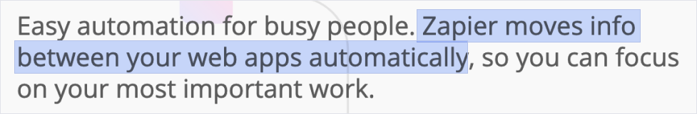
Image Credits: Demand Curve
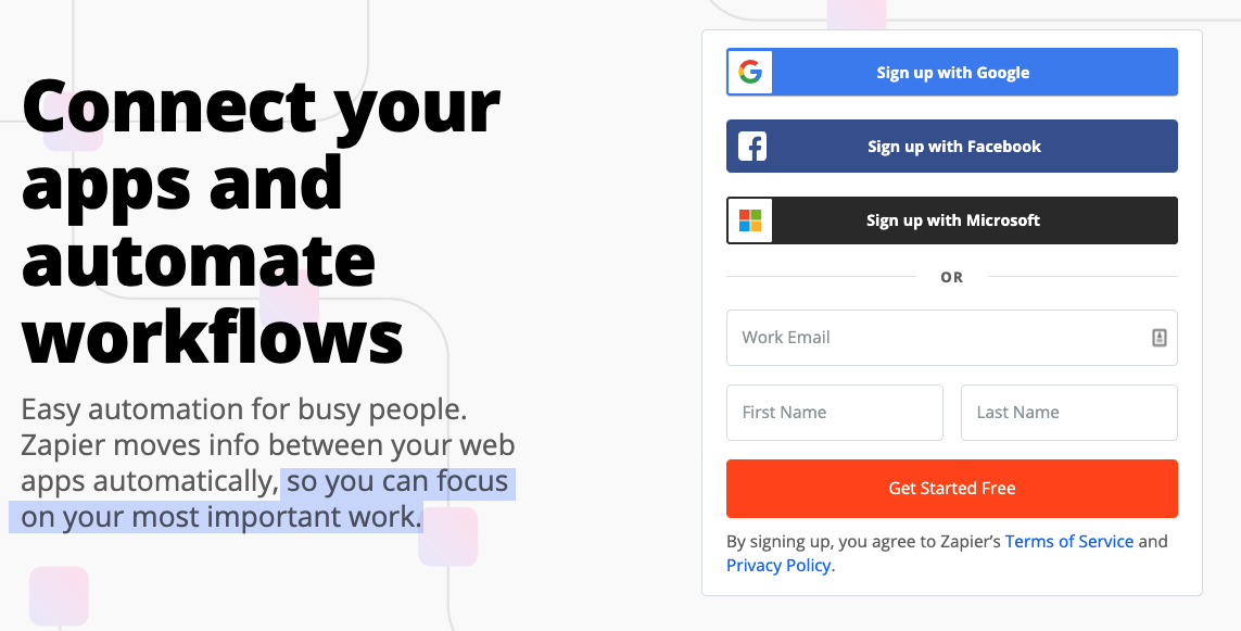
Image Credits: Demand Curve
A call to action that promises the transformation your just promised
Calls to action (CTAs) are used to capture the interest of your visitor by getting them to sign up or give you their email address. This is crucial because it will give you permission to communicate with them in the future without them needing to return to your website. You can’t convert visitors to customers without some type of call to action.
A strong CTA encourages your visitor by telling them the next step they must take to get the benefit promised in the header and explained in the subheader.
Zapier lets users sign up with one of three very common accounts. Then, they handle any objection one might have to paying before trying it out by using “Get started free” as the CTA button copy.
Zapier could reduce friction from signup by removing the first and last name prompts. You really only need an email. A data enrichment service like Clearbit can gather the rest of the user’s information from their email.
The less information you ask your visitor to provide, the higher the conversion rate will be. If you require more detailed information, consider asking for it in a follow-up communication instead of on your homepage.

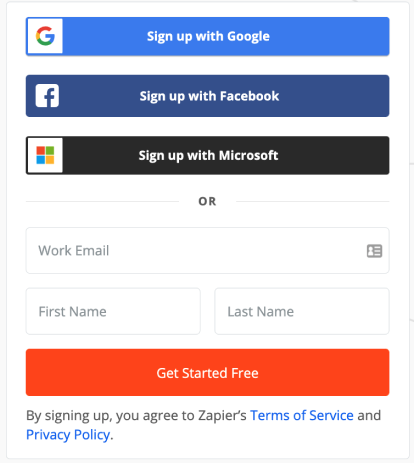
Image Credits: Demand Curve
Follow up with relevant social proof
The next section a visitor sees once they start to scroll is social proof. Social proof can come in many forms: Logo walls of companies that use your product, testimonials, case studies and even mentions of your brand on social media. As a startup, you’ll need social proof to convey your company’s credibility. People like to know that others have gone before them when trying something new.
Zapier includes social proof using very recognizable companies. They also handle objections by saying they have the ability to handle any company size: “Trusted at companies large and small.” Depending on your target customer, curate the logos you show to match the size, industry and relevancy to those visiting your site.


Image Credits: Demand Curve
List your most popular features with examples
The features section makes up the bulk of your homepage. Visitors who make it to this section will be more engaged, because they made it past the ATF. The features section should go a step deeper than your header and subheader to begin to explain why your product is uniquely valuable, and it should address concerns or objections.
First, let’s look at how Zapier uses visuals to help users understand the true value of their product. Visitors reading the ATF section might think, “Oh, Zapier allows me to connect tools I already use together. That’s cool.” But Zapier is underdelivering on their true benefit.
What Zapier didn’t show you until now is how you can trigger sequences of actions through a multitude of apps not just one-to-one. Zapier’s sequence of visuals helps visitors understand the value of their product faster.

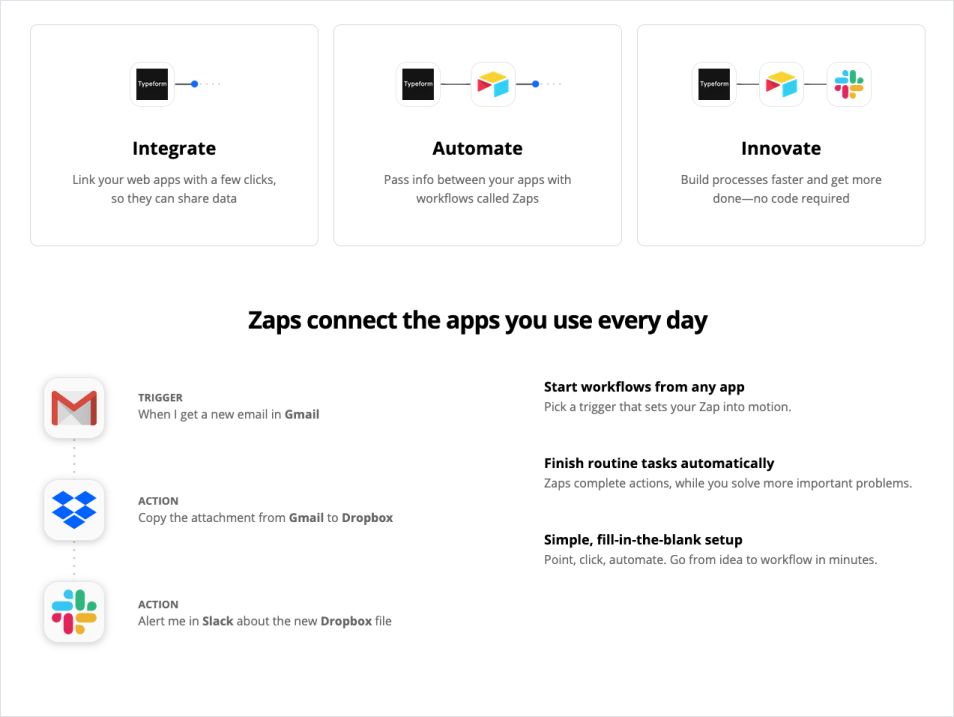
Image Credits: Demand Curve
Now that we understand how Zapier uses visuals, let’s explore the copy:
“With a few clicks”
People typically object to using software that’s hard to use. So, Zapier’s copy frames their product as easy to use.

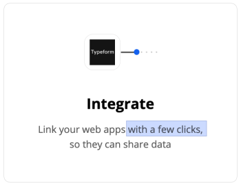
Image Credits: Demand Curve
“Workflows called Zaps”
Zapier coins their own term. Why? Non–technical people likely don’t know what a webhook is. To a visitor with no webhook knowledge, a “Zap” is a new thing.
Users will associate the concept of a webhook with Zapier. Instead of thinking “I need to set up a new webhook,” it becomes “I need to setup a new Zap.” This builds Zapier’s affinity with their customers.

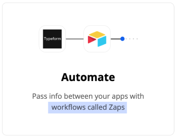
Image Credits: Demand Curve
“Faster and get more done”
Zapier is blunt about what their product benefits are. Stating what’s obvious to you might not be obvious to your visitors. It’s best to be clear and use simple terms.
“No code required”
A typical objection can sound something like: “This seems great, but I’m not technical. I don’t know how to code. I can’t set up something like this.”
Zapier: “No code required.” In three words, Zapier removes one of the largest barriers preventing their target customer from setting up automations.
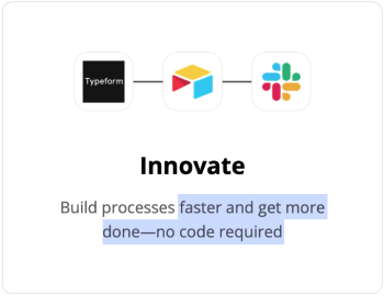
Image Credits: Demand Curve
If you want to establish understanding even quicker, use examples and visuals your target audience would be familiar with.
Zapier uses popular apps in its feature visual so that most visitors can relate.


Image Credits: Demand Curve
Then, it phrases each step of the sequence as if a non-technical user was saying it out loud.

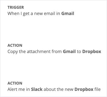
Image Credits: Demand Curve
Describe the benefits your customers receive from each feature
To further encourage users to sign up, the features should be framed as benefits. Ask yourself what the underlying value of the feature you offer is, and then tell users exactly that. Let’s take a look at how Zapier sprinkles in the benefits:
- “From any app” implies flexibility and ease of use.
- “While you solve more important problems” associates Zapier with empowering users to work on the most important problems.
- “Simple, fill-in-the-blank setup” counters any objection that Zapier might be hard to use.
- “Go from idea to workflow in minutes” uses a frame of reference users are familiar with (the time it takes to go from idea to workflow). Now, it only takes minutes.

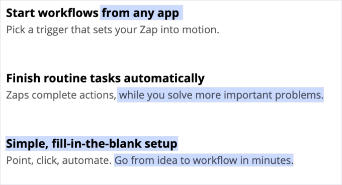
Image Credits: Demand Curve
How handling objections can increase your conversion
It’s important to proactively hedge against objections if you want to increase conversion. Ask yourself what concerns users might have if they were to start using or switch to your product.
Zapier’s visitors might think: “This seems incredible. But, I don’t use Slack, Dropbox or Airtable … and I don’t want to switch all my apps just to use this ‘Zap’ thing.”
Zapier shows off their search function to handle that concern and makes things more engaging. They delight visitors by giving them a peek of what’s inside.

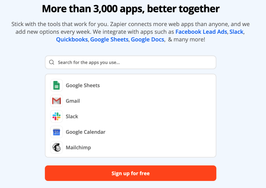
Image Credits: Demand Curve
Some visitors may still think Zapier is too technical. We haven’t actually seen inside the product yet. Zapier shows off the inside of the product to handle this concern. You can tell they tailored the inside of their product for non-technical users by looking at the language they use.
The marketing was telling a visitor it was easy to use until now. Now, the product confirms it.
Visitors with this skepticism might start to think “That’s not too bad. I would like to … See the demo.”

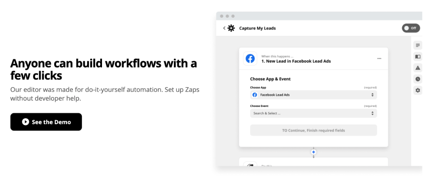
Image Credits: Demand Curve
How to design a pricing section that doesn’t scare your prospect
Based on our experience, a straightforward and transparent pricing structure will lead to higher conversion rates. It’s important to include price, restrictions, access to benefits and support so your customers understand what they’re getting.
In Zapier’s pricing section, both plans open with a pitch that targets different personas. If a user only needs to connect a few apps together (solopreneur, freelancer or new startup), the free plan is for them. If a user needs advanced workflows (bigger startups, enterprise), then premium is for them.

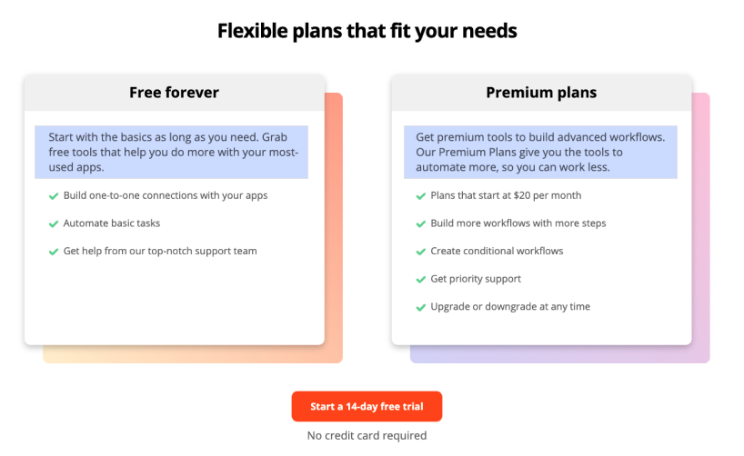
Image Credits: Demand Curve
Create a pricing call to action that takes away all the risk
You can improve your second CTA’s conversion rate by priming your visitors about what will happen next. Zapier’s CTA isn’t a simple “Get started.” Instead, they use a bargain (14-day free trial) to motivate users to try it out.
Some users will still avoid signing up because they don’t want to enter their credit card information, even if it is a free trial. Zapier addresses this objection with, “No credit card is required.”
End your homepage with a final call to action and more social proof
The last section of your homepage should be a final call to action. This is your last chance to motivate users to sign up for your product, so it’s important to get it right. Zapier reminds visitors why they should be excited about Zapier by including testimonials showing real people benefiting from their product. They include a catchy header, “Zapier makes you happier.”
Zapier does a great job of motivating visitors to sign up by using social proof: “3 million people” are already using Zapier. This bypasses the objection, “Is this legitimate?” and provides a sense of missing out, because so many people have already discovered the tool. The copy also associates Zapier with a user’s tedious tasks being completed for them.
To push for final conversion, Zapier provides a sense of urgency by saying, “Wave goodbye to your busy work.” This builds momentum. They finish it off with “Don’t waste another minute,” “Create an account now,” and “Start saving more time,” all of which provide a sense of urgency to sign up now.

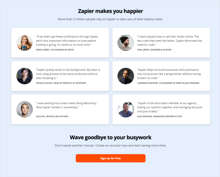
Image Credits: Demand Curve
How to apply this teardown to your homepage
To summarize, here are the key points you should take away from this teardown:
- Quickly establish what your product is and why it matters to the person reading.
- Avoid unnecessary steps to reduce friction.
- Hedge against objections by anticipating visitors’ reactions to your copy.
- Use visuals to establish a reader’s “aha moment” faster.
- Use images and references that visitors are familiar with as a lens for the value your product provides.
- Make your landing page more interactive by embedding part of your product in it.
- Pepper in benefits whenever you can while ensuring it feels natural.
- Push for conversion by using bargains and providing a sense of urgency. What can you tell a visitor to make them act now?
Apply these takeaways to your startup’s homepage to increase conversions.