
VCs read pitch decks extremely quickly, which means that every detail holds the potential to get them to double down on a startup or just pass altogether. While crafting the high-level narrative is critical, of course, founders can’t skimp on the details either.
That’s why every Disrupt, we host a session we call Pitch Deck Teardown. It’s a convivial workshop where founders in the audience send me their decks, and I walk through a curated set of them live in front of an exceptional VC panel, who critique the deck slide by slide. This year at TechCrunch Disrupt 2021, we were joined by Maren Bannon, co-founder and managing partner at January Ventures; Vanessa Larco, partner at NEA; and Ben Ling, founder and general partner of Bling Capital.
We went through two decks — one consumer and one enterprise — covering about 30 slides in total. It’s honestly hard to summarize all the discussions we had on the panel — there were just so many interesting viewpoints that I highly recommend reading the transcript or watching the video included below.
So for this summary, I decided to pick four slides, two from each deck, that provoked our panelists to show how VCs can have radically different views on the same material.
Product slide
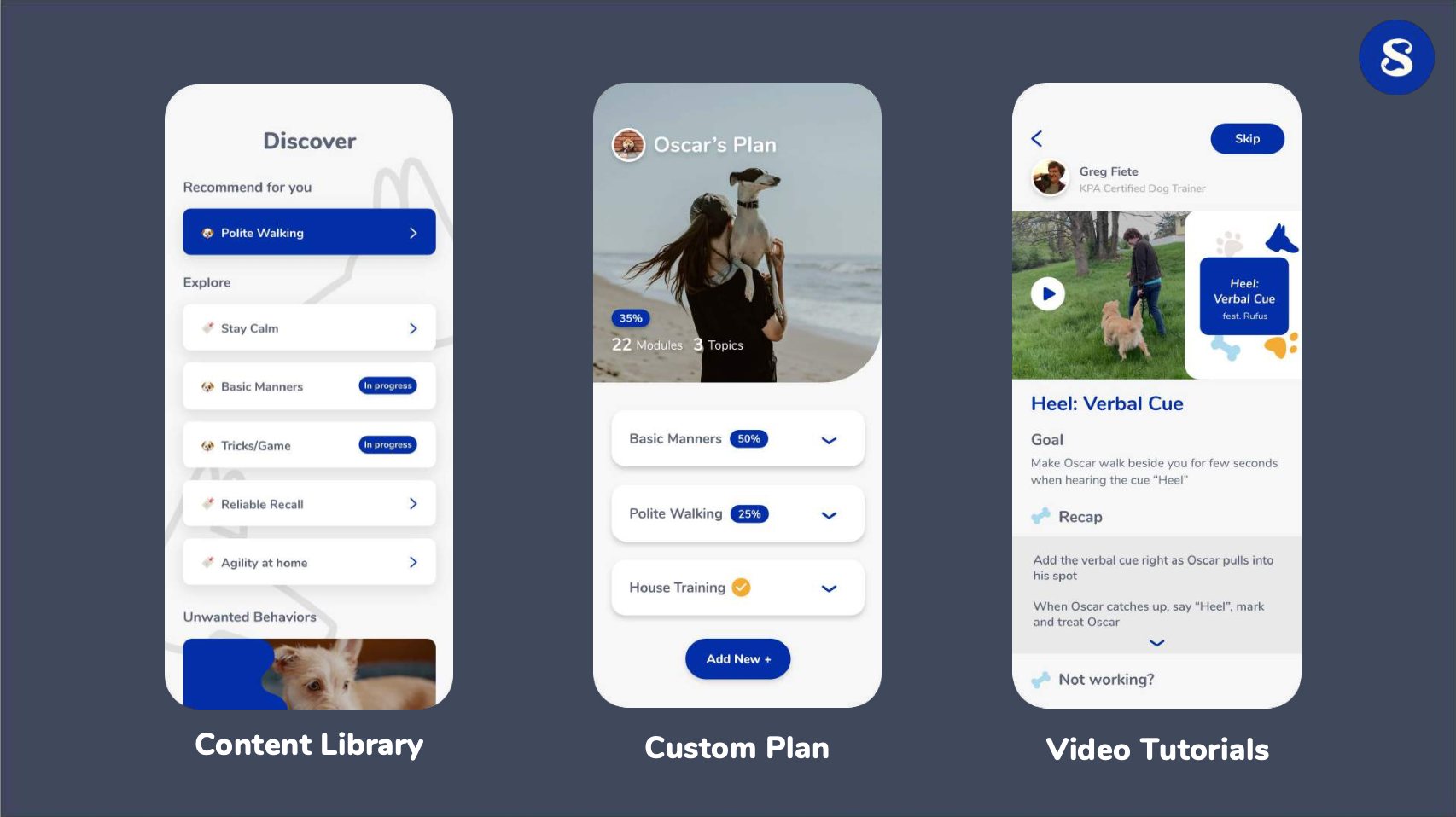
Most consumer decks, like this one targeting dog owners, will have some form of product slide that shows exactly what a startup is building. It’s a critical slide, but one that can be easy to get wrong.
Larco liked the design, but suggested offering investors ways to dive deeper:
Screenshots are typically great, but if it piques your interest, it would be great if they had a link to a Loom video or something so that if I did want to go deeper and if I was really curious about what the product actually looks like, I could. That said, when it launches automatically into video, I find it typically hard to sift through it unless I am really interested already. So I think screenshots with an option to go deeper is great. But this looks great, the UI is great and clean. It explains the three core components of the app, which is basically what I asked for upfront. So this is pretty well executed. (Timestamp: 9:00)
The company had an additional slide just like this one with three more product screenshots. Larco felt that this maybe added a bit too much information about the UI.
I would take the top three, and then maybe in the bottom of the slide, say “We also offer these other features,” or perhaps put it in the video. (Timestamp: 10:20)
Ling also liked the simplicity of the design.
To me this is fine, because you can flip through it really quickly, take a quick look and then just move on. It’s not a slide that has 15 lines of text that you have to sit and sort of pull through. It just tells you, okay, training, tracking and then there’s like on-demand things that you can do with the trainer, great. Literally 30 seconds, and you can go to the next slide. I think it’s not a really heavy slide that makes the investor feel like they don’t understand what’s going on. It just gives you more color. (Timestamp: 10:36)
Bannon felt that showing more product depth is critical, particularly for younger companies.
I also like this design of having more images of the product versus fewer, because it makes the point they actually have a product. And I see a lot of pre-seed decks that don’t have a product. I think the more that you can hammer the point home that you have something out in the market, that’s really powerful for investors. (Timestamp: 11:12)
Given that there were a total of six product screenshots across two slides, all equally spaced, I asked the panel whether it made sense to show more of a “user flow” through the design — that a user would start in one part of the app and then move to others as they interacted. Larco felt this wasn’t necessary.
I think it depends on the product. If it’s an enterprise product, and you’re rolling out some big thing, maybe. But in a consumer app, I’m going to assume you have easy onboarding. (Timestamp: 11:47)
- 3 lessons we learned after raising $6.3M from 50 investors
- The pandemic showed why product and brand design need to sit together
- RapidSOS learned that the best product design is sometimes no product design
Customer acquisition slide
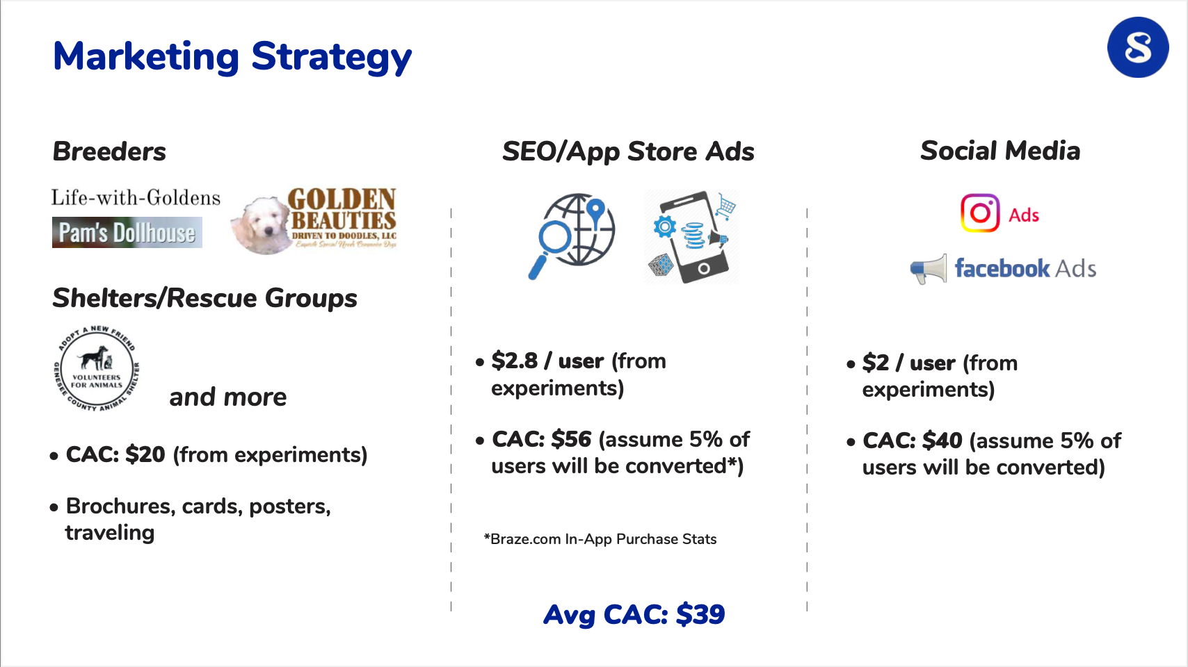
One of the most important slides — particularly for consumer companies, but not exclusively — is the customer acquisition slide. How do you get customers to use your app or service? How much does it cost to market to them (aka the customer acquisition cost or CAC)? The answers to these questions ultimately define the speed and scale of the growth of a business, and thus, how much interest venture capitalists will have.
Larco liked the slide since it showed that they had the right model for thinking about growth.
I like seeing a team that is concerned about CAC, and has run some experiments. I can tell that they had limited budgets to run the experiments, because they’re giving you the user and then the assumed CAC based on what they think will convert. So it’s a lot of assumptions, but these CAC numbers are within range for what I see for consumer companies. So it looks about right.
I would give them bonus points for being really thoughtful in trying to arrive at some of these numbers. For a consumer company, especially early stage, I need to believe that this team is sophisticated enough to be able to run a good user-acquisition playbook. And this gives me more confidence in this team. So I would take them more seriously because of this slide. (Timestamp: 16:22)
Bannon agreed, although she wanted to see more organic channels in the mix.
I like the testing that they’ve done. But I think the issue I’d have with this slide is, it looks like overreliance on paid. And I would want to see other channels that are not relying on paid ads. (Timestamp: 17:12)
Ling felt that the slide was missing some information around the scale of the business.
I like the fact that they are thinking about different channels. However, it doesn’t have really enough information about the experiments and then also what the expected payback is. But that’s okay; this slide will basically invite a conversation in person about that.
It demonstrates competence, but it doesn’t actually show the information that’s needed. It’s a little unclear, the stage of the company. What’s the scale of revenue, the scale of users? If they only have like 10 users, then this is not really all that useful. But if they have some meaningful amount of revenue, then some of this may actually be useful and I can give you partial credit. (Timestamp: 17:31)
Larco agreed.
Ben, to your point, I’m just assuming it’s not [highly scaled up], so I am just giving them credit for thinking it through this way. It just gives me an idea of how they think about user acquisition, but I would just discount all of these numbers.
- Reimagine inside sales to ramp up B2B customer acquisition
- What’s the cost of buying users from Facebook and 13 other ad networks?
- How bottom-up sales helped Expensify blaze the path for SaaS
Problem and solution slides
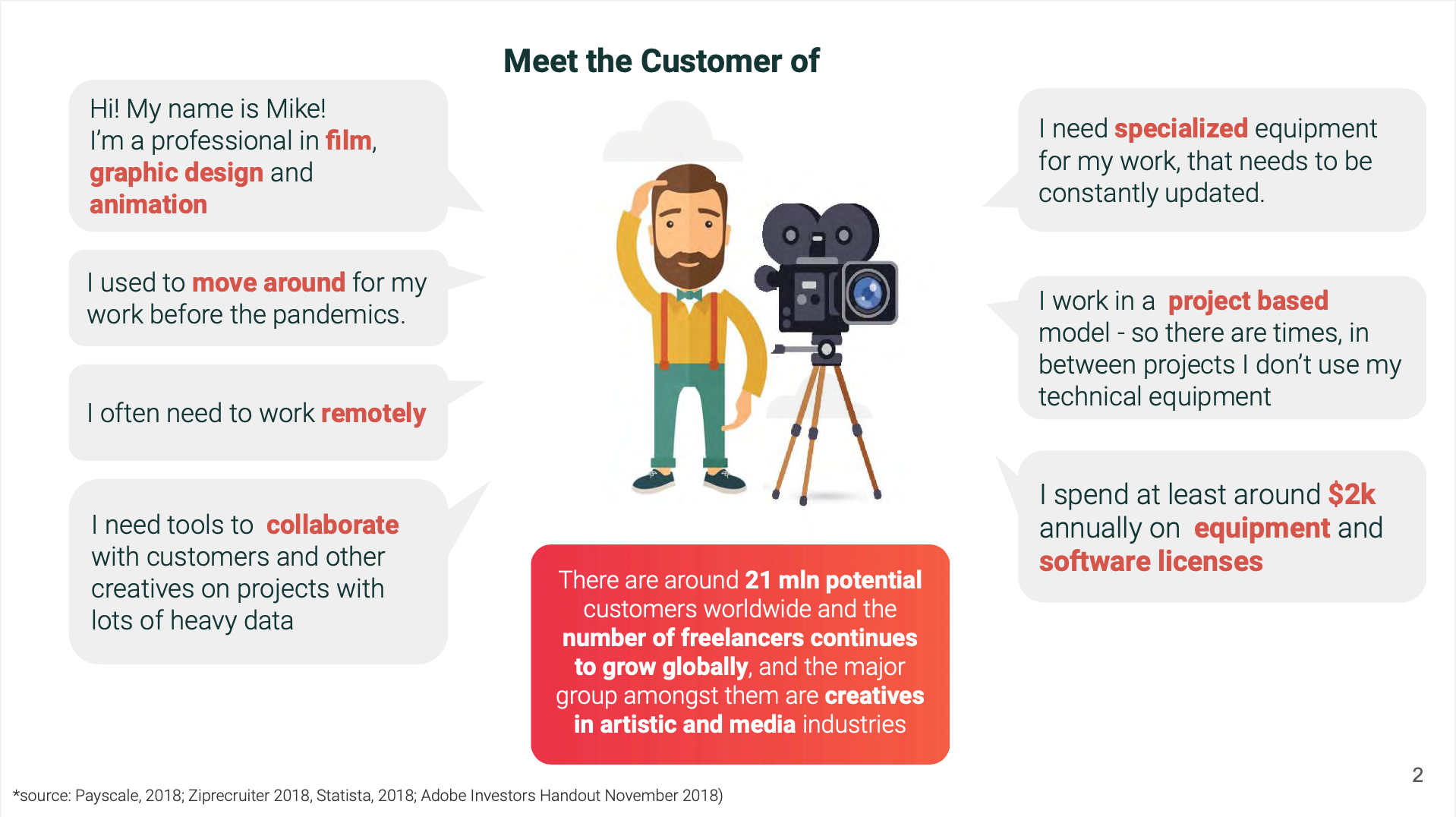
We scooted right along to a deck for an enterprise company focused on providing SaaS services to graphic designers and filmmakers. After the title page, the next slide is often what is dubbed the “problem” slide, or defining what problem your startup is trying to solve for customers. In this case, the deck included an example customer and a bunch of that user’s problems. Our panelists weren’t fans.
Larco felt that the slide was overwhelming.
I get what they’re trying to do, but it’s just a lot going on. It’s a lot of text. I would rather see the problem set up. I appreciate that they’re setting it up from the user’s perspective. But it needs to be easier to follow along. (Timestamp: 28:11)
She also noted a bit later that the slide isn’t even necessarily saying what it thinks it’s saying.
I think we’re still talking about Mike. Is Mike the buyer? Or is Mike the user? Is the user the buyer? Are they the same thing? Does the project he’s working on buy it for him for like everyone on that project, and so he gets a license and a seat, or does he buy it as himself? And then he influences all the other people working on this film to buy it too? Who’s the buyer? And do you need everyone else on it or not? I don’t know yet. (Timestamp: 32:21)
Bannon was in agreement.
I would say simplify this one. It was very hard to digest, and I came away more confused actually about what exactly the problem is that the customer has. (Timestamp: 28:31)
Ling noted that an investor couldn’t really understand this slide without seeing more of the deck.
So to me, this slide makes sense. But the way that I look at this slide isn’t that I understand it; it’s that I will look at the next slide and then flip back to this slide. (Timestamp: 28:45)
So we did flip ahead to what might be called the “solution” slide.
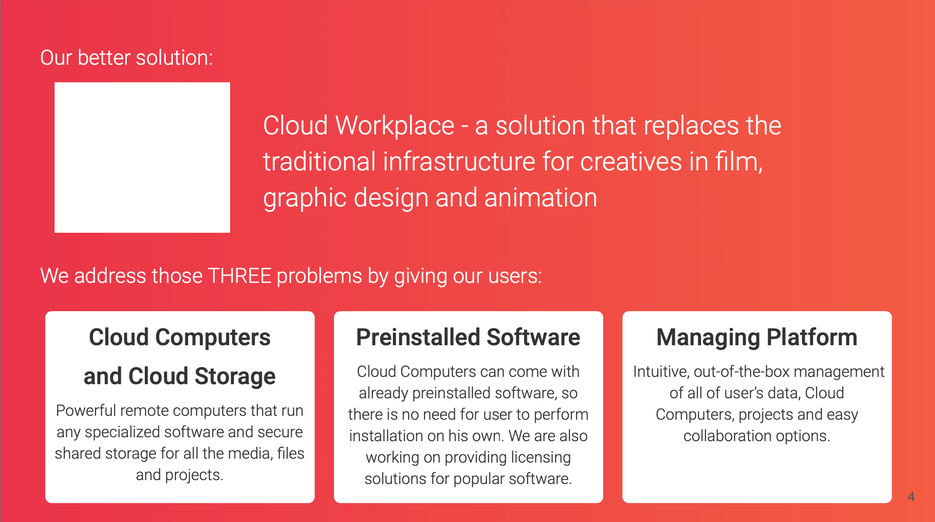
Ling felt the two slides together were discordant.
We tell our founders to try to make it so that these two slides are parallel. You show three problems, and then you show three solutions and how they solve the three problems. That’s better than having a mapping, where I’m now trying to figure out which of these columns maps to which of these problems. Are they really the most important problems or the small problems? What does this company do? Plus, if you can summarize what the company does in one sentence upfront, it really helps. (Timestamp: 29:22)
Pretty much all our panelists showed confusion about these early slides. Larco felt that the slides would have already lost many investors.
I have many pitch decks in my inbox every day, and if I can’t figure this out quickly, I just hammer on to the next one. Maybe I’ll get back and I’ll read this one again later. (Timestamp: 30:14)
Ling noted that an investor skipping to another deck is the kiss of death when fundraising.
The thing here is that, you have to assume that investors are looking at the deck, and if they can’t figure out what it is that you do, or they can’t make a decision, they’ll put a star by that deck, and they’ll come back to it at another point in time. But basically, you’ve lost that quick opportunity to get a meeting. (Timestamp: 30:57)
Larco agreed, and also noted that just because an investor wants to come back to a deck doesn’t mean they will.
If my folder gets too long, I just wave the white flag, delete all, and start all over, because I’m not going to get to like 80 pitch decks or something. I’m just going to call it. These are like a few months old and they’ve probably raised already. (Timestamp: 31:32)
Bannon noted that while the problems a startup solves can be complicated, summarizing a startup down to one line is just critical for communicating with investors.
I think as a founder, it’s really hard to get exactly what you do down to one line. I think it takes a ton of iteration. I think just knowing that as a founder, you’re not going to get it right on the first try is crucial. So just keep showing it to people and get it so that you can do it in one elevator ride or one really simple line about yourself. (Timestamp: 31:55)
- Craft your pitch deck around ‘that one thing that can really hook an investor’
- What I wish I’d known about venture capital when I was a founder
- How some founders are raising capital outside of the VC world