Apple’s location devices — called AirTags — have been out for more than a month now. The initial impressions were good, but as we concluded back in April: “It will be interesting to see these play out once AirTags are out getting lost in the wild.”
That’s exactly what our resident UX analyst, Peter Ramsey, has been doing for the last month — intentionally losing AirTags to test their user experience at the limits.
This Extra Crunch exclusive is a simplified conversation around this Built for Mars article, which helps bridge the gap between Apple’s mistakes and how you can make meaningful changes to your product’s UX.
For an industry that’s often soured by privacy concerns, Apple has an unusually strong stance on keeping your data private.
AirTag not reachable
There are two primary purposes of an error message:
- To notify the user what has gone wrong (and how it affects them).
- To help the user resolve the issue.
Most businesses do a decent job at the first one, but it’s rare that a product will proactively obsess over the second.
Typically, Apple is one of the few examples that do — it’s indisputably one of the leaders in intuitive design. Which is why I was surprised to see Apple’s error message when an AirTag is not reachable:
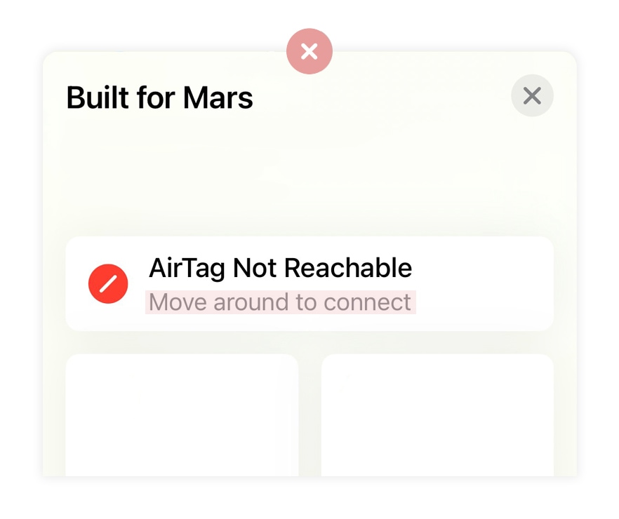
Image Credits: Built for Mars screenshot
There’s a huge amount of ambiguity in the statement “move around to connect,” and it fails to mention that this error could be because the AirTag’s batteries have been removed.
Instead, Apple should make this message clickable, which opens a modal to learn more about this issue.
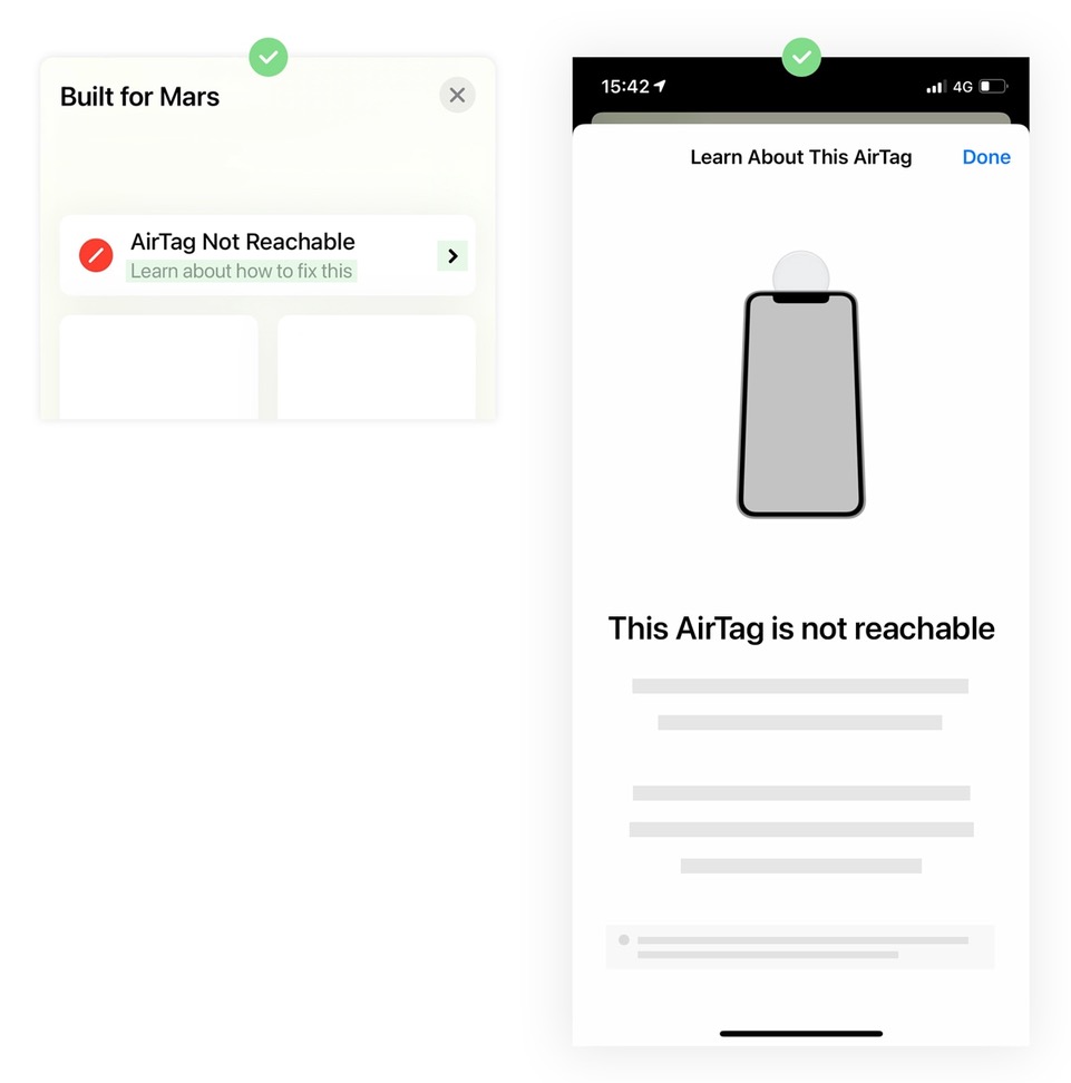
Image Credits: Built for Mars screenshot
The important takeaway here is that within your product, you’ll likely have a series of error states, messages, tooltips and modals. But do they actually help the user resolve their issue?
Although this isn’t always possible, from my experience of helping hundreds of companies with their UX, almost everyone can improve something.
Tip: If possible, ensure that your error messages actually help the user resolve their problem. At the very least, advise them on what steps to take to see if the error is still there (i.e., should they clear their cache and try again? If so, how?).
The trade-off between privacy and UX
One of the newsworthy features of the AirTags is that if you try to use them to secretly track someone’s location, then — if they have an iPhone — it’ll send that person a notification to let them know that they’re being tracked.
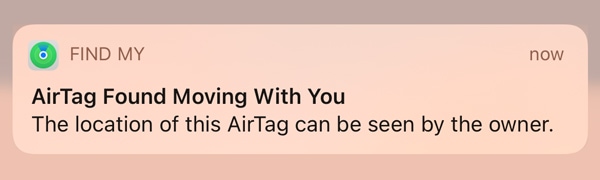
Image Credits: Built for Mars screenshot
For an industry that’s often soured by privacy concerns, Apple has an unusually strong stance on keeping your data private — something they doubled down on at WWDC this year.
And it’s no surprise that often there are trade-offs between privacy and user experience. For example, it’d be more secure to have three-factor authentication (rather than the industry-standard two), but the UX would be considerably worse.
For the record, I’m pro-privacy and commend Apple for the steps they’ve taken. However, there’s a UX issue with AirTags that I think could be resolved by relaxing some of these policies — to no detriment of the user’s actual privacy.
If Apple notices that you’re being tracked by someone else’s AirTag, they’ll tell you. But, other than removing the battery, there’s not a lot you can do. If you scan the AirTag, the only information that you’ll see is the owner’s phone number.
But, if you were really being stalked, this phone number would be fake anyway, because there’s no validation when creating a tag.
So if the data is likely fake when nefarious activity is really taking place, then why not help reduce the anxiety in the instances where it’s a false positive — e.g., when your friend accidentally puts their keys in your coat pocket?
I give some examples of what data they could show in the full article, but my point is that there are circumstances where the vast majority of instances are false positives, and the benefit of providing slightly more information may have a huge impact in those moments.
As an example: Owners name their tags during the setup process, but this name is hidden from the person being “tracked.” Say the name of the tag was “Jamie’s Keys,” — this may remind you that you just saw Jamie earlier, and he did put his keys in your bag while you played football.
Tip: Companies should be super focused on privacy right now, but be aware of the impact to UX, and consider the broader trade-offs. And if there’s an opportunity for false positives in your product (say, a health tracker), how are you working to reduce anxiety and fear?
The search for milliseconds
Maybe it’s a British thing, but occasionally I find myself in a public area, such as a train station, and notice a piece of paper with “wet paint” written on it.
OK, but what paint is wet? All of it? The handrails? The walls? The doorway?
Now imagine a very similar sign that says “wet paint on handrail,” with an arrow literally pointing to the handrail.
It’s incredibly likely that in both scenarios I walk away without painty hands; however, with the latter, I’m less worried about how to navigate the situation.
The above outlines something I hear a lot from companies: We don’t worry about the UX on our form because we have above-standard conversion rates.
The missing insight here is that UX isn’t just about making immediate conversions greater, but building experiences that are pleasurable to use, which, in turn, motivates the user to engage more later.
A smoother sign-up experience may not increase the conversion rates on that form, but it could increase long-term engagement in the product. And people rarely consider the two as being as intimately connected as they really are.
As an example, AirTags require ambient light to launch their compass-style tag-finding minigame. If you don’t have sufficient light, then they’ll show a “more light required” message.
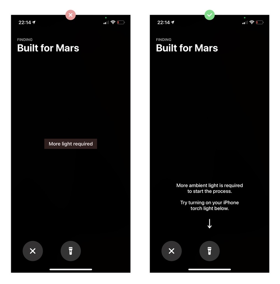
Image Credits: Built for Mars screenshot
In the same way that an arrow on a “wet paint” sign would help reduce the anxiety of getting painty hands, Apple could quite literally point to the torch icon below this message to reduce the time it’d take to understand and react to what you’re seeing.
- Adding a bit more context to the message.
- Lowering the message so it’s physically closer to the torch icon (so it’s in eyesight).
- Adding an arrow pointing to the icon.
For clarity, this may not increase the number of people who engage with the torch icon, but, by reducing general anxiety around this feature, you may increase the number of people who go on to find lost items.
Tip: When measuring conversions, you shouldn’t just consider the immediate conversion, but the long-term goals (e.g., engagement, churn). When looking through this lens, minor UX changes show their true value.
For more UX tips, check out the full teardowns at Built for Mars.