Twitch evidently has no issues getting people to spend time on its platform — even politicians can draw huge crowds by streaming themselves playing games. But monetizing video content is hard, and Twitch has missed revenue targets for the last few years.
So how does Twitch make money? And more importantly, what subtle psychology does it use within its iOS app to encourage viewers to spend more?
I’m a UX analyst and the founder of UX community Built for Mars — where I regularly tear down some of the best products in the world, showing you how they’re made, and, more importantly, how they could be improved.
I recently published my analysis of Twitch. But for Extra Crunch subscribers, I wanted to go a little deeper and bridge the gap between what Twitch does and how you can make meaningful changes to your product’s UX.
In general, you should encourage the user to make the hard decision (i.e., to commit to subscribing), after understanding all the benefits.
So here are three UX tips to discuss during your next team Zoom call.
The Anchor Effect
In short: The Anchor Effect is a heuristic bias whereby people will become attached (anchored) to an initial piece of information. For example, spending $1,000 on an iPhone may not seem like a bad deal if you saw an ad for the $1,500 one first — by comparison, it looks “cheap.”
On Twitch, when a new user subscribes to a channel for the first time, they’re shown the benefits of subscribing, and then asked how long they want those benefits for before being shown a price.
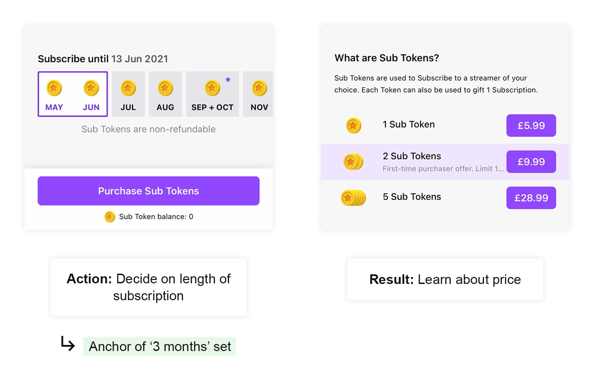
Image Credits: Twitch
This type of bias is everywhere. For example, the order of your pricing tiers will affect conversions — which is likely why Mailchimp shows its pricing tiers in reverse order.
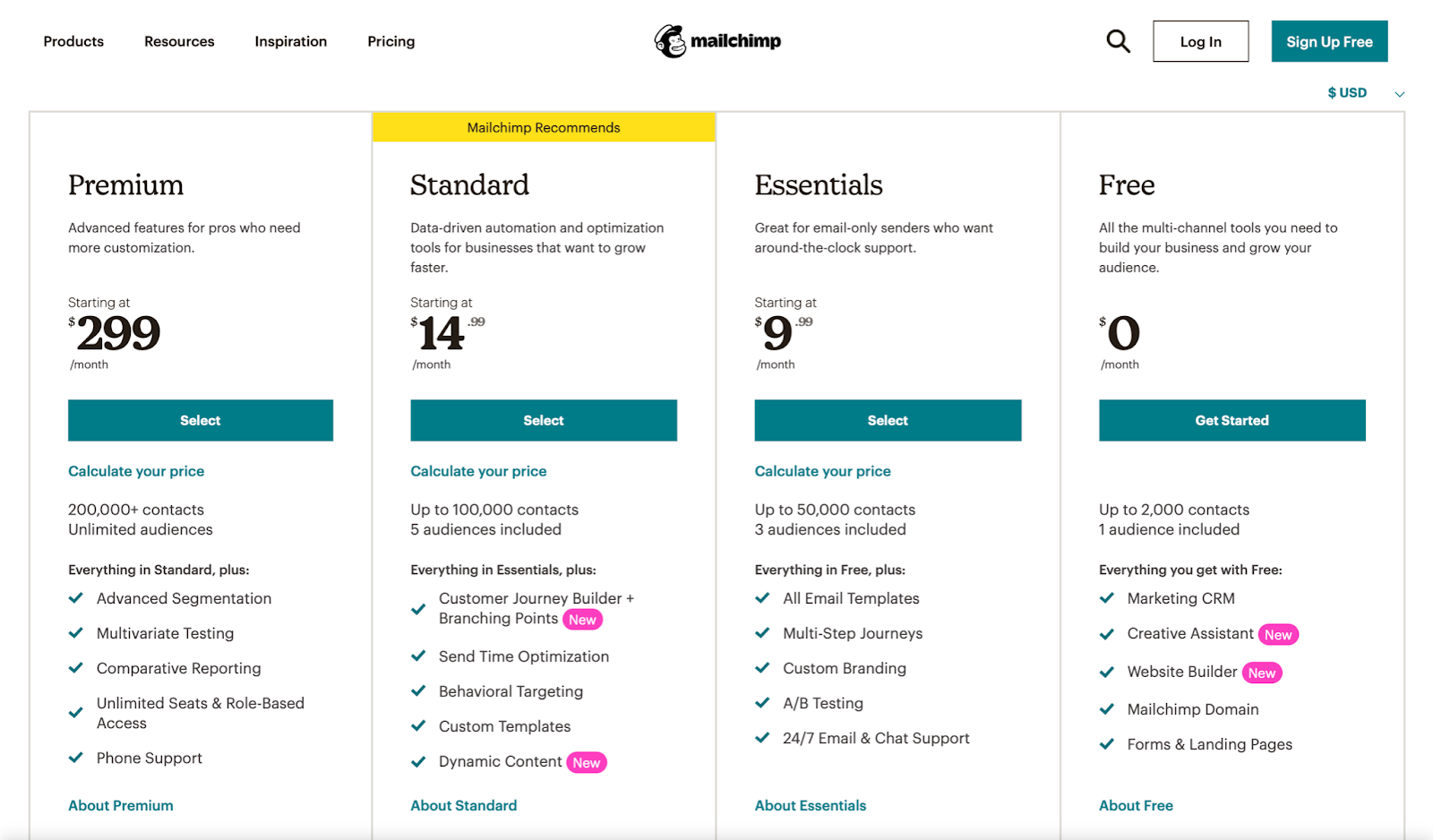
Image Credits: Mailchimp
As you naturally read this from left to right (in the Western world), you become anchored to the expensive $299 package. By comparison, that $14 standard tier feels very reasonable.
So should you go and immediately switch your pricing tables around? No, probably not, it’s more nuanced than that.
But! Be aware of your anchors. They’re silently driving human behavior, and by identifying them, you can tweak them to work in your favor. Remember that the first piece of information that the user sees will become that anchor.
A pocket full of change
Twitch utilizes a virtual currency called “Bits.” Viewers can spend these Bits on in-app items, and some of the money ends up in the streamer’s pocket — it’s essentially a donation.
I described this as “a system designed to increase how much you spend, not one that’s optimized for the best user experience,” because you need to buy Bits in awkward increments.
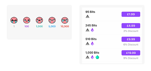
Image Credits: Twitch
Twitch is not alone; Microsoft used to do this with Microsoft Points — you’d need to buy in bundles of 1,000, but everything you wanted to buy cost 1,050, or something to that effect.
It’s unlikely that your company has an internal digital currency, but if you sell software as a service, it’s possible that you have a “budget” system, where users top-up accounts. So, what can you do to improve your UX?
Tip: Allow users to top-up their account in flexible increments, which reflect actual purchasing power. So if a “monthly seat” costs $7.99, then don’t force the user to top up in factors of $10 — let them decide and make any unused funds refundable.
De-risking decisions
In general, you should encourage the user to make the hard decision (i.e., to commit to subscribing), after understanding all the benefits.
Something odd happens when we commit to something: The act of deciding to do something makes us more likely to do it.
That might sound obvious, but people don’t seem to think about it much. By setting an alarm for 7 a.m. — therefore making a conscious decision to wake up early — you’re more likely to get out of bed at 7, even if your alarm ran out of power and never went off.
This introduces a UX complexity: At what point do people make decisions while using an app?
Often it’s at the point of clicking, not the final stage of a process, meaning the user decides to buy the item when they click “check out now,” not when they’ve entered their card details and click “complete purchase.”
So, a great addition to your UX toolbelt is to actively de-risk decisions if the user isn’t ready to make them. For example, Twitch asks you if you want to subscribe to a streamer before seeing even a second of their stream.
It’s unnecessarily boolean. Instead, if they changed the text to say “learn more,” the user could click it without having to internalize the decision.
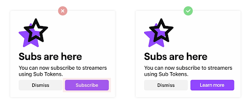
Image Credits: Twitch
Your UX can encourage the decision-making process to happen when you want it to. So consider if you’re asking the user to commit too early — or too late. (A/B test it if you’re not sure.)
For regular UX tips like this, stay subscribed to Extra Crunch, and check out the full teardowns at Built for Mars.