
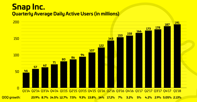
Snap screwed it all up jumbling messages and Stories, banishing creators to Discover and wrecking auto-advance. Prideful of his gut instincts, Snap CEO Evan Spiegel refused to listen to the awful user reviews and declining usage. Now a YouGov study shows a 73 percent drop in user sentiment toward Snapchat, the app’s user count shrank in March and its share price is way down.
Yet the re-redesign Snapchat is finally rolling out today in response won’t fix the problems. The company still fails to understand that people want a predictable app that’s convenient to lay back and watch, and social media stars are more similar to you and me than they are to news outlets producing mobile magazine-style Discover content.
There’s a much better path for Snapchat, but it will require an ego adjustment and a bigger reversal of the changes — philosophy be damned.
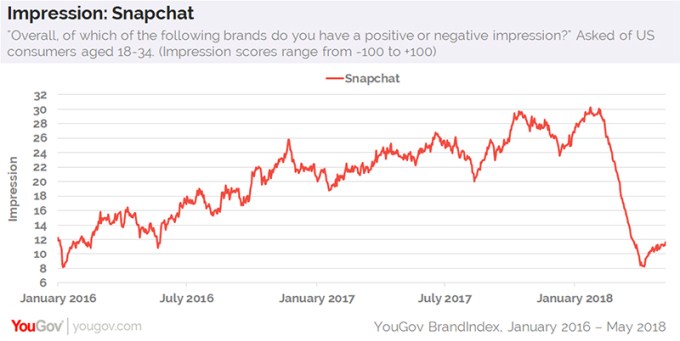
Snapchat’s impression amongst US users fell off a cliff when the redesign was rolled out early this year
Here’s what Snapchat was, is becoming and should be.
The old Snapchat
Snapchat’s best design was in September 2016. It lacked sensible Stories sorting, and got some questionable changes before the big January 2018 redesign, but the fundamentals were there:
- Left: Messages in reverse chronological order
- Right: Stories from everyone in reverse chronological order with a carousel of ranked preview tiles in a carousel above or below Stories
- Auto-Advance: Automatic and instant
The broken Snapchat
Snapchat’s big January 2018 redesign did two smart things. It added more obvious navigation buttons to ease in new and adult users. And it made the Stories list algorithmically sorted so you’d see your best friends first rather than just who posts most often, as TechCrunch recommended last April.
But it introduced a bunch of other problems, like pulling creators out of the Stories list, turning the inbox into chaos with ad-laden Stories and breaking auto-advance so you have to watch an annoying interstitial between each friend. Spiegel stubbornly refused to listen to the poor feedback, saying in February, “Even the complaints we’re seeing reinforce the philosophy. Even the frustrations we’re seeing really validate those changes. It’ll take time for people to adjust.” That quickly proved short-sighted.
- Left: Messages and Stories from friends mixed together, sorted algorithmically
- Right: Discover, sorted algorithmically, with influencers and people who don’t follow you back mixed in
- Auto-Advance: Interstitial preview screens
The re-redesigned Snapchat
Users hated the redesign, initial reviews were mostly negative and Snapchat’s growth fell to its lowest rate ever. After some tests, today Snapchat tells us it’s rolling out the re-redesign to the majority of iOS users that’s a little less confusing. Yet it doesn’t address the core problems, plus makes the Discover screen more overwhelming:
- Left: Messages sorted reverse chronologically
- Right: Friends’ Stories at the top sorted algorithmically [Correction: Not chronologically], then subscriptions to creators sorted algorithmically, then Discover channels sorted algorithmically
- Auto-Advance: Interstitial preview screens in Stories but not Subscriptions or For You
The right Snapchat
While the re-redesign makes Snapchat’s messaging inbox work like it used to, it overloads the Discover screen and leaves auto-advance broken out of a misguided hope of ensuring you never watch a frenemy or ex’s Story by accident and show up in their view counts. But that’s not worth ruining the laid-back viewing experience we’ve grown to love on Instagram Stories, and could be better solved with a mute button or just getting people to unfriend those they can’t be seen watching.
That’s why I recommend Snapchat move to a hybrid of all its designs:
- Left: Messages sorted reverse chronologically
- Right: Stories from all friends and creators, displayed as preview tiles, sorted algorithmically to preference close friends
- Further Right: Discover, with preview tile sections for subscriptions, publishers and Our Stories/Maps/Events [This whole screen could be crammed into the Stories page if Snap insisted on just one screen on the right]
- Auto-Advance: Traditional instant auto-advance without interstitials, plus a mute button to hide people
This design would make the inbox natural and uncluttered, ensure you see all your closest friends’ Stories, keep influencers from being buried in Discover, give publishers and Snapchat’s own content recommendations, including new creators, room to breathe and let you easily relax and watch a ton of Stories in a row.
Snapchat could have slowly iterated its way to this conclusion. It could have done extensive beta testing of each change to ensure it didn’t misstep. And perhaps facing an existential crisis from the exceedingly viable alternatives Instagram and WhatsApp, it should never have attempted a sweeping overhaul of its app’s identity. Twitter’s conservative approach to product updates looks wiser in retrospect. Instead, Snap is in decline.
Facebook’s family of apps have survived over the years by changing so gradually that they never shocked users into rebellion, or executing major redesigns when users had no comparable app to switch to. Snapchat calls itself a camera company, but it’s really a “cool” company — powered by the perception of its trendiness with American kids. But as ephemeral content proliferates and Stories become a ubiquitous standard soon to surpass feeds as the preferred way to share, they’ve gone from hip to utility. So if its features aren’t cool any more and are offered in a slicker way to a larger audience elsewhere, what is Snapchat anymore?