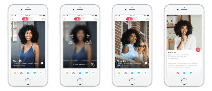
Tinder today is rolling out a new navigational experience for users of its mobile application that’s designed to make it easier to move between profile photos and profile text. In the updated app, photos now take up more screen real estate – that is, they extend to the edge of your phone’s screen. The way you move between photos and profiles has changed too, as you now tap on different parts of the screen to navigate between the photos and the text.
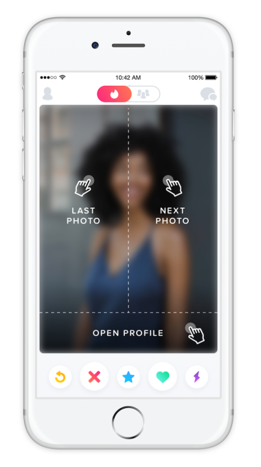
Tinder is often credited with popularizing the “swipe to like” mechanism that now a number of apps – including those outside the dating space – have since adopted. In the app’s new navigation, however, swiping is taking a back seat. You can now move backward and forward between photos just by tapping instead. For example, to move to the next picture, you would tap on the right side of the screen; and to go back to the last photo, you’d tap on the left.
Meanwhile, a tap on the bottom of the photo will open up the user’s profile, allowing you to read their own text and see more information about how far away they are, their education, your shared connections, their top artists, Instagram feed, and other information.
The new design brings to mind social app Snapchat, which made gesture-based navigation a key part of its user experience. But more importantly, it seems to be Tinder’s way of embracing the popular “Story” format found on Snapchat, Instagram and elsewhere, given that users are now able to move through imagery with taps, not swipes. The format has become something of a standard on social apps today, with everyone from Facebook to Skype adopting tappable photo Stories.
But the change also means that the new Tinder app now makes user photos an even more prominent part of the experience of using Tinder – a move that means it will continue to be thought of as the ‘hot or not’ mobile app for dating. While Tinder’s photos-first mentality is part of its appeal, it may be also why it can’t shake its older reputation as a “hookup” app. Other dating app rivals are responding to Tinder’s positioning by focusing instead on relationships, as with Hinge, or on presenting a broader look at users’ profiles, as OK Cupid is doing with its photo grid and focus on questions.
In addition, now that Tinder’s interface feels more like a “Story,” it opens the door to the integration of video in the future, if Tinder wants to go that route.
Beyond being a new way to tweak the app’s design for ease of use, Tinder explains that the navigational change is also focused on under-the-hood updates that will allow the app to be more flexible when it comes to future design changes in the future. The development team re-engineered Tinder’s card stack with this new design, which will allow the company to leverage the new app architecture to experiment and iterate more quickly going forward, the company explains.
Notably, the team shifted away from Objective-C to Swift on iOS, which Tinder’s iOS Architect & Engineering Manager Garo Hussenjian says is “no longer the future of iOS development;” instead, “Swift is the present,” he notes.
The end result is that the architecture is leaner, the code is cleaner, and the new swipe experience is smoother, Hussenjian adds.
Tinder says the user interface changes will be rolling out starting today to all users worldwide.