Facebook Messenger is getting a new look. No, it’s not getting rid of its Stories feature, Messenger Day, but is instead making a series a smaller changes to the way the content on its home screen is organized in an effort to speed navigation and help you pick up where you left off on your last visit.
The update introduces new tabs to the top of Messenger’s main screen for moving between your messages, active contacts, and groups. In addition, the app will now push you to visit other areas by using a red dot on various sections and tabs to let you know when there’s activity.
Facebook explains that the new design is meant to better highlight the many other ways that people connect and communicate, beyond text messages.
The update relocates Groups from the bottom navigation bar to the a tab at the top of the screen, making it a less prominent feature in the redesigned app.
Now, at the top of the Messenger home screen, there are tabs for your messages and a list of who’s active on the app now (as indicated by the green dot next to their name), alongside the new groups tab.
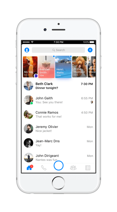
Above: iOS inbox before
By giving active users their own dedicated section, it feels like Messenger is encouraging you to start more conversations through the app, as it’s easier to see who’s online in one long, vertically scrollable list, as opposed the horizontal scrollbar before.
But also, by centralizing all these messaging-focused areas into the home screen instead of spread around the app, it frees up Messenger to focus other, newer parts to its experience in its main navigation bar at the bottom. For example, Games – which just rolled out worldwide earlier this month – gets its own button on this bar now that Groups has been relocated elsewhere.
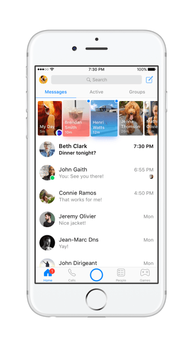
Above: iOS inbox after
Oddly, given its desire to compete with Snapchat across platforms, Facebook has now decreased the size of its Camera button in Messenger. Before, the oversized button was larger than those surrounding it, often even leading to accidental presses – as well as a chance for Facebook to show off its Snapchat-like collection of filters, effects, and masks. With the update, however, the button is back to a normal size, and is nicely lined up with its neighbors.
This is a better design aesthetic to be sure, but it also makes the Camera functionality feel less like Messenger’s leading feature, like the larger button did before.
The updated bottom bar now has tabs for Home, Calls, the Camera button, People and Games. On iOS, there are labeled, too, where before they were just the icons. (On Android, the app is sticking with only the icons.)
[gallery ids="1492940,1492939"]
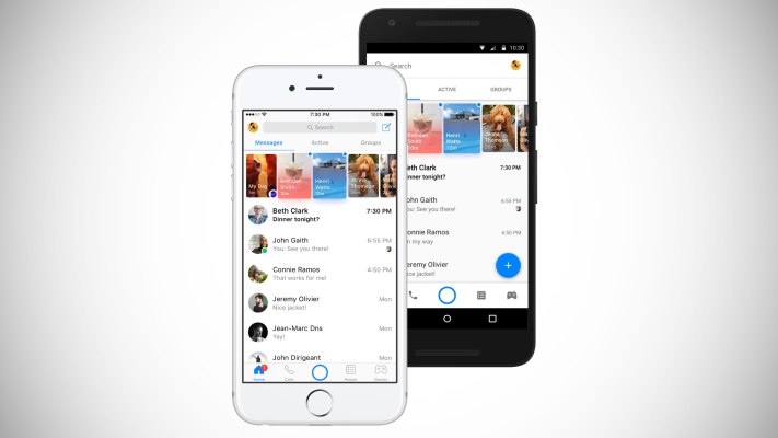
Above: Android Before & After
Another new feature in the revamped Messenger app is the red dot that appears when one of the sections in the app has new activity. For example, if you haven’t read one of your messages, you’ll see the dot next to the Home icon on the bottom. If you missed a call, the red dot will appear next to the Calls tab on the top of your home screen.
This will be a useful guide to helping you find those things you missed since you last logged on, but it could also be potentially annoying to those of us with app OCD. That is, if you’re one of those people who today taps the Marketplace button in Facebook just to clear the red dot from your screen, prepare to start clicking around Messenger more following the update.
Facebook says the changes are rolling out to Messenger worldwide on both iOS and Android starting this week.