Big data is hardly new at this point — nor has it wrought anywhere near its potential effects on many companies and institutions insulated by inertia and red tape. A summer program at the University of Washington called Data Science for Good shows that fresh eyes and good code can make more in 10 weeks than some have done in as many years.
It’s all part of UW’s eScience Institute, and the program is based on similar ones at the University of Chicago and Georgia Tech. Teams of students from around the country apply to take part, then travel to Seattle and work with experts who connect them with data and tools.
This year the theme was “Urban Science,” so for three months, the four teams ground through hoards of data kept by transit authorities, municipalities and contractors. The results are impressive — and possibly lucrative. Here’s the story each team told during a demo day held at UW’s physics and astronomy department.
Diving into ORCA
Seattle is more than a little late to the game when it comes to centralized mass transit, but the advent of ORCA (One Regional Card for All) has started tying things together nicely. The system also produces a torrent of data, very little of which is put to good use, as I understand it. The team decided to dive into this data to see what they could see.
ORCA tracks lots of stuff: where and when passengers get on, what type of card it is (subsidized, for instance, or senior), what business (if any) it is associated with and so on. This is augmented, theoretically, by in-vehicle sensors that register passengers by weight and the buses’ location reports. First came eight weeks of intensive input sanitizing and database wrangling.
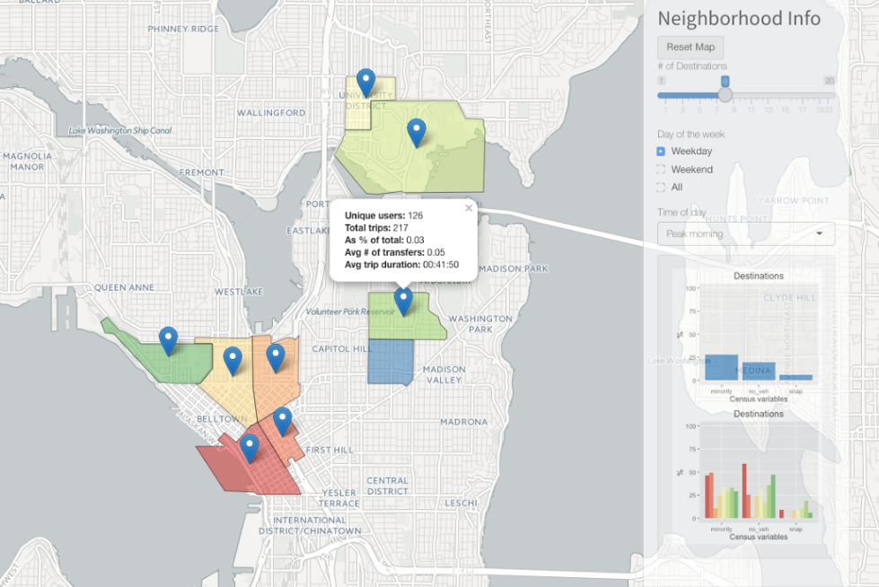
Differences and relationships between the numbers provide powerful insight into who’s riding where, when and — potentially — how to prevent problems like overcrowded buses. The city could also tap into this data to find out which companies are meeting certain “commute reduction” goals, like persuading X percent of employees to use transit.
The team’s presentation was slick and the options many: a curious bus rider could easily find and avoid rush hours and commonly overcrowded lines — and a Department of Transportation researcher could just as easily look at city-level data as it evolves over months and years, finding trends and spotting impending crunches.
I don’t say that hypothetically; in the audience (directly behind me, in fact) were two people from local transit authorities whose delight was obvious. For years, they told me when I asked, they’d been trying to do this kind of analysis and create this kind of tool. And a handful of students did it in one summer with next to no money. The project lead repeatedly turned in his seat to look at them meaningfully, and they obliged by inviting the team to present to both city and state officials.
OpenSidewalks
On-demand directions from Google or Apple are a godsend to those of us lacking basic navigational skills, but a major deficiency is an almost total lack of accommodations for people with disabilities. For instance, one route might be shorter — but take the user along sloped or ill-maintained sidewalks with no curb cuts and no marked crosswalks. That’s a serious obstacle to someone in a walker or with limited sight, and the ability to prefer other routes would be invaluable.
The OpenSidewalks team decided to tackle this problem, but soon found it was even more difficult than they expected. OpenStreetMap allows for annotations such as those they wanted to add, but the standard edit tools are not suited to them. Municipalities must track their own sidewalks for maintenance purposes, and do, but that data (or at least the data the team had access to) was a total mess. The USGS maintains slope data, but it’s not easy to merge with the rest. Chaos!
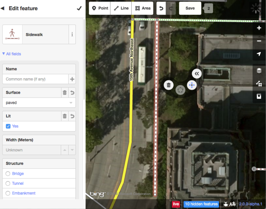 The solution isn’t a neural network or computer vision system, though: For now, it’s just elbow grease. The team created a custom editing app for OSM and established a set of schema for tagging the features they deemed most important: curb cuts, crossings, sidewalks and associated attributes like width, condition and so on. They presented their work at the State of the Map conference and later ran a “Mapathon” to test the effectiveness of their toolset; in a day, their volunteers annotated much of the University District.
With luck, the editor and project will gain a bit of steam and friendly mappers around the country will start piecing together areas where this kind of effort is most needed.
Unsafe Foods
Food recalls are, while not exactly commonplace, at least expected now and then. But even with all the advances in supply chains and oversight by every company that serves perishables — after all, it costs a fortune to recall an item — usually even the quickest recalls seem to come well after the horse has left the barn.
A tainted shipment of yogurt or frozen vegetables can be on the shelf or offered online for months before the company has enough evidence to spur a voluntary recall. But with all the people leaving reviews online, shouldn’t it be possible to catch these things before they spread too far and cause greater harm?
That was the question asked by the Unsafe Foods team. And when you think about it, it seems almost strange that for all the sentiment analysis and trend watching that’s done online, this hasn’t been a priority.
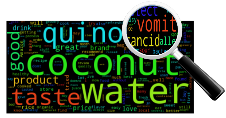
The team looked up recent recalls and scraped thousands upon thousands of reviews from Amazon’s systems. One obstacle they encountered right away was — you guessed it — the government records for recalls were incredibly messy. It took a long time just to figure out a way to extract the UPC from recall reports and match that to a product ID on Amazon. Fortunately, the tool they created for doing so is reliable and reusable, although let’s hope the authorities learn to package their data better soon.
After that, the team started sifting through the reviews looking for reliable patterns that would indicate food-borne illness and not just an unsatisfied customer. They deployed machine learning algorithms and statistical models, but ultimately found that there just wasn’t enough data: Their processes successfully identified reviews relating to recalled products, but couldn’t predict those recalls with any accuracy.
Still, while the data were insufficient and the methods need more investigation, the concept seems sound to me. In fact, as I told the team later, their presentation left me disappointed not in them but in Amazon. Amazon, after all, has unfettered access to much more data and is known to do all kinds of deep data diving; there’s no way this type of analysis hasn’t occurred to them. With all the info from Fresh and other services, it seems to me like a fairly serious lapse to not even attempt to do this kind of work. Either the company gave it a try and ran into the same problems, or decided it was more expedient to let things take their normal, slow course.
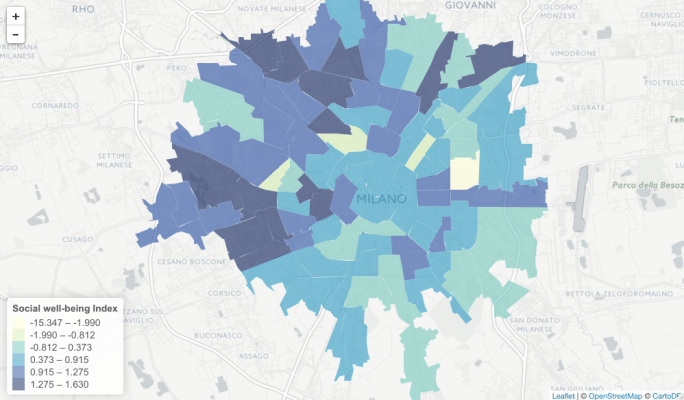
Crowdsensing the Census
Census data is used for all kinds of things and is often consulted when deciding where and how to deploy resources. But the census is labor-intensive, expensive and infrequent; surely there’s some way to get a general idea of important measures like poverty without going door to door and asking? Such a tool could be deployed by developing countries that can’t afford a manual census. The Crowdsensing the Census team aimed to find a cross section of easily attainable data that would let them estimate poverty levels district by district, and on a scale of months rather than years.
There’s no shortage of information on all kinds of aspects of city life, so the question was not one of getting the data but sorting through it. Yet again the limitations of mismatched standards and record-keeping enter the equation: The team compared data from Mexico City and Milan and soon found that the two have very different ways of dividing the city, and recorded different data therein.
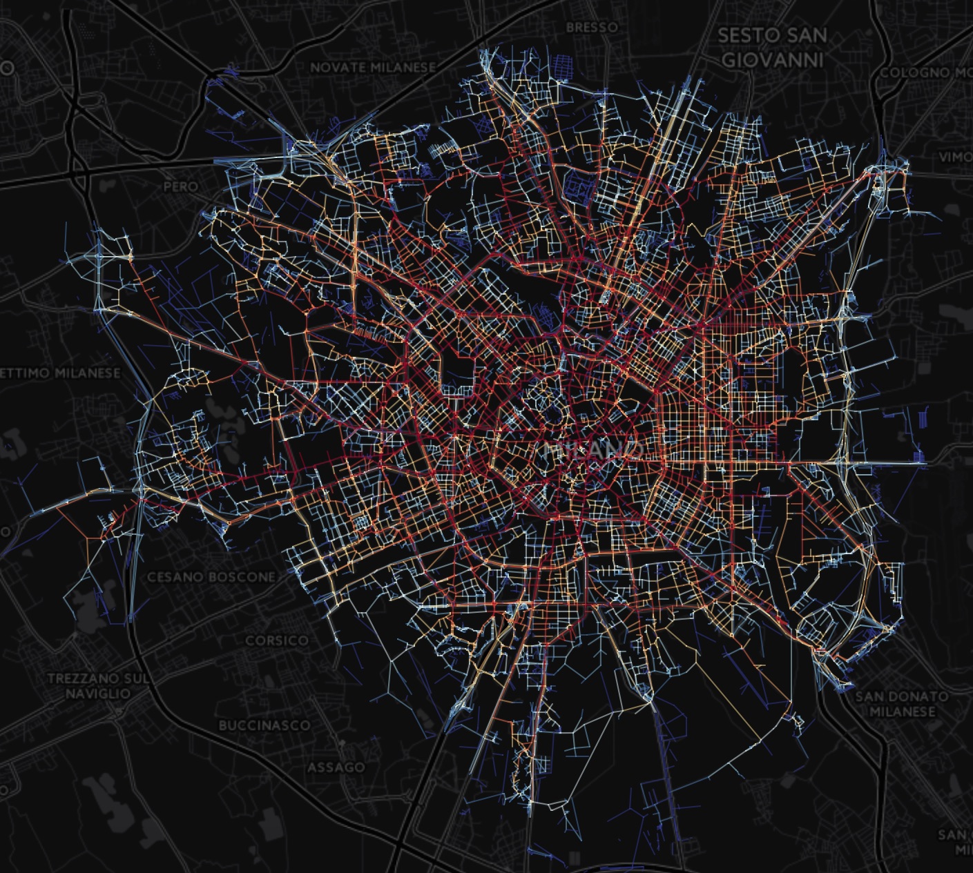 They managed to tame it sufficiently, though, that their other measures could be brought to bear: “points of interest” from OpenStreetMaps, things like bike racks, bars, universities, banks, and such; call detail records taken from mobile providers; and an analysis of street layouts to determine their convenience and accessibility to other areas and resources.
The results were mixed, but promising. Many correlations were found between measurements they extracted and socioeconomic status, but ultimately there was just too much to sift through, too many possible variables to explore. Why were more bars indicative of a nicer neighborhood in Milan, but not Mexico City? Should having a radial layout to the city change how accessibility is scored? Should transient cell signals be downplayed if there’s a university nearby?
Essentially, they opened a can of worms and had only a limited time to… sort them, or whatever it is you do with the worms.
I was more than a little pleasantly surprised at the quality and thoroughness of the projects in the DSSG program, and with luck others like it will start popping up around the country, like this one did at UW.
If you’re interested in the piece-by-piece progress of the course, visit the blog entries of the teams as they worked their way through the problems and solutions described above. And check back next year for another batch of promising data science — for social good, naturally.