Upon picking up the Samsung Gear Live from Google’s I/O developer event recently, I immediately thought that I’d be making a permanent switch from the Basis, my current watch. It’s thinner, has a step counter, and a sensor for getting your resting heart rate — not quite as advanced as what the Basis is packing, but I’m not a fitness nut.
It also lets you do some pretty neat things. If you watched the Android Wear section of the keynote, you saw Google show off features like ordering a ride via Lyft in seconds or getting a pizza delivered with a quick voice command. Granted, you can already do both of those things on your phone and they work really well, but it’s clear that in a few years you might be able to do a whole lot of things with a quick voice command to your wrist that will save time compared to the control mechanisms we’re used to today.
Not many apps include Android Wear functionality today, so in reality, the biggest selling point for Google’s smartwatch platform is instant access to Google Now, the search giant’s contextual service for telling you what you need to know when you need to know it.
As it stands today, Google Now isn’t quite as impressive on your wrist as it is in your pocket.
Yes, it can show a card saying that your flight is on time if an email was sent to you Gmail account, but in most circumstances it isn’t showing something actually relevant to what you’re doing. On a recent trip to Los Angeles, it kept trying to show nearby bus stations – even though I kept using driving directions from Google Maps to get around and always choose BART over busses to get around San Francisco.
If you’re active on social networks, the current notification system on Android Wear will keep your wrist buzzing. Twitter mentions, favorites, and retweets show up as they come in, as do certain Facebook notifications (I received birthday reminders and messages, and saw other people receive friend request approval notifications). You don’t yet have the ability to delineate which notifications are worth seeing and which don’t need to show up at all.
That’s not to say you have no control over notifications. You have the ability to mute them, but only on an app-by-app basis.
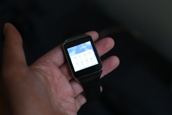
Then there’s the Gear Live’s overzealousness when it comes to demanding your attention. By default, the screen is always on. That makes sense, considering the primary function of a watch is to display the time so you can glance at it. But there are two levels of “on” for the Gear Live — a mostly black screen with white numbers showing the time, and the colorful Google Now-like interface shown in most demos.
Even though the mostly black screen is fine at a glance, the Gear Live really wants to jump to that latter level. It makes me want to check to see if there’s a new card waiting for me whenever it lights up — I mean, why would it if there weren’t something worth seeing?
Unfortunately, that’s usually not the case. The screen would light up, I’d swipe to see what Google thought was so important for me to see, and there’d either be no cards waiting for me or a card telling me the weather in my current city. Useful in the morning or before I head out for dinner, but not enough to be worth drawing my attention multiple times per day.
My Basis, on the other hand, always has the same two things showing when I check it: the time and a small graphic representing how close I am to reaching my daily step goal. The interface is essentially as complex as an old-school pedometer, with steps, calories, and heart rate always a tap away. I never have the problem of hoping to see something only to be disappointed.
If we’re going to all have smartwatches tied to our phones, they should be designed with that paradigm in mind. They should expect us to already have a constant stream of interactive data coming in at all times — which means that when we look at our wrists, it should only show what’s really important in a particular moment.
For what it’s worth, Google has shown that it realizes apps have to be different on this new form factor. In a session at Google I/O, it told developers to be mindful of their impact on user battery life and time, suggesting ways that they could keep the amount of time interacting with an app to a minimum. On its Design Principals page for Android Wear developers, the company also suggests how developers can “focus on not stopping the user” and avoid being “a constant shoulder tapper.”
So it’s probably pretty likely that these first apps aren’t representative of what users will experience once developers figure out what they need to do differently. Eventually, I imagine I won’t get a notification on my wrist every time I’m mentioned on Twitter while I’m at work because Twitter will see that I just favorited something on Tweetdeck in my browser. Same thing with not having anything to look at when I unlock my screen — eventually, there will be so many apps with information waiting for me that I’ll have the opposite complaint.
As for the aggressive attention-seeking of the device itself, Google simply needs to be a little more thoughtful with its presets. Yes, I could change a setting so that my Gear Live’s screen isn’t always on by default, but that eliminates the benefit of Android Wear being “glance-able.” I’d rather it only dropped me into the card interface if there are actually cards with information I haven’t seen yet.
I’m not particularly worried about Google Now on Android Wear, either. It’s probably the best example of Google’s “walk right up to the line of what’s considered creepy and stop” philosophy in action. Just guessing here, but it wouldn’t be surprising to hear that they’re already collecting data on how often people use various cards to determine what’s worth pushing to your wrist in the future.