 As consumer applications continue to migrate from the desktop to the Webtop, one of the most advanced areas where this trend is taking hold is in photo-editing software. Desktop editing apps like iPhoto, Picassa and even Photoshop are giving way to Web-based apps like FotoFlexer and Picnik (and many more).
And the Webtop photo editors just keep getting better. Today, FotoFlexer released a completely revamped user interface, making it simpler and more intuitive. FotoFlexer also added a bunch of effects, such as the ability to type directly onto a photo, add animations, and choose from more frames. Once you finish tweaking your photos, they can be posted all over the Web (Photobucket, Facebook, Flickr, SmugMug, etc.)
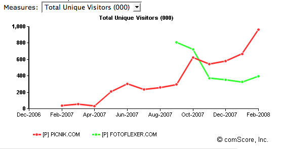
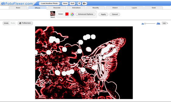
I made the image above in about 30 seconds. (You can play with it here). The tabbed UI is really easy to use, and there seems to be a lot of effects and layers that you can add. I am not so crazy about the animations, but I think those are supposed to appeal more to young girls. All in all, though, the functionality that is available for a Webtop app is pretty impressive and the new features and functionality should make it much more competitive with Picnik. Which one you use now is really just a matter of personal preference. (FotoFlexer is more tightly integrated with Photobucket, Picnik is baked into Flickr). I like Picnik. Mike prefers FotoFlexer. But as the traffic graph below shows, more people agree with me.
The fact is that FotoFlexer is getting trounced by Picnik. According to comScore, FotoFlexer only had 396,000 unique visitors worldwide in February, compared to 966,000 for Picnik. This new UI could help it turn things around. And just in time too, because a big new entrant to the Webtop photo-editing game is debuting tomorrow (more on that later).