
After my recent article about empty states, I was lucky enough to get an interview request from Holly Jade, a user experience (UX) designer with serious credentials including TEDx, Apple and Google. During the interview, I went into terrified rambling mode.
Holly is putting together a kind of primer for those involved in UX design called UXONOMY. The idea of the project is to clearly define UX, which she says is such a young field it’s wide open to interpretation.
I’m not often put on the spot and asked in real-time what I think. After all, I’m a writer. I spend hours formulating my points and even longer subconsciously developing an idea. Anyway, inevitably I was asked what compelling UX is. “Compelling UX is designed in a way that does not cause a disconnect between expectation and reality,” I said.
How pretentious, I thought. Now I’m alone and thinking straight, let me try to clear it up in writing.
The disconnect between expectations and reality
Have you ever come across an app that seemed ideal? The copy on the landing page is crystal clear and promises to fix your problems in the exact way you’d like. The screenshots show a simple and powerful UI, with intuitive navigation and a clear connection between trigger and action.
A minute later, you’re signing up for a free trial of the pro plan and soon you’re inside the app.
“Bloody hell. I thought it’d be decent but it’s terrible. Right, well. Off to their competitors.” I’ve certainly done that before. I bet you have, too.
That’s because the environment of a landing page is perfect for sucking you in, drawing you further down the page and exciting you before hitting you with a call-to-action. The format is good for getting new users. It’s not good for honesty, reality or setting users up to stick around for long.
How do you create expectations and reality?
This article is about the disconnect between expectation and reality, and how a misalignment between your design, writing and development can ruin everyone’s hard work.
Expectations are created by:
- Your landing page
- Marketing material
- Your pricing page
- Advertising
- Social buzz
The reality is:
- How it feels to use your app
- The benefits of the app in line with its features
- How the app works
I’ll look at the ways you may be misleading your users and increasing the likelihood that they will churn out before giving your app a chance.
In the next part of the article, I’m going to look at the reasons why this disconnect causes so many problems, and what you can do to fix it.
The principle of least astonishment in UX
After I got off the phone with Holly, I started looking around for the real term for what I’d been talking about. As it turns out, there’s a theory known as the principle of least astonishment (POLA).
if the designers, developers and writers aren’t aligned in their vision, there will be <span class="il">astonishment</span> somewhere down the line — and not the good kind.
Much of the material I found about POLA was from years back, some as old as 1999. It’s crazy to think that this topic hasn’t been addressed in the open for that long, especially when it still applies today. What it means is that design should behave in the way the user expects it to behave. For example, you wouldn’t expect to have to use your finger to draw numbers into a calculator or for a blue underlined piece of text to be anything other than a hyperlink, so it’s better to be traditional than to create friction.
Astonishment from the user journey and interaction
An interesting way of reframing UX is to think about it as a journey starting from before the user ever gets inside the app. That makes marketing a big part of it and puts the responsibility on designers, developers and writers in equal measure. Because if the designers, developers and writers aren’t aligned in their vision, there will be astonishment somewhere down the line — and not the good kind.
Once users are in your app, they are in a self-contained environment which is much more controllable. Now the issue isn’t their external expectations as much as it is their interactions. As Peter Seebach wrote for IBM back in 2001: “Navigating pages is all about identifying the objects that have functions, figuring out what those functions are, and then hitting the button as hard and as often as you can in the hope that it’ll do something.”
Even 15 years later, and in apps instead of web pages, this statement makes sense and doesn’t feel dated. Designers still face the same challenges as they did when there wasn’t much variation to astonish users with — to quickly communicate the “where” and “what” of a UI.
Since the brain loves familiarity (until it gets outright sick of it), connecting UI elements to universal actions is a solid way to quickly onboard users. Unfortunately, you don’t always have control over what kind of influences your users will bring with them.
Astonishment from expectations outside of your control
Maybe a calculator that only accepts input from you drawing on the screen seems like a great idea to you, but because this madness isn’t common practice, the user has expectations from the outset that aren’t in your control.
As Scott Berkun says in his 1999 essay How to avoid foolish consistency: “People don’t like to learn things. If they take the time to learn something, they expect to be able to apply that knowledge in many places. It follows that good designers conserve the number of things users need to learn to get stuff done.”
An example of this in practice from my own experience: After buying a smartphone recently for the first time ever (don’t laugh), I was excited to install Inbox by Gmail. It was the only mobile mail app I’d ever used, and since it needs activation on mobile first, I switched from Gmail to Inbox on desktop and mobile.
Because I was used to the swiping right and left to process emails in Inbox, when I decided to try out Gmail for iOS, it seemed ridiculous to me. In Inbox, swiping archives an email or a group of emails, whereas in Gmail it only brings up the option to archive.
This might not have been a problem if I weren’t already used to Inbox, but Gmail feels clunky and counterintuitive because of that. Consider, from a UX perspective, which competing apps your users could be switching from. Are gestures in those apps smoother, with fewer steps and less friction to get the same job done?
Now we’ve worked out the nature of the problem, let’s look at some ways to fix it.
Align UX and marketing: communicate the value, but don’t oversell it
There are two main factors to the marketing material surrounding your software that will influence users before they interact with the app itself: copywriting and visuals.
“When copywriting isn’t paid proper attention, products can fall into the trap of being all style and no substance,” says Art over at GatherContent.
I’ve worked on projects in the past I didn’t care about, and when you’re tasked with something like that, it’s just easier to oversell it and not bother about the reality of the product. After all, if you’re not convinced yourself, you won’t convince others so easily.
While copywriting, according to Wikipedia, is “often used to persuade a person or group,” from a UX perspective it should first focus on pure honesty. After all, if we’re going by the POLA, if it’s your copy, your landing page and your “social proof” that’s astonishing, your app can only be disappointing. That means you might get more sign-ups but your drop-off will be bigger.
Your user‘s first interaction is when they find out you exist
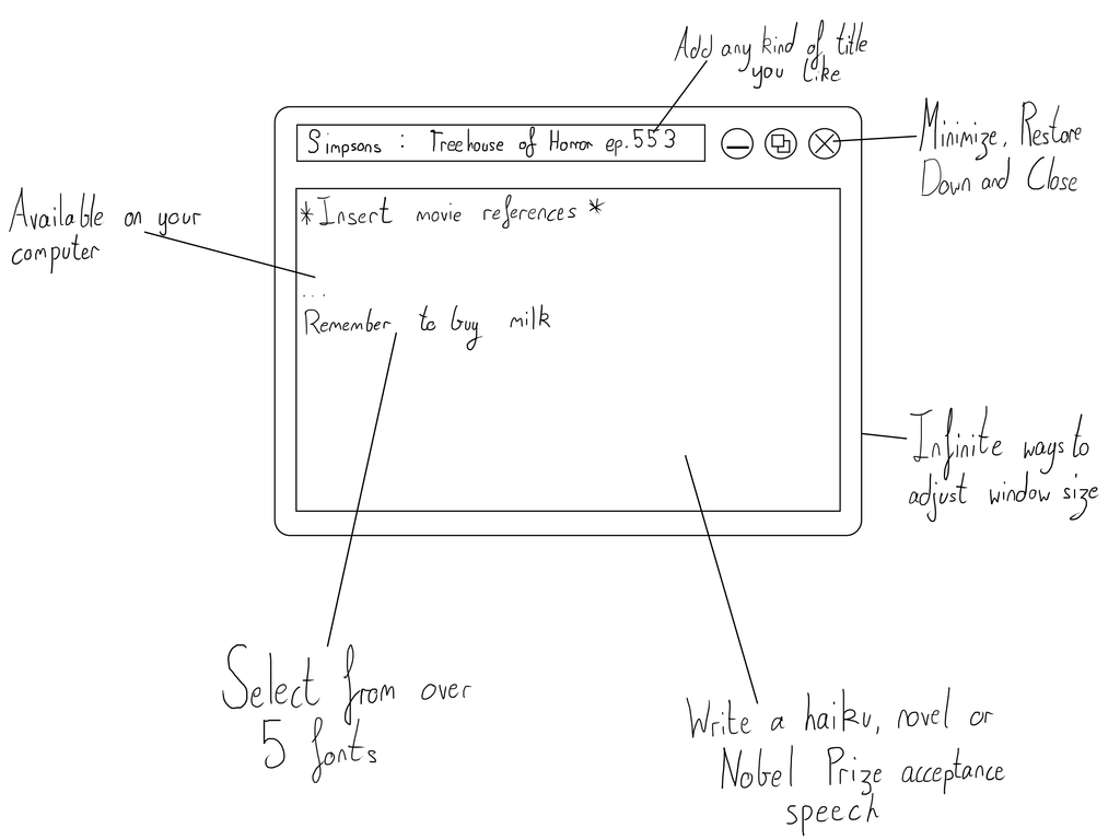
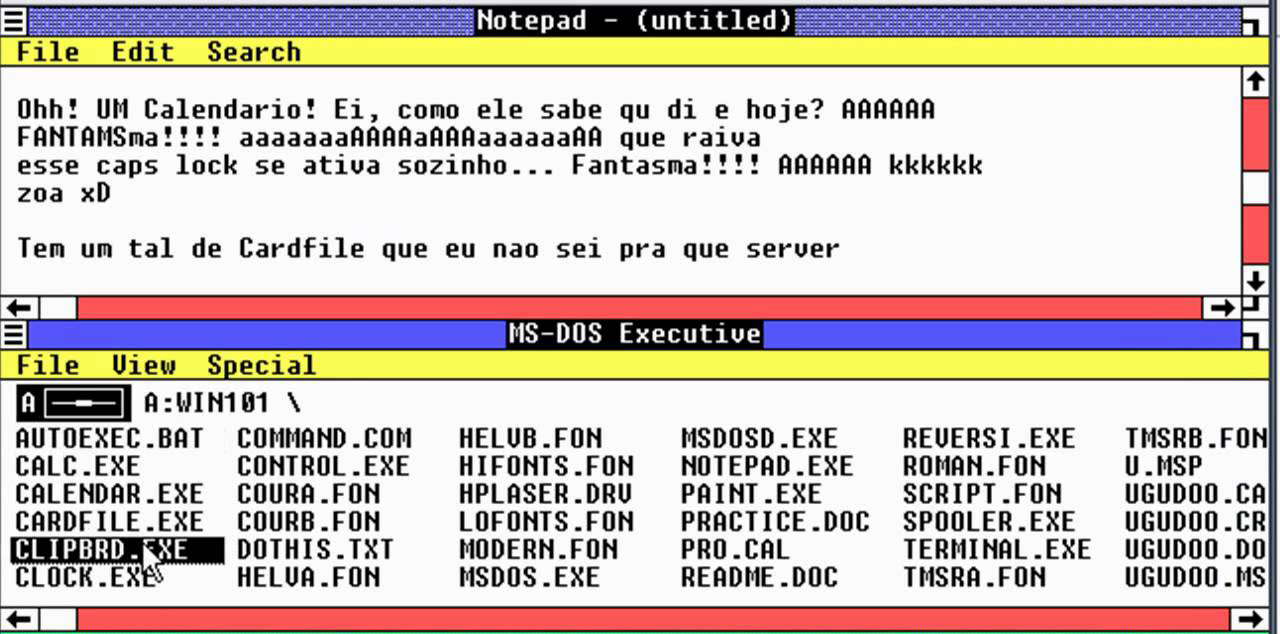
Going back to the hilarious idea of a landing page for Microsoft Notepad, if that’s the first thing an unwitting future Notepad user sees, they’d be in for a terrible shock.
What’s the most common first point of contact for your users? For most companies, it’s their landing page, so that’s where the demystification should take place. Even if there are false representations in other places such as social media, with an honest landing page you can prove the rumors untrue in a snap, for better or for worse.
When a user finds out you exist, you’ve got to consider what impression you’re giving them. Even a modern, flat website for a dated app can make the difference between creating the wrong expectations.
The idea that design shouldn’t astonish is controversial.
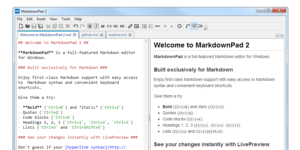
Another example from my own experience: I have been using a markdown text editor, iA Writer, on my phone. In my quest to write more efficiently, I was seeing if I could find a Windows alternative to it and saw this question on Quora: “Is there a good, minimalistic, markdown-enabled writing application for Windows? I use a Windows PC, and envy certain Mac apps, such as iA Writer and Byword. Are there any alternatives for Windows? I especially like the instant Markdown support and focus features of these apps.”
The first answer had suggested MarkdownPad. I expected that it will look like iA Writer, but I saw that it looked like this:
Who’s fault is this? Not the developer’s — just my own (and partially Microsoft’s).
Even though the developer has me prepared for how MarkdownPad will look by hiding nothing on the landing page, I’d foolishly expected things to be different. (After coming to terms with the fact that it’s just how Windows apps look, I went back and downloaded it anyway.)
You can’t control every expectation a user might have, and, as we’ve seen, there are some ways to stop expectations damaging reality. With this said, could the POLA be dangerous for progression?
Problems with the principle of least astonishment
The idea that design shouldn’t astonish is controversial. After all, it’s an art form and a kind of communication, and if you were to have told Marcel Duchamp not to sign a urinal because it will astonish, he would have told you to fuck off.

With that said, it’s useful to take a look back at Scott Berkun’s essay on foolish consistency which defends the need for a change sometimes — something I’d agree with because otherwise we’d still be on the command line or cutting magnetic tape to edit videos.
He says that in rare cases, going along with the POLA is pointless conformity. For similar, yet functionally different UIs, stretching them to feel the same for the sake of consistency would be ridiculous. Berkun gives the example of the UI of Pac-Man and of a driving game, which are both games but need to be operated in different ways.
Users vs. Humans
Even though an abandoned WordPress blog is truly one of the saddest things I can think of, the great thing about researching these fringe topics is coming across blogs you never knew existed.
It was on an abandoned blog I found this nugget of a quote from Louis Dietvorst:
“We name him/her the User because we think he/she “Uses” our software. And just build the system the way we think it’s nice. The User should just accept that. We don’t like to ask him or her because that only might introduce “complaints” and “delay” to our work … bury the word User, because it’s not users we want to interface with, but Humans!”
The fact is that humans open themselves up to “pain” and “discomfort” (if you can say that about using software). We don’t care that the secret to happiness is low expectations and are determined to be disappointed by pretty much anything.
It seems strange to say that you shouldn’t surprise your users, but design has more in common with communication and facilitation than a signed urinal.