
I’m not much of a designer. In fact, I’m awful at it. I am, however, interested in how it’s done. I read and write plenty about customer success; along the way, (somehow) I found Samuel Hulick’s site UserOnboard.
His detailed descriptions of the user onboarding process in popular apps give designers an idea about how some of the most successful apps in the world keep you from quitting, becoming frustrated or getting no value. It leads by example.
After being introduced to Samuel’s content, I came across a tweet of his linking to the site emptystat.es, a collection of empty state screenshots that’s been taking user submissions since 2013.
With my brain still whirring from writing about user onboarding, and equipped with Evernote, I set about collecting material to write a post about what has been called the most overlooked aspect of design.
What Are Empty States?
An empty state is what the user sees when there is no data to display on the screen. This could be because:
- The user has only just signed up.
- The user has cleared the data themselves.
- There’s been an error.
We’ll quickly go through some examples of these three different kinds before taking a deeper look into how empty states can help increase retention and ensure users get the most out of your app.
Gmail’s New Sign-Up Empty State
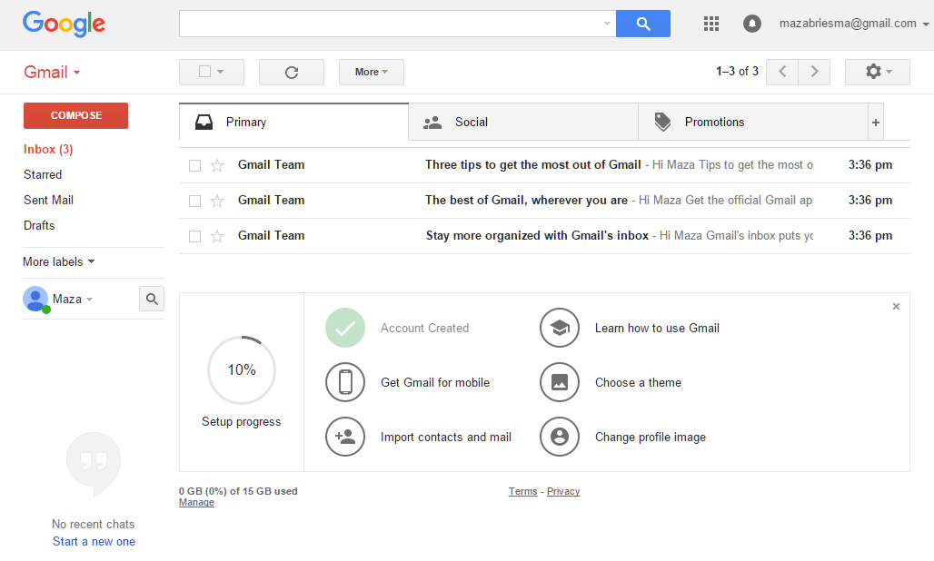
The way Gmail onboards new users is great, but what happens when you (eventually) end up in the app itself? Well, it gives you further information in the same format you’ll be seeing it in the future: emails. It also sends instructions on how you can get more value out of the app, all designed to increase user success (and subsequently, retention).
Process Street’s Zero Data State
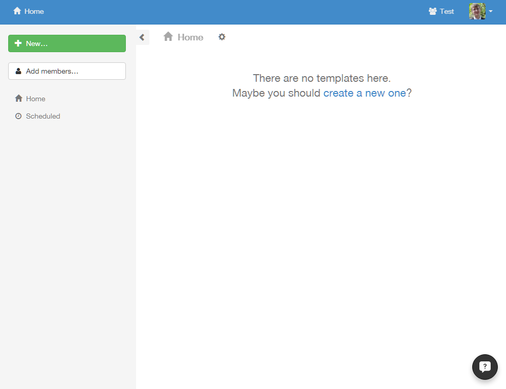
Like a lot of apps that rely on the user creating their own content, Process Street’s zero data state tells you how you can populate the app. Templates are the core of Process Street, and without them, there’d be no checklists, no need for folders, tags or… you get the idea.
Eventbrite’s Error Page
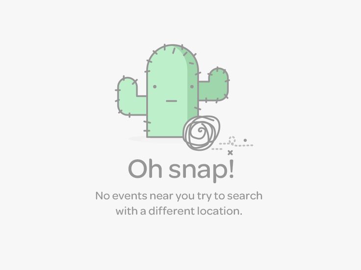
Even though it’s set in a desert wasteland, this empty state error message is inviting, helpful and full of life. Unlike, some error messages, it tells you what you should do next. Nothing in your app should be a dead-end.
The What, Why And How Of Empty States
A useful empty state tells you what it’s for, why you’re seeing it, and how you can fill it up. There are more elements that we’ll look at later, but an empty state should be useful first, amazing second.
When designing, think of those three questions (what, why and how) as the formula for re-engaging your user, but also keep in mind that it’s the bare minimum requirement for an empty state.
Getting The User’s Attention With Empty States
This is a big one. It’s the most efficient way of continuing your onboarding process’ good work and keeping your valuable users sticking around. As I said at the start, empty states can and should be used to (re)engage your users and help them get success.
How can empty states be used to get attention and drive engagement? Well, what’s the first thing you’d be thinking when you land here?
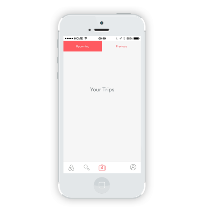
Very empty. No trips. This tells me what the screen is for, but nothing else.
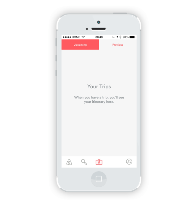
Okay, so that’s why it’s empty, but the fact I’m here probably shows I don’t know how to add a trip.
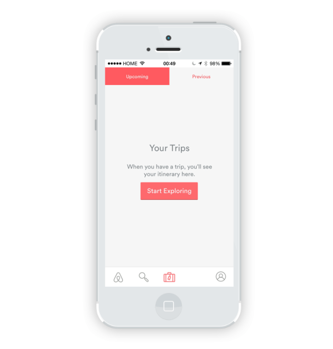
Bingo. This obvious button and fitting CTA copy tells me how to solve my problem. If I just saw that I had no trips, it’d feel like the app was being deliberately unhelpful.
Let’s do this again with another app.
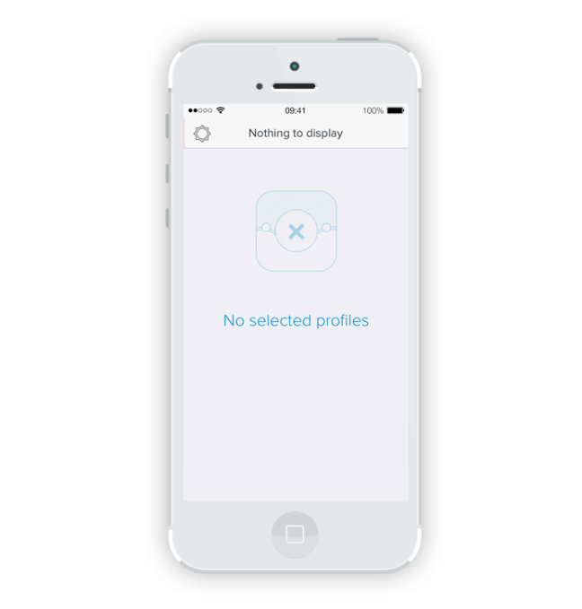
Zero data and zero help. It tells me what the page is for — displaying selected profiles — but nothing else.
Now I know why I’m here, but not how to solve my problem.
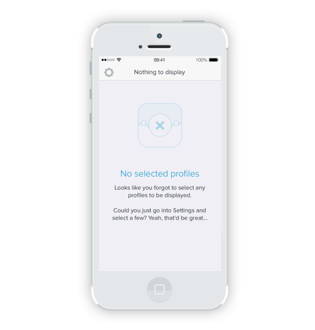
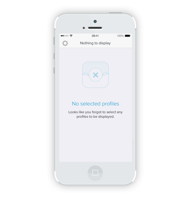
Is it just me, or is this app being sort of rude? Anyway, helpfulness is what we like. Now we know how to fix our problem and fill the empty state with valuable data. Both of these examples follow the same what, why, how formula.
Personality And Benefits Are Icing On The State
There are two more things that there’s room for in empty states, and that is personality and benefits. Personality makes your app memorable and pleasurable to use. Benefits help communicate why your app is useful to the user, which increases retention and solves user onboarding issues.
Khaylo Workout
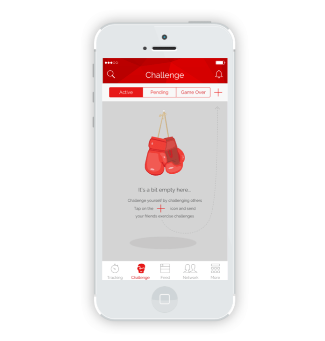
This tells you what it is (an empty Challenge screen), why it’s there (because you haven’t challenged any friends) and how to fix it (tap the + icon). But that’s not all. This empty state communicates the app’s personality with aesthetically pleasing graphics and conversational language and tells you the benefits of challenging others.
Let’s take a look at another great empty state that ticks all the boxes.
Beamly
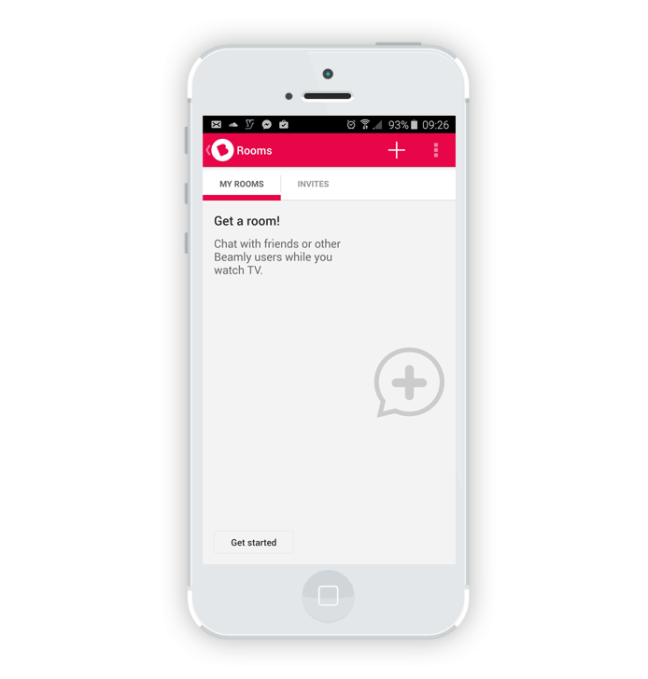
I’ve never used Beamly, but this empty state was so helpful I know exactly what the app does. On top of the three basic components (what, why, how), it sneaks in a fun remark and explains the core value of the app to new users or returning users that need a handy reminder.
Working Brand Personality Into Empty States
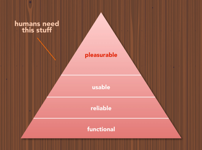
Empty states are an excellent opportunity to make a human connection with your users and get across the personality of your app. Just like how web designers like to get creative with 404 pages, empty states are no different. Emotional-design guru Aaron Walter turns to the hierarchy of human needs for an explanation of what makes an app’s user experience successful; while your app should be functional, reliable and usable, it also should be pleasurable.
According to Smashing Magazine’s Simon Schmid, there are a lot of ways to make a user’s experience pleasurable. I’ve narrowed down the list he made to the most relevant kinds of pleasure you can offer with empty states:
- Positivity. See the article “What Are The Top 10 Positive Emotions.”
- Surprise. Do something unexpected and new.
- Uniqueness. Differ from other products in an interesting way.
- Attention. Offer incentives, or offer help even if you’re not obligated to.
Using Emotion In Empty States
Going back to the topic of inboxes, I noticed something interesting about the attitudes of different empty states; that is, how some inboxes congratulate you for making it all the way there while other apps encourage you to fill it up.
What kind of feeling your empty state conveys depends on the purpose of your app. Hangouts wants you to add content, whereas Outlook (with its Focused inbox, designed to help you read everything important) wants you to remove it.
Hangouts
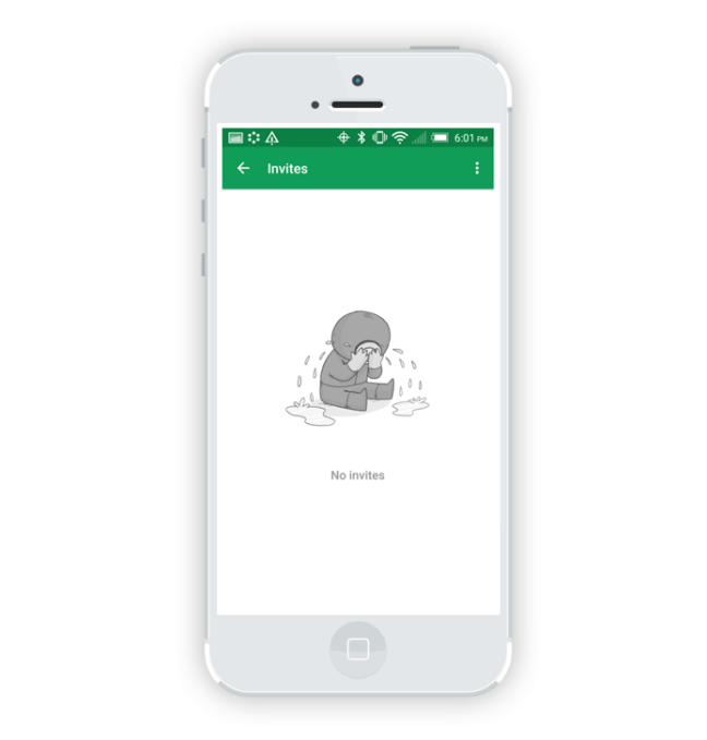
Whatever this thing is, it’s sad. Is that an incentive for the user to get invites on Hangouts? Design works in mysterious ways…
Outlook
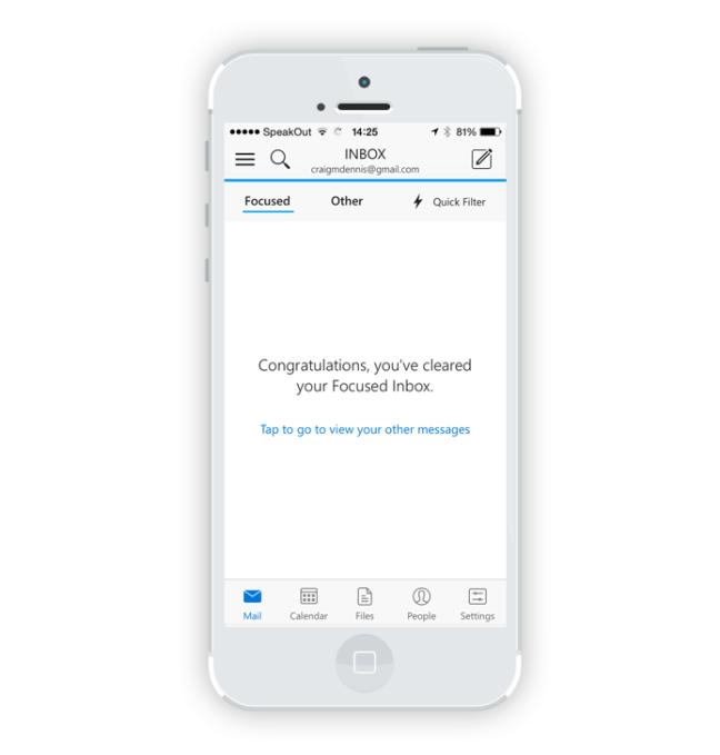
You’ve achieved success with the feature. Definite positivity.
Surprising Users With Empty States
It’s probably fair to say that most error messages come as a surprise to users. Why not use this surprise to delight them, instead of showing them something that feels like they’re not getting success out the app? After all, an error message isn’t what you want your user to be seeing too often, so taking a fun attitude toward it when it does happen could help lighten the mood.
Cognito Brain Training
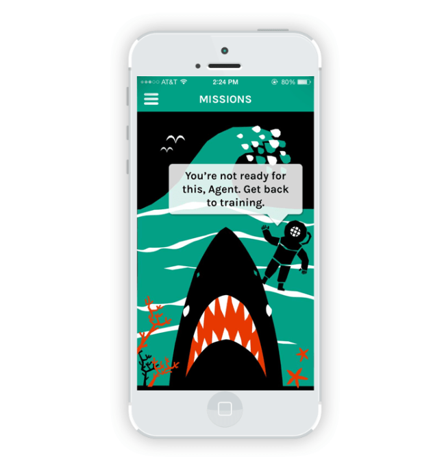
I’m always surprised to see a shark, regardless of the context.
Timehop
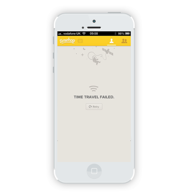
If you’re going to surprise me by saying my Internet connection’s down, at least do it in a cool way, like with time travel and stuff.
Conveying Benefits With Empty States
Finally, let’s leave the realm of design and delve in to more comfortable territory for me: copywriting.
The central focus of your first-use empty states should be (re)selling your users on the benefits of your app. Your user onboarding process won’t always go as smoothly as you planned, and it might be that after signing up, your app sits as a half-forgotten icon on the home screen for days, weeks or months before being revisited. A user who stopped using your app during or after onboarding is at the biggest risk of abandoning it for good, so make every effort to:
- Remind the user what your app does.
- Tell them why they should bother with it.
In other words, the old copywriting axiom of sell with benefits, support with features.
Note: If you want a quick overview of writing clean copy, check out another article of mine on business writing tips.
Now, let’s take a look at some great examples.
Basecamp’s Projects’ Zero Data State
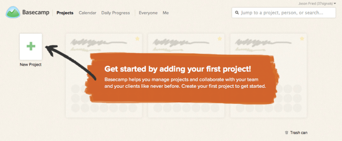
I love it when an app tells me what to do, how to do it and why I should care.
Dropbox’s Team Zero Data State
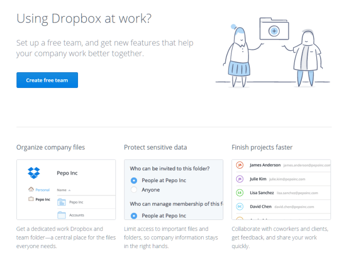
Dropbox’s copywriters are so slick. I have no use for this feature, but I did it anyway just to get more material for my swipe file.
What Are The Key Takeaways For Empty-State Design?
Because you made it all the way to the end, you get a special reward — a break from my rambling and a clear explanation of what I found while tearing through as many empty states as I could get my hands on. To recap, the basic questions an empty state should answer are:
- What is this screen?
- Why am I seeing it?
- How can I fix this problem?
On top of this, you should aim to:
- Communicate personality. Make your app a joy to use and connect feelings with features.
- Explain the benefits. This is critical for your first-use empty states so your users know why they should care.
Here’s where I found the empty states for this article: emptystat.es; UX: Empty States; UI Empty States.
While I’m still on the empty-states kick, if anyone has some particularly good ones, I’d love to see them. Leave them in the comments below, and thanks for sticking with me while I enthused.