All smartwatches owe a debt to Pebble; the startup, in its previous life, was building smartwatches for BlackBerry devices back when people still used those. The Pebble Time is the second-generation Pebble hardware released by the company, and it starts shipping out to early supporters of the Kickstarter campaign today. After a week of testing, on both iOS and Android devices, it’s clear that Pebble Time is a huge improvement on the original, but is that enough in a world where both Android Wear and the Apple Watch are ascendant?
Video Review
Basics
- 1.25-inch color e-paper display with LED backlight
- 40.5mm long × 37.5mm wide × 9.5mm thick
- Bluetooth 4.0
- 3D accelerometer, compass, light sensor and mic
- Up to 7 day battery life
- Polycarbonate case with stainless steel bezel
- 22mm standard watch lugs
- MSRP: $199, pre-orders begin at the end of June
- Product info page
Pros
- Category-dominating battery
- Slim, light design
- Cross-platform
Cons
- Third-party access limits on iOS
- Design definitely isn’t for everyone
Design
Pebble Time is shipping in two flavors, including a primarily plastic version that I received for review, and a Steel edition to follow at a later date. Even the entry-level $200 Time incorporates some steel into its look, however – that bezel surrounding the display is a stainless steel accent treated with a PVD coating for scratch resistance and tone.
[gallery ids="1161917,1161919,1161941,1161915,1161916,1161914,1161913,1161912,1161911,1161910"]
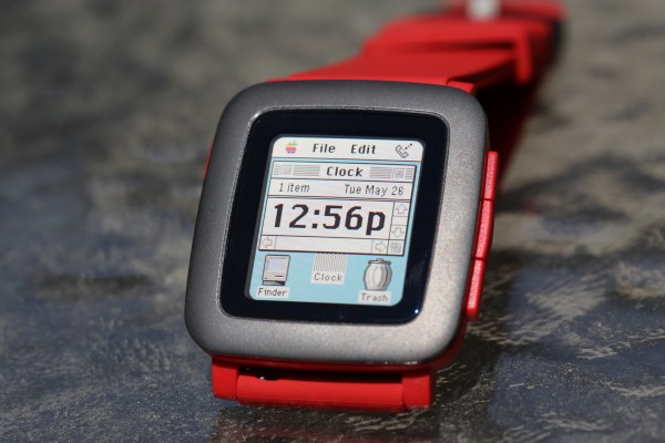
My review unit came in the race car red that Pebble offered as one of three options to Kickstarter backers (I also backed the project and chose the all black model for my personal unit). The red is bound to be noticed, and is definitely the most flamboyant of the color options, but the PVD-treated stainless steel bezel, which uses the same charcoal/black finish as the all-black model, does a good job of complementing the bright band and body combo.
The industrial design on the Pebble Time offers both some of its greatest strengths as a device, and its greatest weaknesses; the hardware is very light, and surprisingly small and thin. It takes up roughly the same space on your wrist as the 42mm Apple Watch, but it’s a lot thinner, with a concave back that molds to your wrist.
That said, it’s also very plastic – from the rubber strap that ships as the default option, to the hard polycarbonate case that makes up the back and buttons of the device, there’s plastic everywhere, and none of that leads to a particularly luxurious feel. It tends to give the Pebble a toy-like quality, which is probably not going to be appreciated by many potential buyers.
It’s still a big improvement overall from the original Pebble, but it’s likely to continue to appeal to that same audience – dedicated tech fans who are looking for something utilitarian with a bit of geeky flair.
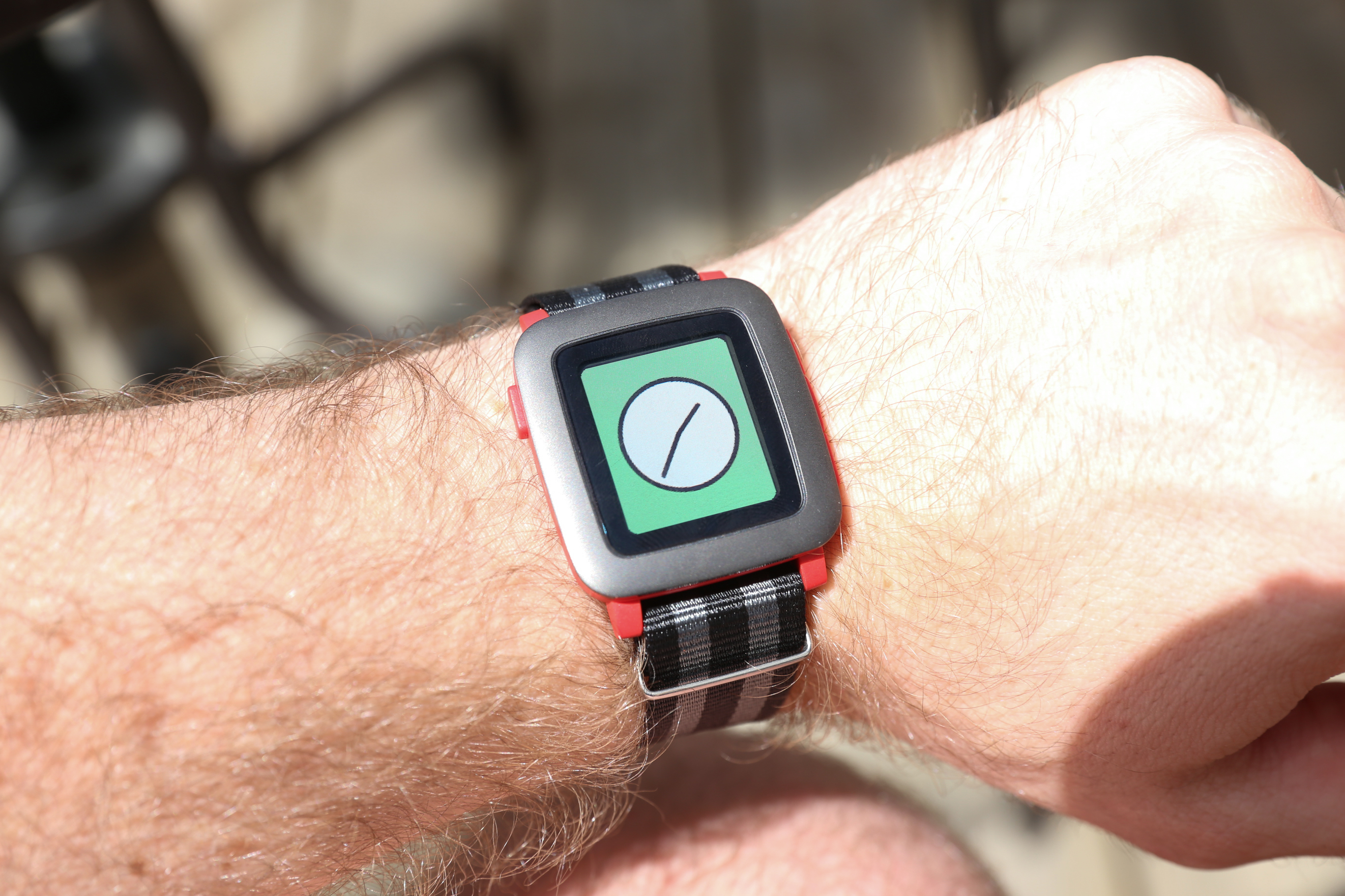
Durability is a big plus with the Pebble Time, and its water-resistant design which lets you swim with the watch, combined with a tough exterior that is so far showing no signs of wear (despite many accidental bashes and scrapes) is testament to that. The other big advantage here is support with existing, standard 22mm watch bands, like the NATO-style strap you see in the pic below. You’ll need watch tools to use it with non-quick release pins (it ships with those in the default strap, luckily), but it’s still way better than forcing people to use proprietary bands in terms of personalization.
Features
Pebble Time is a lot like the original Pebble when it comes to features, and that’s a good thing. The smartwatch pioneer achieved more success than its peers by understanding before most what users are looking for in this kind of wearable – a connected watch helps us most when it stays mostly out of the way. Until, of course, we need it.
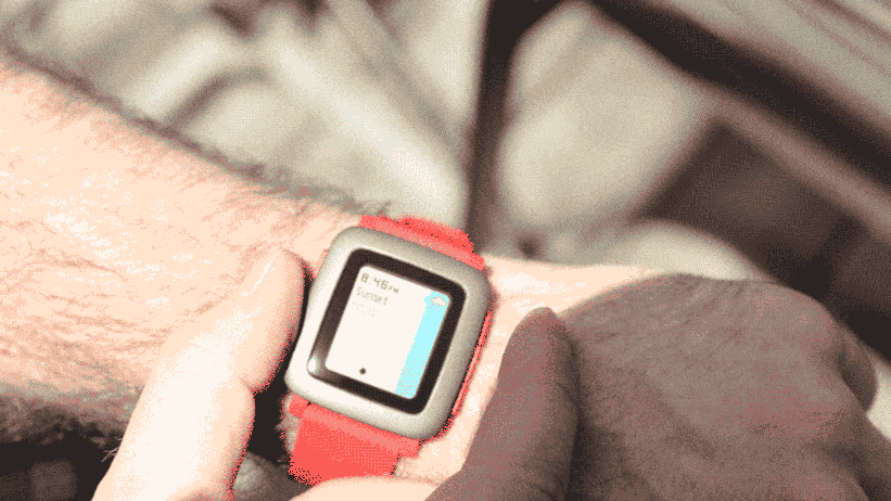
Pebble Time takes that even further, thanks to the new “Timeline” design, which essentially relegates apps to a secondary role in practice. Generally speaking, most users will have little reason to ever leave the watch face, except when they press up and down on the side buttons to go back in time, or to move forward and see appointments and more on the horizon. For each of these, there’s a time stamp and a brief description, with a center button press revealing more info, as well as the ability to mute Timeline notification types and jump to relevant apps.
The timeline is a smart, capable innovation on this new Pebble, but it shines especially well when developers actually use it. Apps that support timeline will pop up notices in your stream when relevant, as determined by time of day, location, or some other contextual signal you specify. These live alongside things you’re probably already expecting to see, like notifications of upcoming calendar appointments.
Pebble has solved one of the biggest usability problems of the previous generation with this new timeline mechanic, making it unnecessary for you to go hunting through menu lists to find specific apps when you need them. That’s still possible, but it’s still very arduous, too, and there’s even less reason to bother now. You can also assign specific apps (as well as other native functions) to long presses on the up and down hardware buttons, making them available instantly.
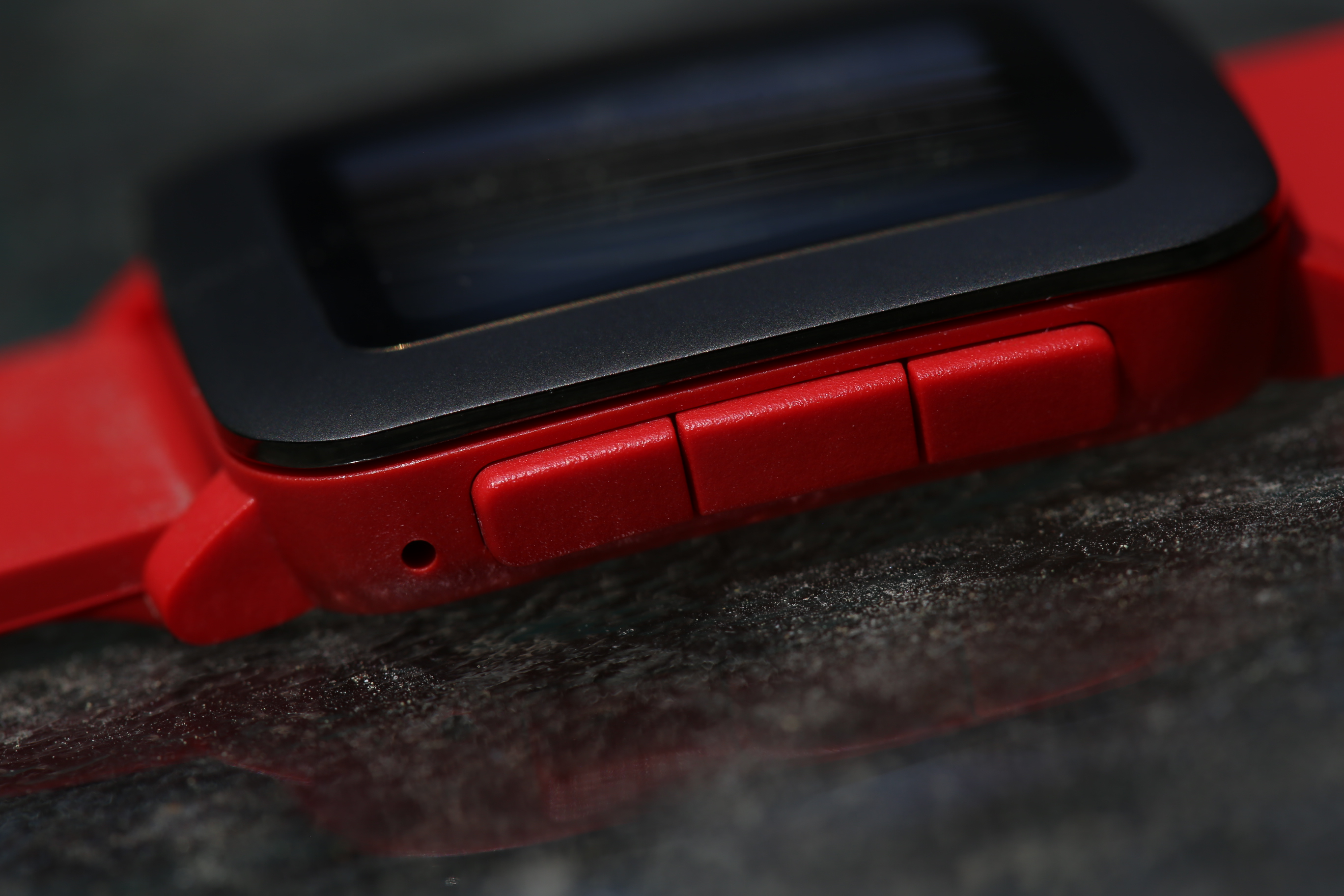
Those hardware buttons, and the lack of a touchscreen, are by now a distinct Pebble feature. The company has eschewed touch-based input in favor of physical buttons, and there are four total on the device, including the back/light button on the left and the navigation/action buttons on the right. After experiencing Apple’s Digital Crown and side button on the Apple Watch, these feel a little more old-fashioned, but they’re still better for navigating a tiny screen than what most Android Wear devices can offer.
Performance
OS
Pebble Time’s software is all-new for this device, and it shows. The most obvious change is that it now supports color, thanks to the new e-paper full-color display, but it’s also visually altered from top to bottom to provide a more refined, less low-tech look, with rounded borders on visual elements; big bold, Susan Kare-style icons; and animations that pepper the user interface wherever you happen to look.
Those animations are, like so many other things about Pebble Time, somewhat of a double-edged sword. Initially, they’re very nice, achieving a smoothness that you might not think possible on an e-paper based display, which by its nature doesn’t have terrific refresh rates. But over time, you do grow somewhat tired of seeing them between each and every screen, since they take a non-trivial amount of time to execute, and involve basically wiping and redrawing the screen with every transition.
Personal taste will enter into how you feel about these; I wouldn’t mind the ability to turn them off, or at least dial back how often they appear, but I’ve spoken to others who found them either extremely off-putting, or a nice UI flourish that helps differentiate Pebble from its various competitors.
Apps, watch faces and timeline all seem responsive and snappy. The exception is that Pebble now doesn’t limit you to a set number of watch faces or apps, but instead rotates out which ones are stored locally based on how long it’s been since you last used them. This means that if you haven’t used something recently, you may encounter a loading bar when you try to launch it instead of the app itself. It’s a minor annoyance on the whole, however, and far better than having to go to the companion app to load and unload software manually.
Display
That e-paper screen is quite the technical feat – the colors are mostly muted, but having color at all is a big accomplishment, and again, a key way in which Pebble Time bests its predecessor. Increased resolution also helps, but the color is what most people will notice straight away if they have experience with the previous generation.
Pebble Time’s screen is outstanding when you view it in direct sunlight. There’s no question that for outdoor use, this e-paper display trounces the competition in terms of readability. Pebble has avoided too much glare with its protective glass on the Time, too, which means this smartwatch is a primo beach buddy.
Indoors (left) vs. outdoors (right) makes a big difference for the Pebble Time’s e-paper display.
Every rose has its thorn, however, and the display’s is that it is mostly terrible in the reverse lighting conditions. Indoors, the screen is dull and gray, with washed out color and brightness that makes it tough to read even in fairly well-lit rooms.
Pebble has included a backlight in the Time to help with this, just like it did with the original, but this only makes things marginally better. The light never seems to activate on a wrist raise based on motion, even when that option is turned on, and the button press does improve visibility, but not in a way that makes the screen look much better. Having tested it indoors first, then taken it outside, I felt like my device had an entirely different screen in sunlight vs. when I originally set it up.
Battery
It’s hard to understate the advantage Pebble Time has in terms of battery vs. most current smartwatches; Pebble Time does indeed get the advertised week-long battery-life touted by the company (it lasted just two days short of that using the original 80 percent charge my review unit arrived with).
Seven days on a single charge feels luxurious.
That extended battery life has a few tangible benefits, including the fact that you can bring it on a multi-day trip and leave the charger at home, which is not insignificant for frequent travellers. It also means you can wear it at night to track your sleep using apps like Misfit, though I find that unpleasant with any sort of wrist-worn wearable, and the Pebble Time is no exception.
Still, seven days on a single charge feels luxurious, no matter what you end up doing with it. At the very least, it’s nice that forgetting to plug in at night won’t mean you’re definitely going to run out of juice the next day, and that can be extremely valuable if you’re leaning on a smartwatch at a multi-day event or conference.
Apps And Software
The native apps on Pebble Time are more than enough to make the case for the device’s existence for users seeking a way to stay more connected to their digital world. Calendar, SMS, phone and other default services, including built-in activity tracking, will probably serve the needs of many potential users. But platform makes a big difference here.
On iOS, the Pebble Time is improved vs. its predecessor, with more robust connection support that means I never once missed a notification on the Time when comparing it directly to the Apple Watch. That’s big, because one of the issues many had with the last generation was inconsistent connectivity.
That said, Apple limits what Pebble Time can do with notifications in a way that Android doesn’t, and that means it can’t play in the same sandbox as the Apple Watch. You can’t dictate replies to incoming messages on Pebble Time on iOS, for instance, not even with canned messages.
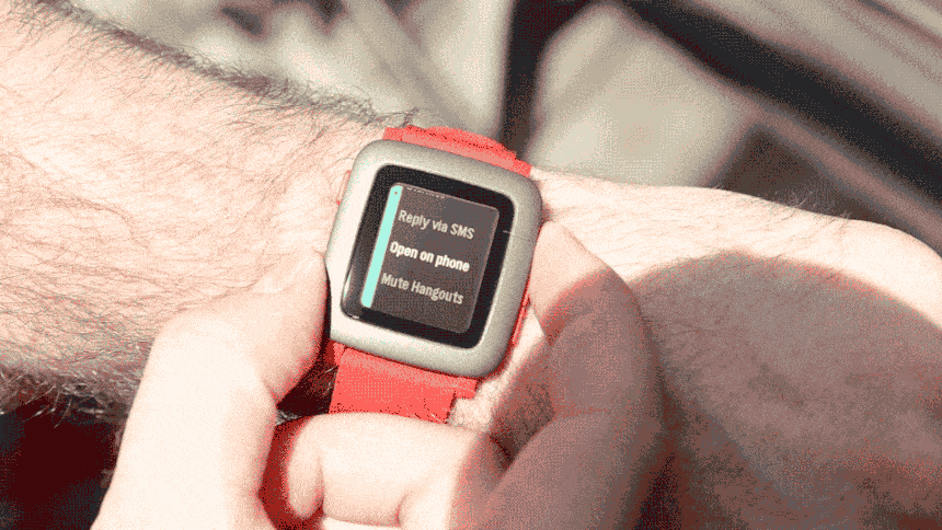
On Android, you can do both those things, as well as send emoji in response to messages; you can do this even if you don’t use the stock messages app as your default option. You can also use the same kind of actions available on your Android device with inbound notifications on apps, just like you can with Android Wear devices, because Google makes those features available to third-parties.
For iOS, Pebble Time’s appeal is definitely faded in the presence of the Apple Watch, especially when it comes to dedicated third-party apps. Apple has a much easier time attracting top developer talent, while Pebble Time has some excellent third-party apps, including one that plugs into Uber, but nowhere near the depth of catalog and not as many big names.
On Android, that hardly matters, and your smartphone platform choice will ultimately make a big difference in the software experience of using Pebble Time.
Bottom Line
Pebble Time is a solid improvement on the original, and one that shows Pebble has earned its reputation as one of the more mature players in this space. That said, its unique design, in terms of both hardware and software, is likely to appeal to a more niche audience compared to something like the Apple Watch, specifically, and likely will please existing Pebble devotees most of all.
It’s also easily my favorite smartwatch to use with Android, beating the existing crop of Android Wear devices by a large margin. The slightly whimsical visual look of the device, as well as its natural suitability for geeky watch faces like the ones I’m using in the videos and images above, combined with the extensive support it enjoys for actionable notifications, makes it a great fit for Google’s mobile OS.
That’s why I recommend the smartwatch for Android users looking for a wearable, and for platform switchers who want something they can use with both; Pebble’s latest, despite its flaws, is bursting with utilitarian charm for those who enjoy its quirky looks.