
Resistance is futile when it comes to Facebook. If your feature benefits the social network’s 1.44 billion users, it doesn’t care if you built it for a smaller audience first. Whether it’s Twitter’s Follow button and verified profiles, or Snapchat’s disappearing photos you can draw on, Facebook will quickly try to assimilate the competition.
Call it a coincidence, call it inspiration, or call it copying. Sometimes there’s a definitive “right way” to build a social app even if it’s been done that way before.
One of its favorite apps to crib designs from is Path. A Facebook employee even said on stage that “Facebook is trying to copy Path.”
While many features get hammered out overseas by Asian messaging apps like Line and WeChat, Path has seen some features that it brought to the U.S. suddenly end up in Facebook. For instance, rather than having to type “Ok,” it let you tap the send button on an empty reply to deliver an affirmative check mark. Facebook then did the same with its Like Thumbs Up in Messenger.
And last year, Path began letting users instant message with businesses rather than call them. A few months ago, Facebook announced a similar “Businesses On Messenger” feature.
Now, Facebook is testing a redesign for its wildly popular Facebook for iPhone app that borrows more from Path. The change sees the Messenger shortcut button at the bottom center of the screen replaced with a “Post” button. When tapped, little icons for “Take Photo,” “Check In,” “Share Photo” and “Write Post” fly out of the Post button. This lets you quickly select what kind of post you want to create without cluttering the screen with a button for each category.
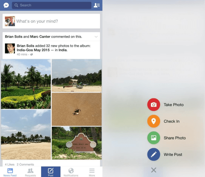
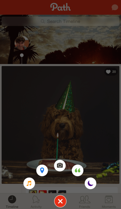
The new Facebook For iPhone design being tested
This “flyout menu” was one of Path’s most lauded design tricks when it launched back in 2011. Dreamed up by iOS engineer Daniel Davis and designer Dustin Mierau, it was so popular with designers that some open sourced their own bootleg versions.
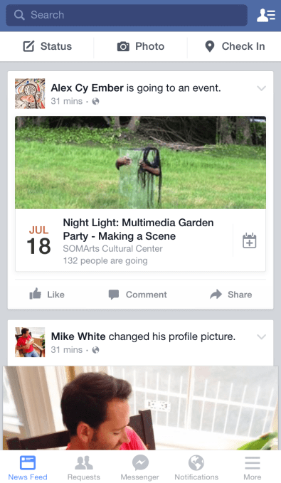
Facebook’s existing iPhone design
The navigation design test also puts the shortcut to Facebook’s Messenger app in the top left, which might help it avoid getting lost among the in-app buttons.
Facebook’s entire mission and business model relies on users volunteering their content. But with content creation apps like Snapchat on the rise, Facebook might find that content slipping toward other social networks. I know I’ve begun posting less to Facebook and more to Snapchat Stories.
By rejiggering its mobile design, Facebook could remind people it’s still the path to sharing with all your friends.
[Image Credit: Ruben L. Oppenheimer via CourrierInternational]