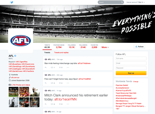
Twitter has been testing a new profile design with a more Facebook-like cover photo and overall look, and now that design is rolling out to all users. The company announced the overhaul in a blog post today, highlighting its new features, which include a number of new ways to view and interact with Tweets.
Your profile pic and customized header are now larger, and you can tweak your color scheme slightly in terms of link highlights, but you lose the ability to set a custom background image. BG pics were a bit of a holdover from the MySpace era, but they could be put to useful ends, as with our masthead on the TechCrunch account, or with others who use it as a sort of personal contact info listing. Ditching them adds a more uniform look to profile pages, and is probably better for new users, something Twitter is investing in heavily lately.
As for content, the main Tweet timeline on any profile page now shows content that’s more popular in slightly larger font, drawing even more attention to stuff that’s been retweeted or shared a lot. This only applies to your own content, and not the content of others that you retweet, it’s worth noting. Users can also pin one tweet of their choosing to the top of their timeline, as a way of showing off the type of content they’re proud of, and as another way of telling an audience what you’re about besides the bio.
Navigating the tweet streams of others now offers a few more options, including the ability to see just tweets with photos and videos attached, or seeing tweets and replies.
New users get the redesign right away, but Twitter is going to be rolling out the new look to its entire user base over the course of the coming weeks. Twitter has been testing a number of redesigns over the past few months, including one that shared the look of the profile rolling out today, but with tiled content instead of a linear stream, and this seems to be a combination of some elements from various test pool buckets. It shifts profiles slightly further from the linear, time-based end of the spectrum and towards something more akin to Facebook, and is probably designed towards making the service more accessible to new users. It’ll probably meet with some criticism from existing members (what doesn’t?), but overall, it’s a look I like.