Jolla is a very small fish trying to make headway in global smartphone waters dominated by the whale-sized Android OS. In its plucky attempt to make a splash, building its own phone hardware as well as floating a new software platform, the Sailfish OS makers have crafted a device that’s different — sometimes refreshingly so — but the Jolla phone’s difference can frequently manifest itself as difficulty. The device asks its users to row against the current, requiring they accept a lot more that’s rough than smooth.
Basics
- 4.5-inch, 960x 540, 245ppi display
- 16GB storage
- Dual-core 1.4GHz processor, 1GB RAM
- 8MP rear camera, 2MP front camera
- 4G/LTE, 802.11 b/g/n Wi-Fi
- Bluetooth 4.0
-
- MSRP: €399/$540 unlocked, off-contract
- Product info page
Pros
-
- Can run Android apps
- Interface navigation can work well one-handed
- Impressive attention to smaller design details
- Swappable NFC backplates for extra colour & function modding
Cons
-
-
- Very few native apps
- Android app compatibility/stability issues
-
- Interface has significant learning curve & navigation can be confusing
- Mid-range hardware; unspectacular performer
Design
In recent years, smartphone hardware design has converged to adopt mostly the same slab-shaped template — unsurprisingly so, being as the interesting stuff is what a large enough, responsive enough touchscreen acting as a canvas for the software running on it lets you do. Any alternative hardware form factors — sliders, physical Qwerty keyboards and so on — just get in the way or put a limitation on the software. The main smartphone design trend over the past few years has therefore been for screens to get bigger to allow for more prodding.
Jolla’s first phone, for all the startup’s talk of doing things differently, does not buck this trend — presenting the user with a rectangle slab of touchscreen glass to act as their playground, albeit one that’s relatively modest in size by current palm-stretching standards. It’s still a little larger than the current crop of iPhone screens, though.
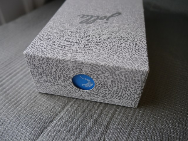
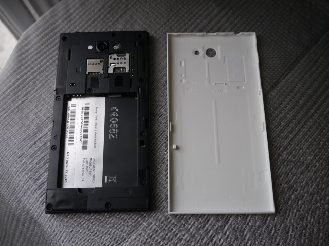
The main hardware design flare here is the sandwich form factor of the slab, created when the backplate is pushed onto the body of the phone. The edge where the two pieces meet leaves a continuous seam which give a little extra grip as you hold the phone. The test device I was using came with a white backplate, contrasting with the black front for an attractive two-tone look.
If brightly coloured phones are your thing there are options to select a more boldly coloured Other Half (as the backplate is known). The first batch of Jolla handsets, launched by Finnish carrier DNA, had a bright pink rear. Jolla has also now started selling an aloe green Other Half via its website, along with a black option for those that want a less stand-out look.
The backplates aren’t just about adding a splash of colour; they include NFC to support a link with the software, allowing a particular colour backplate to also change the theme colours of the OS (for instance). And potentially support other implementations, such as being preloaded with digital content such as a music album. Or those are the sort of use-cases Jolla is hoping to encourage.
It has also released the 3D files for The Other Half as an SDK to encourage developers to get modding the backplates. And with a power (and bus) connector incorporated into the back of the phone where the backplate snaps on, it would be possible for an Other Half to include sophisticated additional hardware functionality, such as a Qwerty keyboard or e-ink screen. (Not that either of those possible Other Halves have been built yet — but the hooks for extending the platform in such ways are ready and waiting).
The handset casing is plastic front and back — so does not feel as premium as metal/glass clad devices like the iPhone or HTC’s One device. But Jolla’s attention to detail in aspects of the hardware design, such as its mixture of rounded edges with smooth blunt ones, and a gloss logo invisibly inked on the matt backplate that jumps into reflective view when you tilt the device, give the design a confident, sure-footed air, and help to elevate the overall look and feel beyond the plebian plastic Android hoards it’s attempting to disrupt.
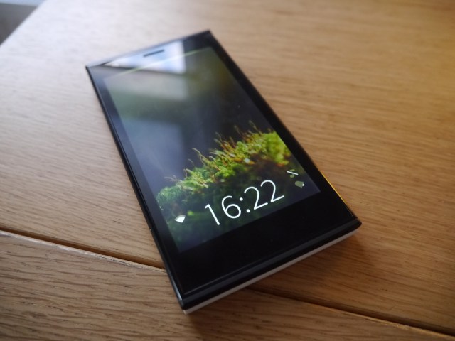
Similarly aesthetic touches are evident in aspects of the software too, whether it’s Jolla’s calendar app with its subtle flip animation that turns Sunday to Monday as you scroll, or the dual-dial interface in the Jolla clock app for setting a timer by positioning two glowing beads within two concentric circles, or the understated double tap gesture that can be used to wake the phone from sleep. A distinct design flare is evident.
Size-wise (and weight-wise), Jolla’s phone is a good middle ground, with enough screen to showcase whatever content you’re playing around with, without being so big the actual device becomes unwieldy. That said, if you’ve already pushed past the 5-inch phablet mark for your personal mobile device you’ll probably miss the extra space. So the one-way-street of mobile phone screen inflation goes.
[gallery ids="955841,955837,955838,955839,955840,955842,955846,955847,955848"]
OS
What’s really new here is of course the Sailfish OS — which carries on the MeeGo heritage that Jolla took from Nokia when the startup’s core team left to carry on developing the platform Nokia was abandoning in favour of making the leap to Microsoft’s Windows Phone.
As a platform MeeGo had plenty of promise but its timing was terrible. Even when Nokia outted the N9 (way back in 2011) Android was pushing ahead of the rest of the field. Now, for Jolla, it’s not so much a gap between Android and everyone else as a gulf. Even the industry’s third placed OS, Windows Phone, (which has been kept afloat by Redmond’s deep pockets), remains a bit-player in an Android-saturated universe.
Realistically Sailfish stands no chance of achieving mass market penetration — but then it’s not really being positioned for that. Jolla’s appeal has mostly been about serving the non-mainstream margins; aka the fringe folk who are dissatisfied with vanilla and are looking for a less orthodox flavour. People who are bored by the functional similarity of Android and iOS, and don’t see a Microsoft-branded alternative as an non-mainstream alternative.
That is necessarily a smaller and more modest market. Indeed, it may be more of a niche than a market but that remains to be seen. Outside Jolla’s native stamping ground of Finland, where national pride and Nokia-fuelled nostalgia may help to buoy up Jolla’s little boat, Sailfish’s greatest chance for building scale is likely to be out East in China — a region that was an early focus for the startup.
However, Jolla has concentrated the launch of this its first handset on Europe (and indeed, on Finland thus far), and appears to have rowed back from talk of a strong early push into China — with no follow up to its 2012 announcement of a distribution deal with Chinese retailer D.Phone. So momentum in the East is not a story it can currently tell, beyond the implied potential of the previously announced Hong Kong-based Sailfish alliance. Ergo, Sailfish’s Eastern promise also remains to be seen.
Features
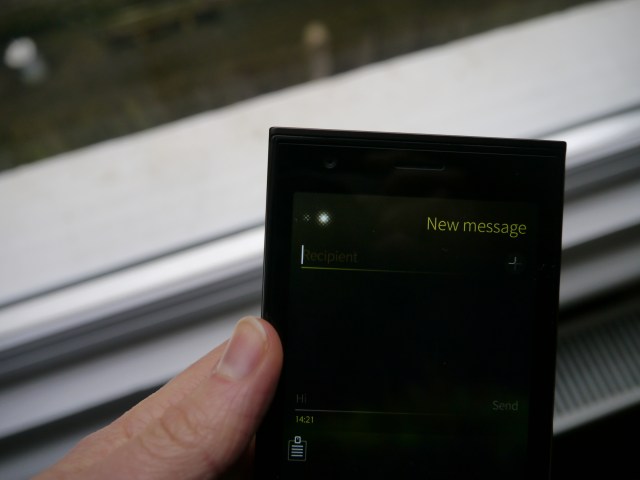
What exactly is different about the Sailfish OS? The Jolla phone interface is built around a series of gestures — pulling down on the screen typically brings a contextual menu into view, and simultaneously incorporates a selector bar so the same fluid movement is used to both point to and select the action from the menu — depending on when/where you release your finger. So, for instance, in the email app, the ‘compose new email’ or ‘update’ actions reside just off-screen, in the pull-down menu.
The advantage of this type of drag interface is you can perform actions with the same (single) finger movement, without having to lift off and tap. So there are potentially some time/efficiency savings, plus the ability to control more of the OS with a single digit, rather than being forced to use two hands to navigate. For certain groups of users with dexterity issues or a disability affecting their hands/arms Sailfish navigation could therefore be a bit less challenging than the tap-happy mainstream mobile options.
Another aspect of the Sailfish navigation is built around swipes. A swipe up from the bottom of the screen brings up an events/notification screen. Swiping in from the left or right is used to close the app you’re currently in — or partially close it (if you pause the gesture mid way through), by allowing you to peek back at the home screen. You can then either reverse the gesture to go back into the app, or follow through to minimize it and land back on the homescreen.
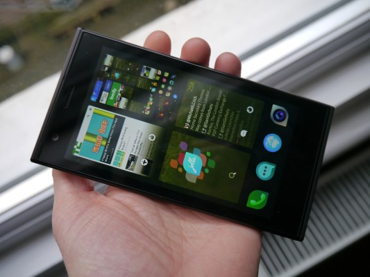
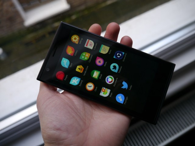
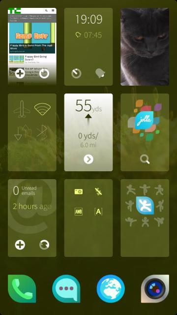
Why would you want to peek at the homescreen? Because it contains a series of minimised apps that are displayed like a deck of cards, each containing glimpses of active content allowing you to see if there’s a new email in your inbox, for instance, or a glimpse of the latest content on a website.
For native Sailfish apps, such as the built in Jolla browser, there is support for functional interaction right from the homescreen card itself — so you can refresh webpages or trigger a call to open up a new webpage just by dragging your finger left or right on the browser card itself. Similarly you can pause/play music from the media homescreen card, and so on.
 At this granular point, the Sailfish interface can resemble a Russian doll of nested gestures. For a user who takes the time to get to know all these short cuts, the interface certainly has the potential to feel fluid and productive. But, on the flip side, all these gestural layers and incremental short-cuts can end up piling a confusing amount of possible navigation options atop the OS, resulting in a steep learning curve for the Sailfish newcomer.
Beyond the user-education challenge, Sailfish’s reliance on gestures is not without other problems too. The main problem with the side-swipe gesture is that it can mis-register as one of the back/forth swipes also used to move between multiple menu screens in apps. And vice versa. So you can end up closing an app, when you were just trying to get to the next screen. Or doing the reverse.
Misregistered actions like that serve to confuse a navigation system that is already at a disadvantage because it’s different to mobile’s mainstream, and therefore involves the aforementioned disadvantageous learning curve.
Knowing when you can swipe or pull down to reach other menus also isn’t always obvious, so the user has to know to be on the look-out for Sailfish’s visual cues — either a glowing bar at the top of the screen, or small glowing dots that indicate the number of additional screens available for swiping to.
Add to that, at times, when — intuitively — you feel you should be able to simply reverse the swipe action you just did to reverse your path and return to the screen you were just on, you find you can’t — and instead have to pull down to retrace your original steps via the contextual top menu.
There is a logic there, but it’s not exactly taking the path of least resistance from the user’s point of view. So the interface can sometimes feel as if you’re being made to do something not because it’s better/easier, but just because it’s different. Which can be irritating.
The navigation also doesn’t do away with taps entirely — which does mean that when you need to tap on something to confirm an action, rather than pulling down to bring up the contextual menu, it’s not always clear that’s what you need to do to proceed. Ergo, more confusion.
The functions supported by the homescreen cards also take some getting used to, especially as non-native Sailfish apps (such as the Android apps that are compatible with the device) don’t include support for gestures. And those native apps that don’t have any additional gestures sometimes resort to signposting that lack — with a written instruction on the card to ‘tap to continue’ — to avoid further user confusion about whether they support gestural interaction or not. But having to do that is rather sub-optimal (and potentially introduces further procedural confusion where apps don’t include such signpost text).
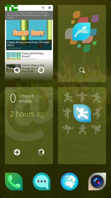 The card-based homescreen is a potentially richer alternative to the icons of iOS and Android. However the size of the cards can limit their functionality as portals into what’s going on elsewhere in your apps. The Jolla phone supports a deck of up to nine cards displayed on screen at once. When there are more than four cards their size shrinks so the text/content displayed on them can be tricky to make out. The cards are far more useable when larger — so when there’s between one and four on screen (as pictured left) — allowing for content to be displayed more comfortably, and gestural interaction to be less fiddly.
As a ‘glanceable’ interface, the Jolla phone homescreen shares something with BlackBerry 10 — with its panel of ‘Active Frames’ — or Palm’s WebOS. Or, to a lesser extent, with Windows Phone’s info-displaying Live Tiles. Sailfish’s support for gestural interaction with its own take on homescreen cards does take things a little further than Live Tiles. Whether that ability adds significantly to the interface, or is better described as more of an incremental benefit, depends on which apps you use, and the sort of actions you regularly perform.
If, for instance, you’re often checking in on a particular webpage or regularly refreshing your inbox for new content, then being able to perform such actions right from the homescreen without having to dive into the app itself may be a boon. But it’s a little hard to shake the feeling that the usability benefit here is relatively incremental. If you have a new email, you’re going to have to fire up the inbox to read it anyway — and even iOS, with its static icon-based homescreen, sticks a little red digit on your email icon telling you when its time to go check in.
One area where Jolla has delivered a really usable slice of software is the native Sailfish keyboard. The touchscreen keyboard incorporates a scrollable next-word suggestion bar above the Qwerty layout which offers an evolving rack of words to choose from as you’re typing.
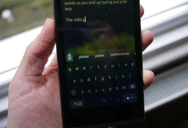
The typing time-savings can be considerable here as multiple word suggestions can fit on the screen so the chances of the right one cropping up before you’ve finished spelling it out are good. Plus, even more words lurk just off screen where you can pull them in with a quick swipe on the bar.
It’s a great use of available (and implied, i.e. off-screen) screen real-estate to support a smarter kind of touchscreen keyboard. Better than the static old iPhone keyboard? Absolutely!
Apps
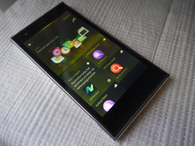
Jolla has built a series of what it terms “essential apps” for the phone that you can download during the set up process, or snag direct from the Jolla Store later on. These include basics such as a media player, email, maps (powered by Nokia’s HERE), calendar, clock, notes, calculator, documents viewer etc.
This is Jolla filling in the Sailfish platform gap itself, as — being the new kid on the mobile block — it’s unable to rely on a substantial third party developer ecosystem to do that for it.
Essential here is a synonym for ‘basics’. These Jolla-made Sailfish apps really are the bare-bones that any mobile user would expect to get as standard on a smartphone. If you want more ambitions apps — and really, which modern mobile user doesn’t? — from ephemeral messaging to insanely frustrating gaming, well, Sailfish isn’t going to be able to deliver. Not yet, and perhaps not ever on its own.
There are a handful of native Sailfish apps made by developers other than Jolla available for download on the Jolla store. But, including Jolla’s essentials, there are less than 200 apps in total on the Jolla Store in total right now — and that includes plenty of very simple stuff like an age calculator app, and kitchen timer and torch apps, plus some apps that have evidently been ported from Android. The Sailfish app ecosystem clearly remains very nascent.
Jolla’s solution for this app gap — or more accurately this ‘app gulf’ vs Android and iOS — is to add a pipeline into the Android ecosystem to allow for a sub-set of apps to be siphoned off via platform compatibility with Android. The preloaded hub for Android apps on the Jolla device is Yandex’s app store — which holds some 85,000 Android apps for downloading and extend the device’s functionality.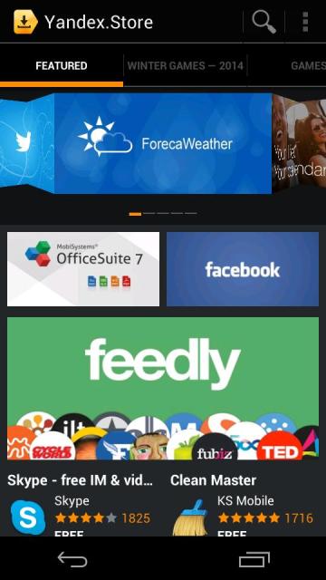
Jolla users can also download other Android app stores (i.e. in addition to the Yandex store) to get access to additional Android apps, although Google’s Play ecosystem is obviously off limits.
Jolla’s line in to the Android app ecosystem is an inelegant fix for a platform that wanted to provide an entirely alternative mobile reality. But when your platform lags the mobile category leader by circa one million+ apps then it’s a necessary compromise. And that pragmatism means Jolla’s device gets a much needed leg up in the app stakes vs other smaller players also trying to crack the Android/iOS duopoly (such as Mozilla and its HTML5 Web apps approach with the Firefox OS).
It is not a trouble free compromise though. The main problem with this approach — ignoring the core philosophical one of having to incorporate the very thing you dislike (including having to tolerate Android navigation keys cropping up within Android apps to sprinkle additional confusion over your alternative navigation system) — is that Android apps don’t always run smoothly in the Sailfish OS environment.
This was true when I did a hands-on with the Jolla phone back in November. And it’s still true now, although the big bug evident then, of the Android runtime sometimes spontaneously taking over the interface, appears to have been sorted now. App compatibility issues are an ongoing problem, though.
Many Android apps — including the Yandex app store — run sluggishly, with noticeable lag. Some Android apps are also unstable after installation — Skype for instance stopped responding after a moment’s use (although, to be fair, the Skype app is pretty universally terrible, regardless of the mobile platform you’re accessing it from). Plus, certain actions within Android apps aren’t supported within Sailfish — which triggers a dialogue box when you try to do something you can’t, informing you that such and such an action isn’t possible. Such is the price of compromise.
But, when the Android apps do work, their line in to a dominant ecosystem does help to expand the Jolla experience for its users, providing access to a lot more app ‘essentials’ — whether that’s Facebook or Twitter or Cut The Rope. Whatever your particular app poison. Just so long as you don’t expect the next Flappy Bird viral hit to be natively spawned on the Sailfish platform.
Performance
Some performance issues on the Jolla phone are clearly directly associated with its Android emulator feature, such as the laggy apps discussed above.
More general handset performance issues that affect the Jolla phone likely relate to what is effectively (on paper) a chunk of pretty mid-range smartphone hardware.
The handset is not a powerhouse in the processor stakes — certainly not by today’s flagship phone standards (which is one of the problems with having a long development time to get your debut device to market, as Jolla has). This relative lack of horsepower translates to overall performance that has a tendency to feel a bit plodding.
There are times when the interface has noticeable lag — such as when taking a photo and watching the shot you’ve just snapped slide off screen and onto the (off-screen) camera roll. The delay isn’t huge but it’s noticeable.
Likewise, the browser can feel a little underpowered when tackling certain websites. And seem a little slow to scroll and respond to taps. Transitions from one type of content to loading another also require a spot of micro-patience from the user.
The response time lag is more pronounced when running (some) Android apps, as noted above.
Native Sailfish apps fair better, as you’d expect, but there it’s not so much overall performance that’s the issue but the aforementioned paucity and scarcity of app quantity and quality.
Elsewhere on the performance front, the handset’s rear camera is distinctly mid-range. Photos lack crisp clarity, and the lens struggles with variable light levels. Likewise, the handset’s qHD screen is far from pin-sharp. Again, these aspects of the Jolla phone are distinctly mid-range.
Battery life at least does seem pretty good, both on standby and for active use. The phone should easily manage a day’s normal use without needing a recharge.
Bottom Line
The Jolla phone’s gesture-based interface has a steep learning curve for newbies, and considering how embedded most mobile users are with Android/iOS navigation paradigms that’s inevitably pushing water up hill. Floating a whole new platform so long after Android and iOS set sail also means Sailfish can’t hope to compete on quantity of native apps — or indeed on attracting hoards of developers, so it’s a tough ask for it to deliver high quality third party native apps either.
That huge app gap means Jolla has been forced to tether its dingy to the very Android leviathan it’s trying to circumvent — to extend the reach of its dinky Sailfish ecosystem in the hopes of building sustainable momentum. It’s a practical and pragmatic strategy but it’s also an ongoing compromise that muddies this new platform’s clear blue waters.