The experience of watching televised sporting events has evolved dramatically in recent years, with data visualization technology making it much easier for spectators at home to understand what’s really going on. Innovations such as the yellow “first down” line in televised football, the pitch and strike zone visualizations in televised baseball, and NASCAR’s racecar tracker have changed the way we all watch sports — and it turns out that one man, tech industry veteran Stan Honey, has led the development of them all. He’s kind of a big deal.
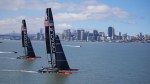
Today, Honey is working on his most difficult project yet: Making the elite America’s Cup sailing race taking place this month in San Francisco understandable, accessible and enjoyable to the masses. It’s a project to which Honey is uniquely suited, since in addition to being an Emmy-winning television technologist, he’s an award-winning sailor whose accolades include winning the Jules Verne trophy for circumnavigating the world in 48 days.
Honey has brought together a team of like-minded sailors and engineers to make the thrills and challenges of sailing easy for everyone to see. So TechCrunch TV headed down to the America’s Cup headquarters at San Francisco’s Pier 27 to get a first-hand look at the technology and talk to the people involved. Check it all out in the video above.
Credit and thanks to John Murillo for shooting and editing, and Felicia Williams for producing.