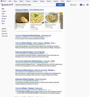
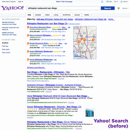
Yahoo has tweaked its search-results page today (yes, it still does search, albeit now powered by Microsoft’s Bing), with a visual refresh that’s meant to better emphasize top search results and that clears up some visual clutter in the navigation bar and additional settings sidebar. Yahoo’s redesign may look familiar, because it’s quite similar to the one that Google introduced a couple of years ago.
As you can see by Yahoo’s own amazing animated GIF, results now appear higher up on the page, thanks to a single-line navigation bar that appears at the top-most edge of the browser window. Yahoo’s branding is also now smaller, and there’s a sign-in area right of the search bar itself. Along the left-hand side you have a simple navigation menu, allowing you to change the search category type and choose from different time options for results.
 Yahoo also says there are some improvements on the backend that should result in faster load times, and notes that the new Navigation bar will spread to other Yahoo properties soon (which is also something Google did before). The page takes most of its cues from the new Yahoo homepage design, which it launched in February.
The company says this is just the beginning, and seems to indicate that further changes for Search results will be coming over the course of the next few years. The company has clearly been acquiring enough in terms of new product and talent to make some big changes to all aspects of its business, so maybe we’ll see some Summly summaries make their way to the results page, sort of like they’ve already done on mobile.