
Editor’s Note: David Lieb is co-founder and CEO of Bump, creators of the popular app that lets people share contact information, photos, and other content by bumping their phones together. Bump has been downloaded more than 130 million times.
It’s been hard to ignore the massive shift in the last decade toward simple products. The minimalist design aesthetic pioneered by Dieter Rams in the 1960s on alarm clocks and toasters was popularized by Apple and Google in the 2000s on iPods and search boxes. Soon after, Web 2.0 took over, yielding big buttons, less text, more images, and happier users. Startup accelerators and design gurus popped up proselytizing “simplicity!” and the rapid growth of mobile in the last five years has created an almost strict requirement for simple products that work on our new small screens and increasingly small attention spans. Some of the most popular products today (Twitter, Snapchat, Instagram) all have simplicity of design and experience at their core.
This Ain’t Is Your Grandma’s Internet
 So why did this happen, and why mostly in the last 10 years? Some say that good design simply lags behind technology and that design has finally caught up. Others point to the evolution of our devices and our environments — definitely a major factor.
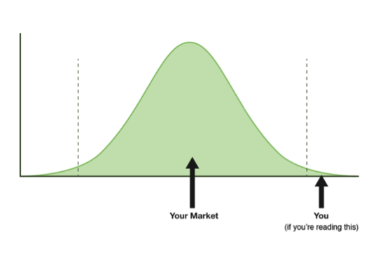
But I believe the high-order bit is even more straightforward: It’s only been in the last 10 years that technology products have reached the mass market. The market size of the entire broadband Internet in 2000 was 50 million people; today it is 2 billion people; in a few short years with the shift to mobile it will be more than 5 billion people. This mass market is comprised mostly of people who sit in the middle of the tech-adopter bell curve, and since they aren’t product designers, computer programmers, and tech bloggers, they require an even higher degree of simplicity.
“Simple” Isn’t What You Think
But “simplicity” comes in many flavors. We can make products simpler by optimizing along a number of vectors:
- minimize number of steps in the flow
- minimize time required
- minimize number of features
- minimize elements on each page
- ….
But the most important, and often most overlooked, is Cognitive Simplicity. This is an idea that slowly emerged as my company, Bump, tried to understand exactly why Bump is so popular, especially in the non-tech crowd. We believe product builders should first and foremost minimize the Cognitive Overhead of their products, even though it often comes at the cost of simplicity in other areas.
Cognitive Overhead
There isn’t yet much written about cognitive overhead in our field. The best definition on the web comes from a web designer and engineer in Chicago named David Demaree:
Cognitive Overhead — “how many logical connections or jumps your brain has to make in order to understand or contextualize the thing you’re looking at.”
Minimizing cognitive overhead is imperative when designing for the mass market. Why? Because most people haven’t developed the pattern matching machinery in their brains to quickly convert what they see in your product (app design, messaging, what they heard from friends, etc.) into meaning and purpose. We, the product builders, take our ability to cut through cognitive overhead for granted; our mental circuits for our products’ patterns are well practiced.
This is especially pronounced for mass market mobile products. Normal people already have to use more of their mental horsepower to cut through cognitive overhead. Now imagine the added burden of having to do that while on a crowded bus, or in line at Starbucks, or while opening your app for the first time while eating dinner with a friend and texting another. This isn’t 1999 when your users were sitting in their quiet bedrooms checking out your website on a large monitor while waiting for their Napster downloads to finish; they are out in the real world being bombarded with distractions.
My, What Big Cognitive Overhead You Have
To illustrate the difference between generic simplicity and cognitive simplicity, let’s look at a couple products that, on the surface, might be regarded as being simple to use, but rank in my book as some of the most cognitively complex products of late.
QR Codes — Designed to check the simplicity boxes of speed, ubiquity, and small number of steps, QR codes really dropped the ball on cognitive overhead. “So it’s a barcode? No? It’s a website? Ok. But I open websites with my web browser, not my camera. So I take a picture of it? No, I take a picture of it with an app? Which app?”
iCloud / PhotoStream — When we heard Steve Jobs preach the utopian future where all of our photos and data would be seamlessly synchronized among all our devices, we smelled the Apple simplicity we’d all grown to love. But in practice, iCloud is rife with cognitive overhead — it only backs up your most recent photos, it works on certain select apps but not others, you have to create an icloud.com email account for it to sync your mail and notes but not everything else. Oh, and it works on new iPhone and iPads and Macs running OS X v10.7.4 or later, but not your PC or Android tablet. Try explaining that to your mother.
Cognitive Simplicity Winners
So which products really nail cognitive simplicity? Here are a couple examples:
Shazam — An app that magically hears what song is playing and tells you what it is? Seems pretty complex, and what’s happening under the covers actually is. But Shazam does a phenomenal job keeping the user’s cognitive burden low. They force people to press a button to “start listening,” show real-time feedback that shows the app is hearing the sounds, and it buzzes when a result is found. Shazam could have made the flow faster or fewer taps, but it would come at the cost of cognitive simplicity.
Nintendo Wii — In most ways, the Wii was far more complicated than its game console peers in 2006. It used accelerometers and IR blasters and detectors that required setup and calibration, and it was a departure from the mental model most people had for video games. But the payoff was a system with low cognitive overhead — you swing the controller to the left, and the little avatar on screen swings his racquet to the left. And voila, toddlers and grandparents alike suddenly became gamers.
Could Go Either Way?
Finally, a couple of my personal favorite daily-use products that could be argued either way. What do you think?
Dropbox — I love Dropbox. All of my stuff is in my Dropbox; Dropbox is on all my devices; so all my stuff is on all my devices. Pretty cognitively simple. But there are certainly some potential cognitive hurdles, or, perhaps better put, cognitive activation energy required before reaching the low cognitive overhead state. Is Dropbox a folder on your desktop or a cloud-storage website? Oh and it’s a program to install on my computer, too? When do things get backed up? Did it work?
Facebook — Facebook started out with very low cognitive overhead — it was a digital version of the paper Facebooks that already commanded high engagement and retention of college kids. Question: Has Facebook’s cognitive overhead increased or decreased as it has expanded to the mass market? What cognitive hurdles have arisen recently that weren’t present in the past? Should this worry Facebook?
How To make Cognitively Simple Products
Make people work more, not less.
Put your user in the middle of your flow. Make them press an extra button, make them provide some inputs, let them be part of the service-providing, rather than a bystander to it. If they are part of the flow, they have a better vantage point to see what’s going on. Automation is great, but it’s a layer of cognitive complexity that should be used carefully. (Bump puts the user in the middle of the flow quite physically. While there were other ways to build a scalable solution without the physical bump, it’s very effective for helping people internalize exactly what’s going on.)
Give people real-time feedback.
If your user has to wonder, “So, did it work?” you’ve failed. Walk people through using your product like a magician leads the audience through an illusion. Point out the steps along the way, or whatever magic your product is providing could be lost to the user.
Slow down your product.
We’ve all heard stories of Google’s relentless quest for search-result speed, but sometimes you need to let your user understand and appreciate what your service is doing for them. Studies have shown that intentionally slowing down results on travel search websites can actually increase perceived user value — people realize and appreciate that the service is doing a lot of work searching all the different travel options on their behalf.
How To Know If You’ve Succeeded
Test on the young, old … and drunk.
The very young and the very old are even more sensitive to cognitive overhead, as their brains aren’t accustomed to the sort of logical leaps our products sometimes require. Grandparents and children make great cognitive overhead detectors.
When you can’t find old or young people, drunk people are a good approximation. In fact, while building Bump 3.0, we took teams of designers and engineers to bars in San Francisco and Palo Alto and watched people use Bump, tweaking the product to accommodate.
Ask your users/customers to repeat what your product does and how it works.
Let people use your product, and then ask them to tell you what it does. They’ll think you are crazy for not knowing already, but what you hear can point to cognitive hurdles you’ve missed. One technique that scales that we use at Bump is to show a one question survey to a small fraction of users inside the app right after they are done bumping, asking “What is Bump for?” or “How do you use Bump?” The answers help us eliminate cognitive hurdles that remain.
There’s never been a time when cognitive simplicity matters more. As the mobile wave continues over the next five years, the world will see arguably the most rapid deployment of any new technology in our history. Products that are truly mass market will need to simultaneously target the Silicon Valley early adopter and the kid riding on the back of a motor scooter in Thailand. Which products will win, and which will lose? My money is on those that focus on cognitive simplicity.