Apple’s Record First Quarter Of 2013, In Charts

Chris Velazco Bryce Durbin

Chris Velazco is a mobile enthusiast and writer who studied English and Marketing at Rutgers University. Once upon a time, he was the news intern for MobileCrunch, and in between posts, he worked in wireless sales at Best Buy. After graduating, he returned to the new TechCrunch to as a full-time mobile writer. He counts advertising, running, musical theater,... → Learn More

Bryce Durbin is a graphic designer and illustrator for TechCrunch. He grew up in Columbus, OH and now lives in Elkader, Iowa with his wife Shannon and their son Link. His portfolio is at brycedurbin.com. → Learn More

Wednesday, January 23rd, 2013
Comments

There are plenty of nifty tidbits to sort through in Apple’s most recent earnings release, so here’s a little aid if you’re more of a visual learner than a text skimmer. We (by which I mean our graphics guy Bryce) have crafted a handful of charts to help you more easily sift through Apple’s quarterly accomplishments, and hey — if you feel like learning a little more, clicking each of the charts will take you to a full post on the matter.

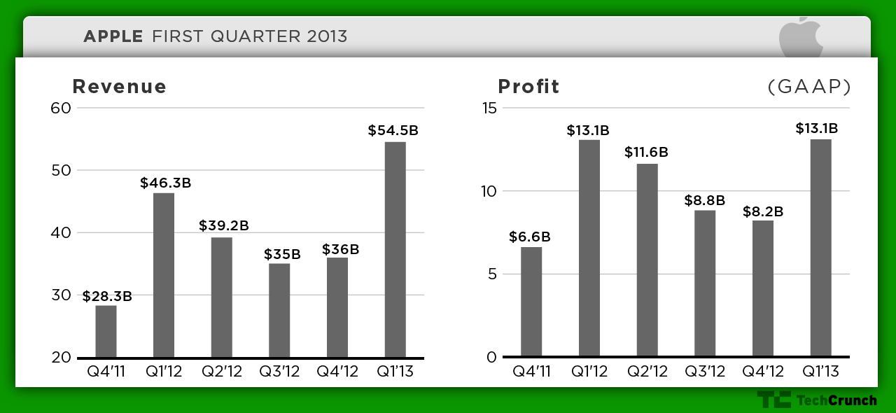
A quick overview of Apple’s earnings:

apple-q113a

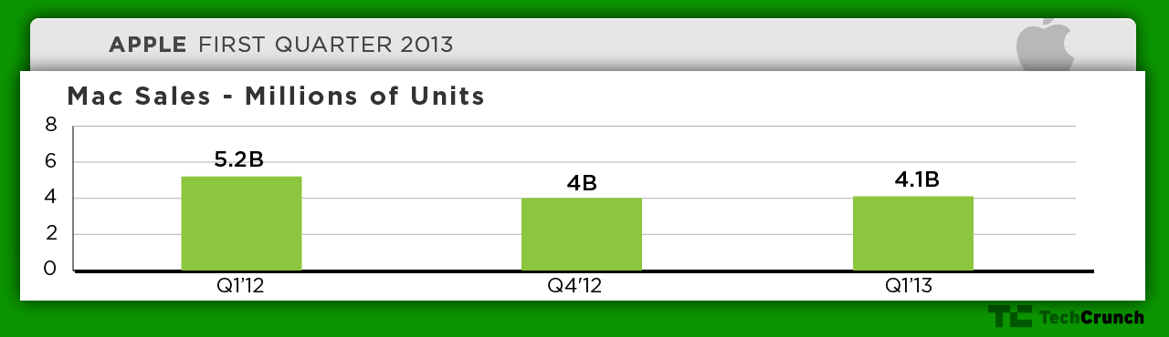
Apple’s wimpy quarterly Mac sales:

apple-q113-mac

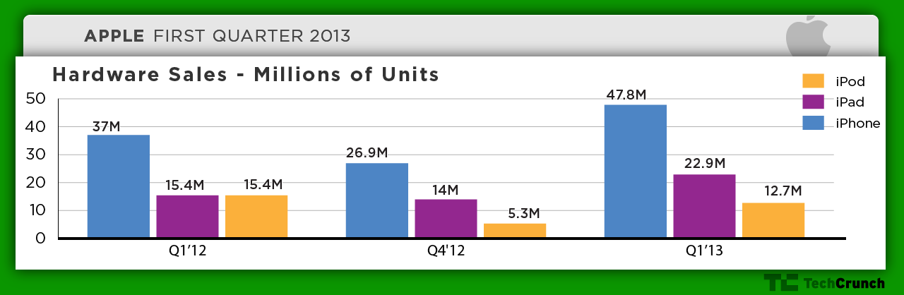
And Apple’s record iOS device sales:

apple-q113-ios

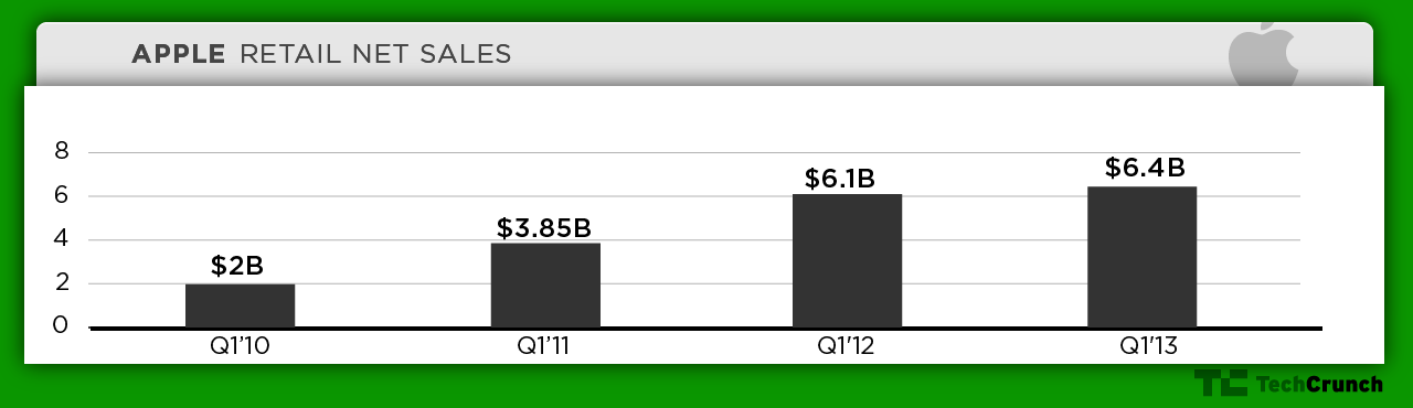
Apple’s retail performance:

apple-q113-retail

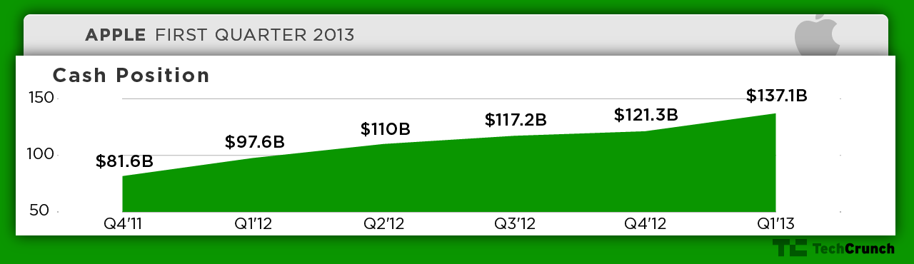
Apple’s cash position:

apple-q113-cash3

More to come!