Editor’s note: Iris Shoor is co-founder and VP Product Marketing at Takipi, a service for managing software downtime in the cloud. Before that, Iris was co-founder and VP Product at VisualTao, a B2B web and mobile service acquired by Autodesk.
For a long while I thought about marketing as wordsmithing – putting an abstract idea into a sentence, picking just the right words. But then things started to change – less text please, more graphics – we’d rather see it than read it. This year more than ever, visual content is going mainstream. Pinterest is using imagery as its main content, and within a few months hundreds of different websites have adopted a ‘Pinterest like’ design. Companies are switching to Tumblr instead of traditional blogs, with little text and lots of imagery. Facebook is making your profile more visual with the Timeline and the new image gallery, not to mention Instagram. There’s a change in the air and this time you don’t need to smell it – you can actually see it.
I have to admit that I started using visual marketing not because I identified a trend but because as an architect by trade that’s the way I think – visually. I founded two companies (you can read more about our journey from 0 to 10M downloads here) where visual marketing is used as a main marketing strategy. To make things more interesting, both companies are as far away from being visual as you can possibly get – a B2B app for engineers and a Cloud/Big Data tool for developers. Here are 5 ways you can use visuals to increase traffic, get more buzz and reach more users:
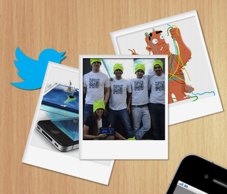
“Say Cheese” – How A Team Picture Helped Us Get Better Reviews On The App Store
After every update to the App Store/Google Play we used to send a newsletter to our user base, highlighting the newest features and asking to review the version. On one release, after sending the newsletter we got 3X more reviews than usual (although there was nothing extraordinary about that version). It took us a while to figure out the reason. For that release we placed a picture of the team – the engineers who worked on the app right next to the ‘review us’ link. While traditional marketing uses people’s faces for just about everything (why do you always see smiling faces next to cheese, cars or real estate?), startups tend to restrict their team pictures to the ‘about us’ page. People are immediately attracted to human faces and react to action, when they feel it is called for by real people.

Want People To Remember Your Product? Look Different
When introducing a new product to a market, one of the main challenges is to have users remember your product and easily tell it from others. You want potential users to remember reading about your product two months ago, or recall seeing it being used by a colleague. Using a memorable image or a unique visual language is a great way to do just that. MailChimp is bringing their brand to life using a humoristic visual of a mailman monkey. DropBox is using childlike illustrations as a visual language, and by doing so differentiate themselves from other storage services. Heroku is using Japanese elements from Origami to Japanese mythology, so people would remember and emotionally relate to their product (which BTW has nothing to do with Japan).


[DropBox and Heroku using memorable visual styles]
Reality Check – Show Your Product In A Real World Context
Look at a screenshot of your product. Now take a step backward and look at the full picture. What does the user look like? Is the product being used at the office, at home or outdoors? Is it daytime or nighttime? When the product is displayed in context users can understand much more within seconds. This method is also more credible, as once you see a product used in a real world scenario it makes it harder to doubt it. For example, on Square’s homepage the main content is an image of the product being used in a farmers’ market. This picture is the main message and they’re not backing it up with text. With just a glimpse users can understand how the product works, where you’d likely use it and eliminate the ‘who needs it’ reaction.
Having A Hard Time Getting To Bloggers? Great Visuals Might Help
There’s no magic trick when it comes to getting media coverage. A great product and a trendy market surely help, but so do beautiful and funny images. A common mistake is to send bloggers product screenshots. Most screenshots don’t capture the essence and magic of a product. In fact, you’re asking the reader to work pretty hard to understand your product by looking at a screenshot. When placed in a minimized/cut version it will most likely become a ‘generic’ screenshot, looking like any other app or website you’ve seen before. Here’s an example from our first product where we tried to capture the essence of a localization feature with visuals, and without screenshots –

“Ouch, That Looks Painful” – Explain The Pain Using A Visual Analogy
Explaining the pain is always a main challenge when introducing a new product – no one really wants to hear what’s wrong with the way they work now. You can probably recall numerous videos of new products where almost half of the video is dedicated to telling you how much your life is a mess. With our second company, Takipi, the pain we’re trying to present is complex software debugging – looking for the source of a problem in the code. We’re not telling developers what they do today is wrong or difficult, but rather use a fun analogy for debugging and the pain they’re experiencing every day.

[Developers – know this feeling?]