HP is currently a company without a strong identity. This comes after a decade of products and CEOs that each fumbled in one way or another. The company needs to make a sharp statement and emerge from the doldrums that has seemingly trapped the iconic Palo Alto company. The purposed logo and rebranding (videos below) shown here would be a great first start.
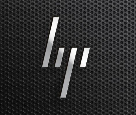
The story goes that the designs shown here were drawn up by Moving Brands and released a few months back (prior to the ousting of Apotheker.) The abstract four line logo is a clever play on the classic HP logo using a 13-degree slant, which is already a common feature in many HP products. As The Verge notes, it’s a bold design and perhaps one that’s too radical for the slow-moving corporate machine that is HP. But it’s hard to look at that logo and not dream of HP rising from the ashes with those four lines proudly displayed on its standards waving over the consumer electronics battlefield.
 HP’s current CEO, Meg Whitman, has the daunting task of steering HP. She’s the fifth leader in as many years with the task. So far during her time at HP’s helm the company’s stock has slowly regained lost value. One of her first major announcements was that HP’s personal systems group, the part of the company that makes PCs, would stay within HP rather than being spun off. She is in a sense reorganizing HP, an HP that needs rebranding as much as it needs to stop hawking printer ink that costs more than the printers themselves.
Moving Brands details their purposed rebranding here. Apparently the project began way back in 2008 and was just recently released to the public. Clearly the new logo and branding has not been implemented, and seeing how the design company released it themselves, HP will probably never use it. Companies tend to package rebranding with a major marketing campaign to maximize exposure. But HP needs to do something along these 13 degree lines. They might make capable computers but there is little excitement around the brand.
UnderConsideration astutely notes that “HP’s logo has been around for so long that it’s not really questionable anymore, it just is and it just exists.” Per Moving Brand’s charts, the slated HP letters first appeared in 1941. Over the years the two letters have seen little change, more often updates involved adding and remove a surrounding shape like a rectangle or circle. But the two letters, H-P, representing the company’s founders, Bill Hewlett and Dave Packard, have remained constant. And they should. However, HP is a stale, lifeless machine and needs a shot of energy. Whether HP will ever implement Moving Brands’ four line logo (they won’t), or instead uses something different, the logo and HP brand need to evolve to help springboard the company into a new era of exciting products — yeah, the logo is just the start, and HP actually needs to make exciting products as well but that’s a topic for another “HP Sucks” post.