Over the last six months, Google has been doing a full house clean — or maybe it’s been shedding an old skin. On the one hand, that’s meant sunsetting products that just aren’t cutting it anymore, like in September when it announced plans to shutter Aardvark, Desktop, Notebook, and Fast Flip, etc. and then last week it continued with saying au revoir (officially) to Wave, Knol, Friend Connect, and more. Then, on the other hand, Google has been updating its look, well, its design.
That meant a bit of a makeover for the Google search page, as the company added a black nav bar at the top of the page (kind of similar to to Drupal’s top bar, no?), a smaller logo, with links moving both to the top and bottom edges of the browser window. Google was after a cleaner, more simplified look — for all of its products. The changes were seen across Search, Maps, Translate, and later Reader (boo, hiss), and even Gmail (meh).
Really, Google has been trying to make its home, Search page feel a bit like your desktop, giving you a presumably quicker way (in one place) to access all of their products (and your stuff), with top priority being given to rolling out Google+ integration across each and all of those products.
Today, Google announced on its blog that it’s “ready for the next stage” of its redesign, which apparently includes a new Google bar that will enable users to presumably even more quickly switch between each of its products, and share easily with Robert Scoble Google+ users.
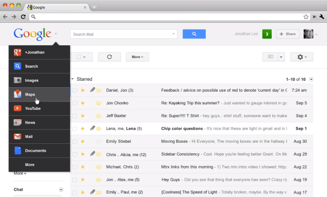
That means arrivederci to the black bar. The black toolbar will be replaced by a new gray “drop-down Google menu nested under the Google logo”. This will include a list of links, along with Google’s services, which can be accessed by hovering over the “More” link at the bottom of the list.

Black nav bar, we hardly knew ye. I was just starting to get used to it, but it was also kind of annoying, and I like the subtraction of that glaring black bar, the idea of more space, and the fact that I will now be able to search the contents of the Google products I’m using. Even if this is part of the Google mantra of “more blank space for no reason”, as one of my colleagues quipped.
I may have to click a few more times, but it keeps the design and feel consistent, especially considering the recent redesign of the Chrome Web Store. As long as consistency isn’t sought after at the sake of ease of use, Google’s design tweaks are welcome.