 Finally. Twitter has just unveiled a much needed revamp of its Twitter for mobile page, turning what was a pretty clunky looking mobile page into a more dynamic web app with top aligned icons for @replies, messages, your stream and search (which was missing from the mobile app previously). The app should work on any mobile browser.
From the Twitter blog:
“The app is fast – you can quickly scroll through your timeline, move between tabs and compose Tweets. It’s rich – it takes advantage of capabilities that high-end device browsers offer, such as touch gestures and a large screen. And it’s simple – it’s easy-to-use and has the features you’d expect from a Twitter application, including your timeline, @mentions, messages that you can read in conversation view, search, trending topics, lists, and more.”
From a pure interface standpoint the HTML 5-powered app is already far better than the existant mobile page. And it’s clearly an appeal to users accustomed to Twitter’s mobile apps; It’s landing page is exactly like the Twitter iPhone app interface (designed by Tweetie founder Loren Brichter) but reversed and the Twitter for Android app has this exact upright positioning, with a different assortment of icons.
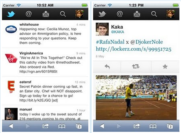
One noticeable difference between the mobile page and the phone apps is when you drill down into a tweet. Click in to a tweet on the mobile app and media is displayed flush to the screen, with the retweet, star and reply buttons appearing below the tweet but above the image.
You still can’t upload photos themselves to the web app, which is sort of a bummer.