About ten days ago, gossip blog Gawker and its sister sites Gizmodo, Lifehacker and others switched over to a drastic redesign which was met with plenty of jeers. People always complain about design changes, but this time it looks like several of Gawker’s sites actually took a major hit to traffic.

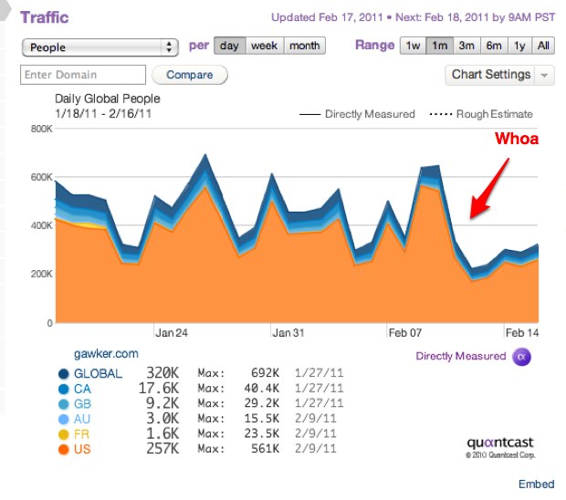
According to Quantcast, which directly measures the sites, Gawker’s U.S. daily unique visitors were cut in half from a high of 561,000 to 257,000 (see chart above). Gizmodo dropped from 746,000 to 420,000 in the U.S. Sitemeter shows an even more harrowing freefall for Gizmodo (see chart at right). Jezebel and Deadspin also took hits. Only Lifehacker seems to be holding steady.
The new design (bottom screenshot) features one top story in the main column, with a few other featured stories below, and more headlines in a thinner column along the side. But it is a bit disorienting because when you scroll down, the righthand headline column doesn’t move, only only the main column does. And sometimes there is only one big full featured post on the homepage, as is the case right now with Gizmodo and a story about Steve Jobs demolished mansion in Woodside, CA.
You can revert to a traditional blog view, but the default is the “top story” view. Most people will probably never figure out how to toggle back to the comforts of the classic reverse-chron design, so they leave instead in frustration. Tweets about the redesign are more negative than positive. Some typical ones:
http://twitter.com/#!/pjfry/status/38424054876737536
http://twitter.com/#!/liberationnyc/status/38333512151089152
http://twitter.com/#!/pseudohistorian/status/37540219318177793
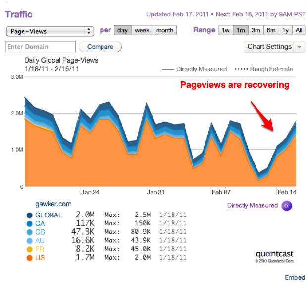
Ah well, maybe they’ll come around. There is one silver lining, however. For those people who do stick around, pageviews seem to be bouncing back to the pre-redesign levels. As long as Gawker doesn’t drive way all of its readers, it should be fine.