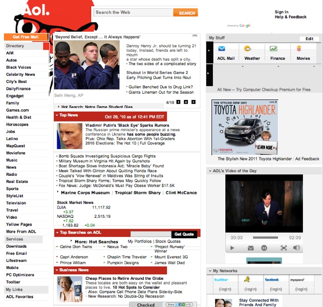
It’s true. AOL is planning to launch a new homepage design next week. There have been reports, but no screenshots. Until now. A source close to AOL (but not, you know, us) provided the screenshot below.
As you can see, it maintains a consistent look and feel with the current homepage (second one below). But there are a few major differences. It’s going from a two-column to a three-column layout, with more splashy feature items above the fold. Instead of a single main column with rotating features at the top and news sections below, now the whole middle column will become featured items with bigger photos. The search box at the top is also more prominent, with tabs for web, image, video, maps, and news search.
The directory to other AOL sites in the left sidebar is pushed down to make more room for the featured items (which drive more traffic). The first columns is still news, with latest headlines first, but the second spot now goes to “Local News” and neighborhood picks (hello, Patch?)
The new, right-hand column is more focussed on discovery, with trending topics and most-shared stories. If you log in with AOL Lifestream, you can see the links and stories your friends are sharing across several social networks including Facebook,Twitter, MySpace, and YouTube. At least, that’s what it looks like from the screenshot.
New homepage

Current homepage