“We were working 24/7, working in very, very rapid cycles, with very, very short deadlines and milestones. We were working in a very, very nimble hyper consumer focused way…all fused in this kind of maelstrom of pizza, Mountain Dew, and all nighters, and you know idealism.”
That may sound like the caffeine-fueled, sleep-deprived rant of a typical Silicon Valley entrepreneur. Except it’s not— try Todd Park, the buttoned-up CTO of the US Department of Health and Human Services (HHS).
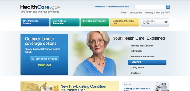
He’s talking about his latest project, Healthcare.gov, a consumer-friendly site that helps users find and compare private and public insurance options and learn about the new health reform law. According to Park, it’s the single largest online repository for public and private insurance information. (See video above.)
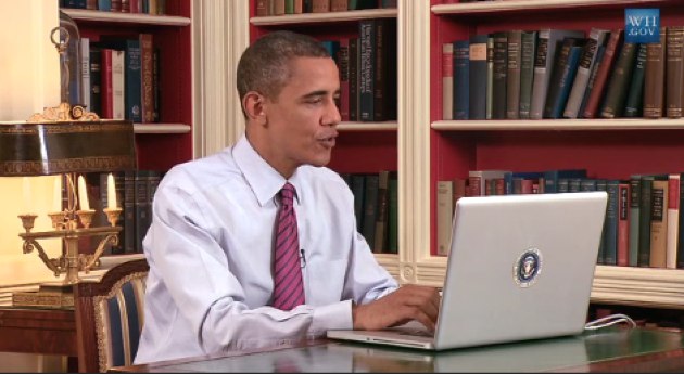
As President Obama demonstrates in a video walkthrough (see video below), a consumer can use the site’s finder to get tailored insurance options by answering a few basic questions about their location and status (i.e. age range, needs, etc.). Later this fall, the site will also include pricing information to help users compare plans by cost.
While Healthcare.gov is definitely not the first comprehensive online initiative spearheaded by the government, it does reflect the current administration’s serious commitment to online engagement and how they’re paying attention to Silicon Valley.
Calling the site an Expedia for health insurance, the White House Director of New Media, Macon Phillips, says they borrowed ideas from other web companies to develop the site:
“It doesn’t look like your normal [government] website because I think the websites that have been coming out particularly during the Obama administration, but even more recently, look towards the private sector— look towards what’s happening everywhere else on the internet.”
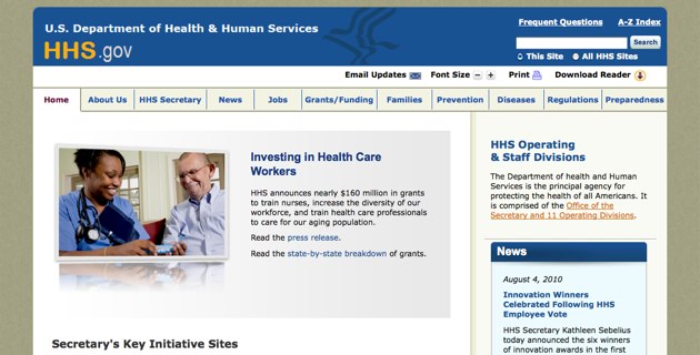
Aside from the big fat “.Gov” domain name, the aesthetics of Healthcare.gov seem more akin to a young startup versus something borne out of a provision in the Affordable Care Act. Its clean, simple user interface features a row of big buttons on the top directing users to “find insurance options” or “understand the new law.” Considering how convoluted our health care system system is, Healthcare.gov manages to organize the information in logical buckets and push key concepts to the foreground. Here’s a look at the Healthcare.gov homepage and for comparison, the HHS site (which has more of a standard .gov website feel).
If Healthcare.gov seems like a welcome, fresh perspective, the government has Twitter to thank. The White House and the HHS were not only drawing inspiration from Silicon Valley, they were looking for talent.
Earlier this year, before the passage of the bill, Macon Phillips stumbled upon Edward Mullen on Twitter, who posted a mock web design of what the heavily debated insurance exchange marketplace could look like. Lesson here: the next time you tweet something random on Twitter, the government could be watching with a job offer in hand.
“There was a designer in Jersey City, NJ, who I connected with because he tweeted his design of what he thought the exchange…would look like because he thought it would be really helpful to show the public that this is a visual thing,” Phillips says. “It was one of many suggestions that we got, but I printed it out and I would show it to people and would say look, this is the sort of creativity that is out there…One thing let to another and he left Jersey City to come to DC and.. helped push us through an information architectural process, asking questions like someone out of government who doesn’t understand the acronyms, doesn’t understand the alphabet soup, [but] fully gets what it’s like to be running a small business, what it’s like to look for your own health care insurance, was asking some really great questions and I think had a really positive impact.”
Once the team was in place, it was crunch time, says Park. From the bill’s passage, the HHS had 90 days to get the site live, hence the “maelstrom of pizza, Mountain Dew and all nighters”— a familiar rite of passage for virtually any tech entrepreneur. The site officially launched on July 1 and a few weeks later President Obama released his video demo. While many blogs pointed out Obama’s Apple endorsement— the poorly hidden MacBook Pro — it was also notable as the first demo a sitting president has ever done for a website.
So how is the website doing? Not so bad. As of this morning, Healthcare.gov has racked up 1,015,148 visits and is fielding thousands of comments each week (there are several yellow buttons across the site where users can give feedback). Phillips says they are indeed listening: each week, the team holds a meeting to specifically discuss the comments of the week. Of course, one million is still far from reaching the 45 million or so who are uninsured, but I’m sure Phillips, Park and his team know there’s a lot more to learn from America’s tech entrepreneurs.
We got a chance to talk to Phillips, Park about the making of the website and President Obama’s reaction via Skype, see video above.