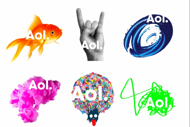
As AOL prepares to spin off from Time Warner early next month, it is going through a slight rebranding. The AOL logo is changing to lowercase with a period (Aol.). The new branding campaign that is about to launch features the logo revealed as white space inside different images and pictures (see below).
The video above is a sneak peak of AOL’s brand advertising campaign, which again reveals the new AOL logo over different images that the company wants to associate the brand with. The attempt here is to try to portray AOL as trendy, vibrant, and interesting—as far as artsy splashes, a headbanger and an acrobatic trio doing flips off one of their own manages to do that. The point is that AOL wants to reveal itself in unexpected ways.
It does need to reboot its image, I’ll give it that much.