Sonos has updated their decidedly dated and frustrating app to reflect a more modern, user-forward aesthetic. What’s changed? Pretty much everything.
If you’ve used Sonos in the past few years, you’ll have struggled with their controller app, a service that, thanks to the myriad of potential use cases, suffered from a lot of user experience problems. Creating playlists, for example, forced you to think about whether you were adding your songs to “Favorites” or creating a Sonos playlist or accessing a playlist in a music service. Settings often appeared in the music menu (until they added a separate icon) and adding and removing rooms from your whole home system usually resulted in tapping a few times in vain until you found the right menu. In short, the app marred an otherwise incredible music experience.
The system also supports cross-service search, allowing you to find music in multiple ways.
Quoth Sonos:
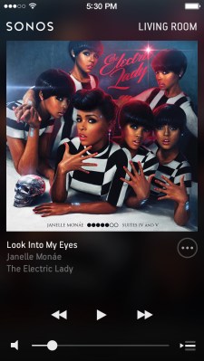
The new app takes full advantage of modern, high-resolution screens and includes more information and images for albums and songs. Multi-paned windows offer music information alongside search and selection systems and the whole thing looks decidedly more modern.
[gallery ids="1001777,1001778,1001781"]
The last few app updates have addressed a few quirks including interface issues and access to on-device content. Now, it seems, Sonos has finally taken a look at its design and usability and really put a lot of effort behind a new and superior experience.
Updates on Android and iOS should be rolling out now although some of my devices haven’t registered the change yet. The way-ay-ting, as they say, is the hardest part.